Jacob Waites
I design, prototype, and build brands and interactions full of expressive type, fun motion, bold colors, and minimal line-work. Sometimes I write and speak about design. My craft is the way I speak to the world, I work to help others find their voice and make them successful.
The Lakehouse
A place to bring together the best upcoming financial professionals and teach them the ways and history of KPMG.
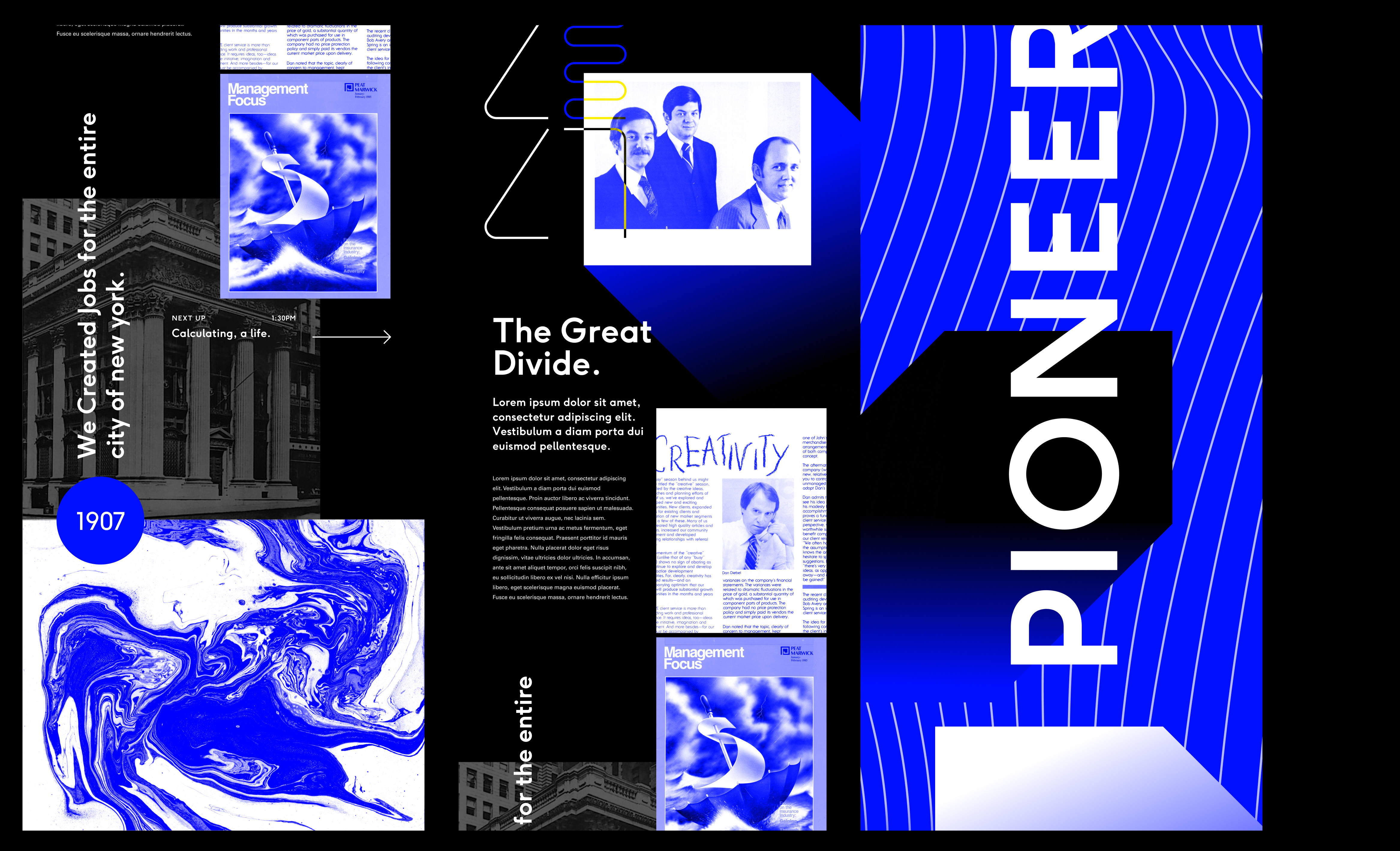
The Lakehouse is a gathering place for new KPMG hires and returning employees to bond and get training for their different roles. I was part of the design process for spatial interaction design on different installations in the lobby and hallways of the massive complex. The project used low-fidelity projection-mapped spatial mockups, a high fidelity VR model, and later on half to full-scale mechanical prototypes to bring KPMG into the space before it was even built.
Project team
This was a massive project, my role was to lead the interaction and experience design of all of the installations for the space along with Tom Kershaw and YC Sun. I collaborated heavily with Brian Standeford and Todd Vanderlin to help build the visual style of the experiences we created. Jenna Fizel, YC, and Todd brought software and hardware to life. Bri Patawaran guided the project and lead the spatial and environment design for the experiences.
The Legends hall
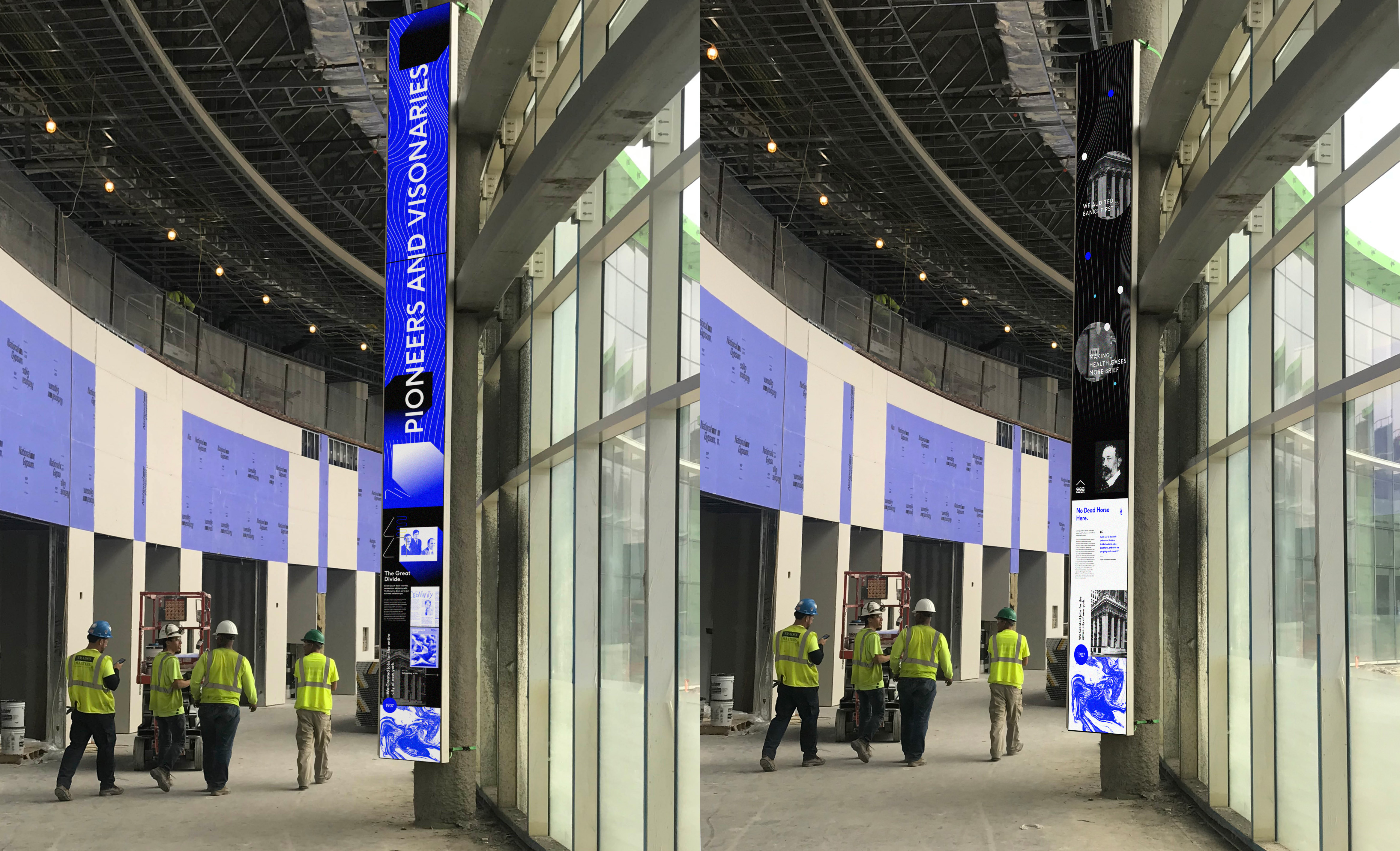
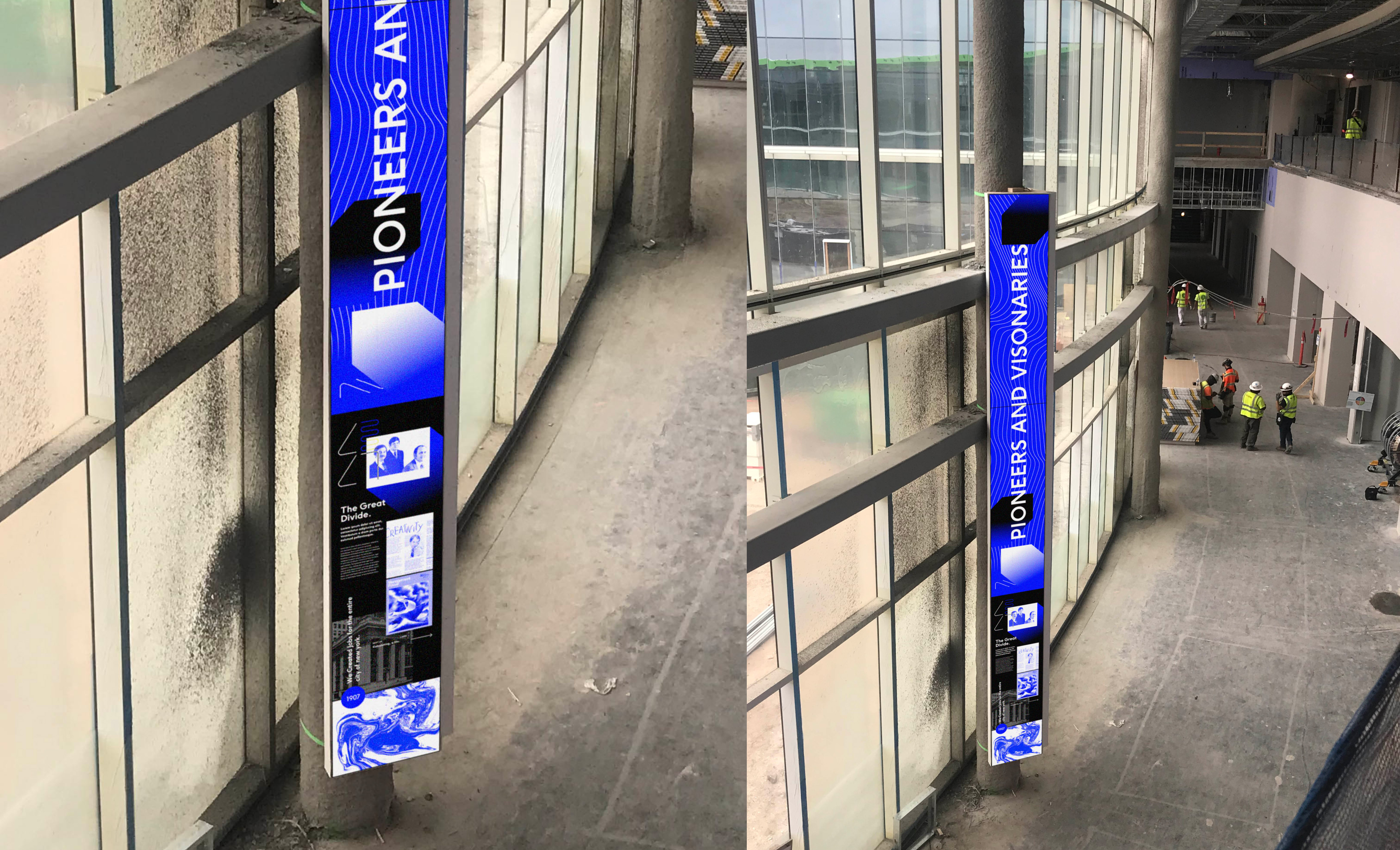
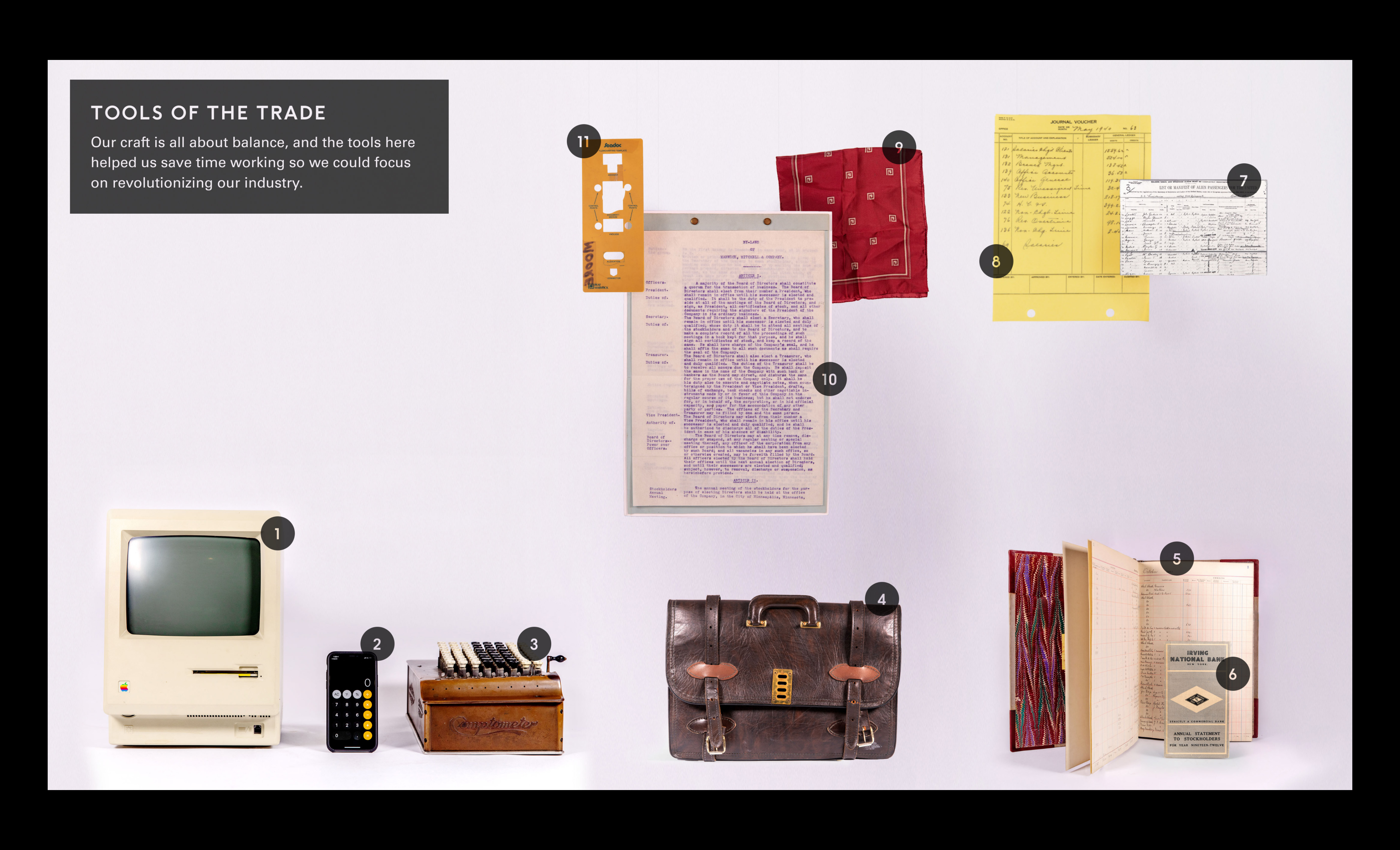
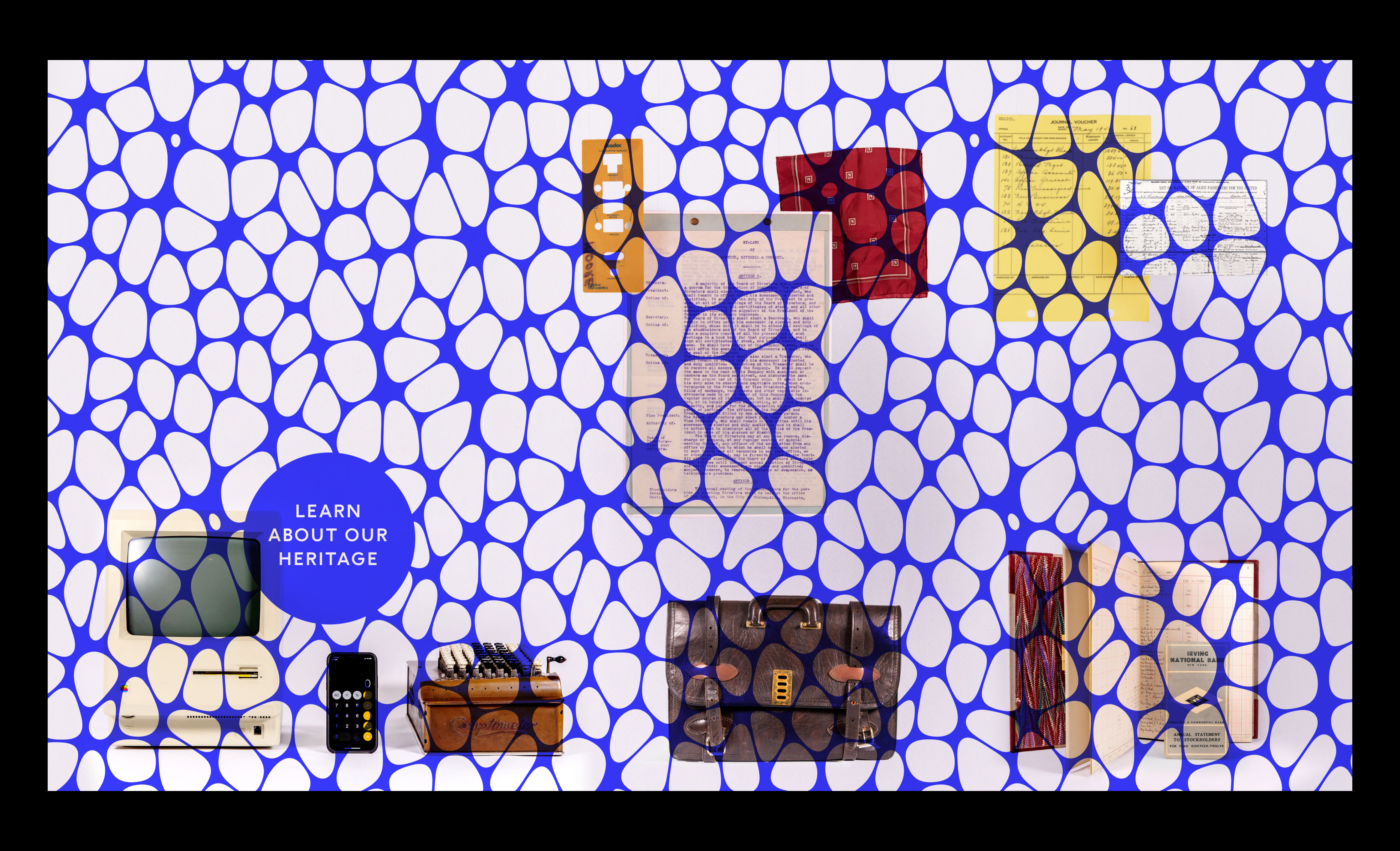
The hall of legends is a curved hallway that acts as a KPMG museum along the way to the main learning center at the Lakehouse. The legends hall features interactive vitrines with transparent screen overlays over KPMG artifacts, along with large, 28’ tall digital screens featuring KPMG history content on a dynamic schedule.
We prototyped the digital column screens in our Cambridge studio using an 10’ tall foam-core mock that I built and marked bezel indicators onto. I set up a projector on a 90-degree tilt and mapped a digital container for content onto it using Figma. I used a prototype window for the projected surface, so whenever we wanted to throw something up onto the mock, we just pasted it into the frame or moved it around, sometimes creating low-fidelity animations taking advantage of the real-time updating view.
R&D and Figma powered projection mapping
Once we had gotten to the point where we needed higher fidelity motion mocks, I remapped the mock to house a custom web app that would hold 4K video files of different motion graphics renders I was making. The app allowed us to flick through different files with keyboard presses at will or set them on a schedule to simulate how the screen might behave in the space.
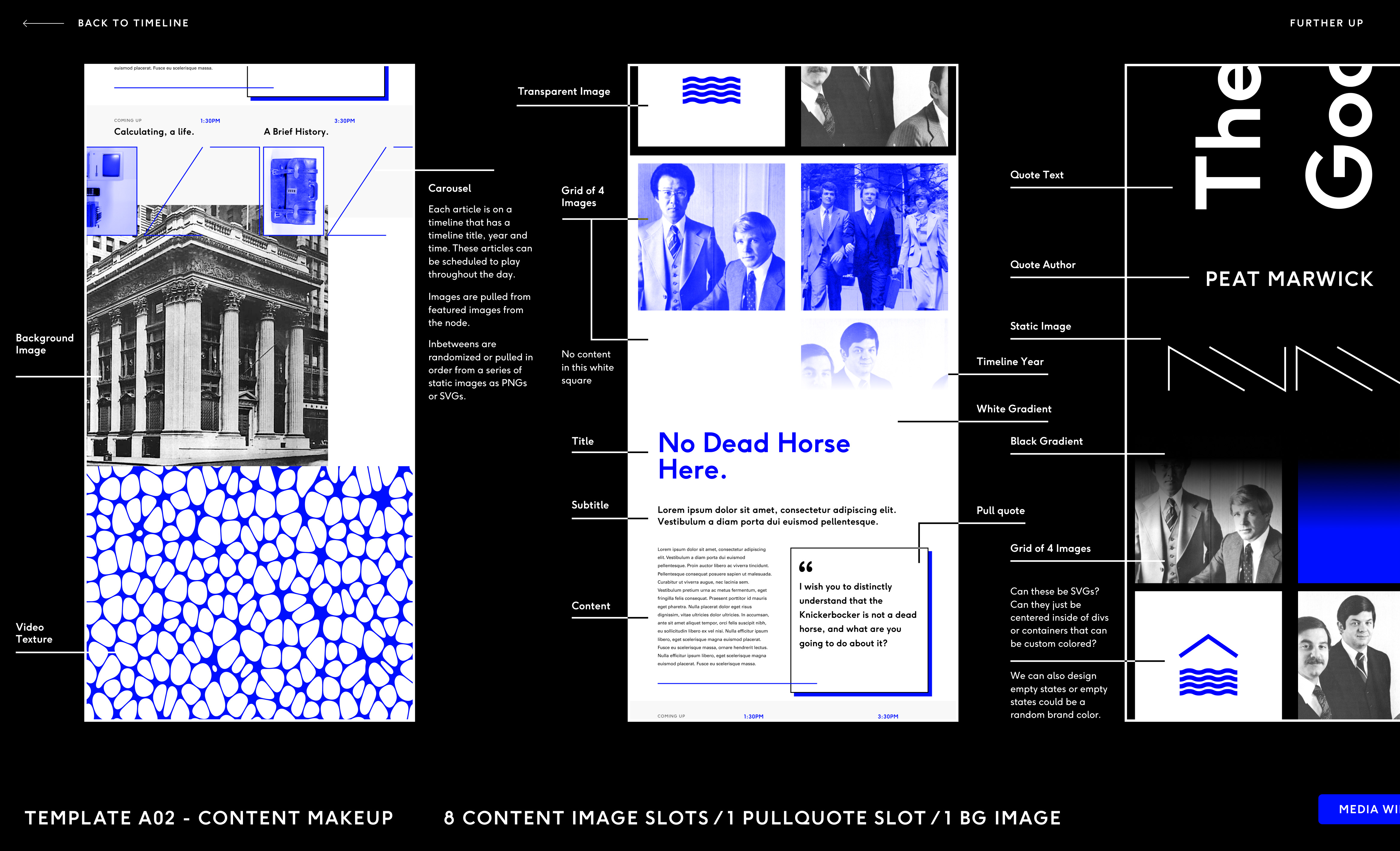
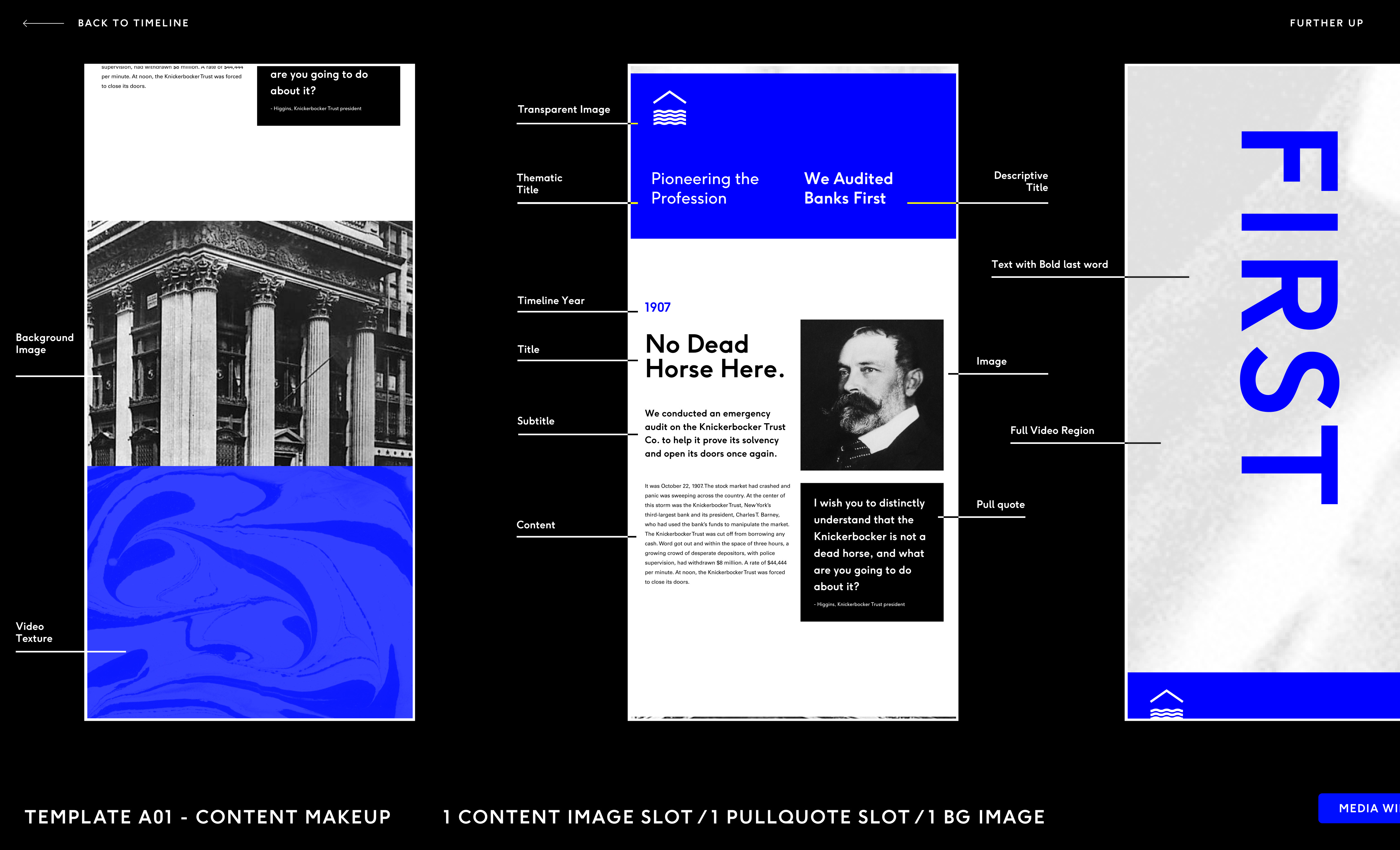
Banner template designs
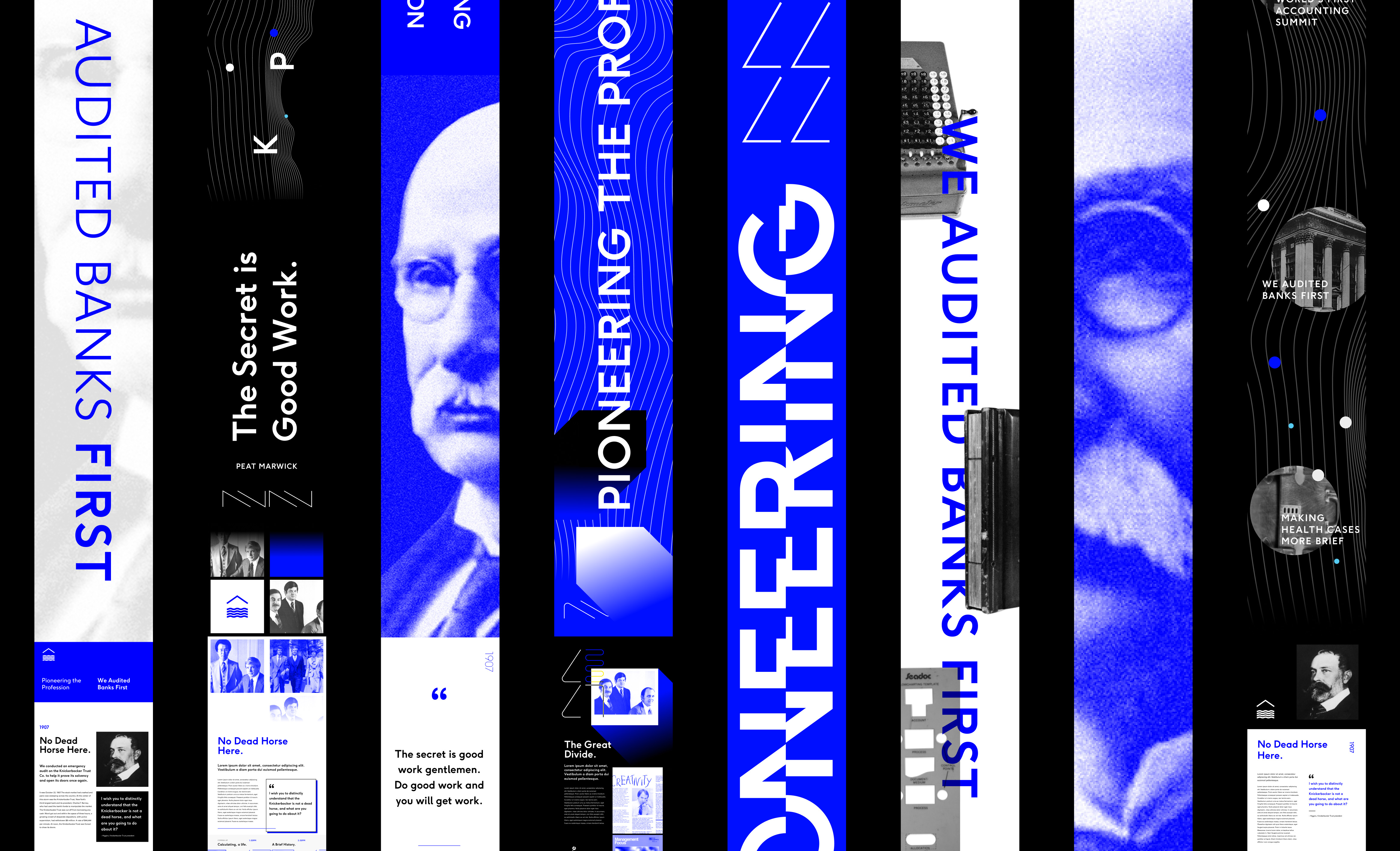
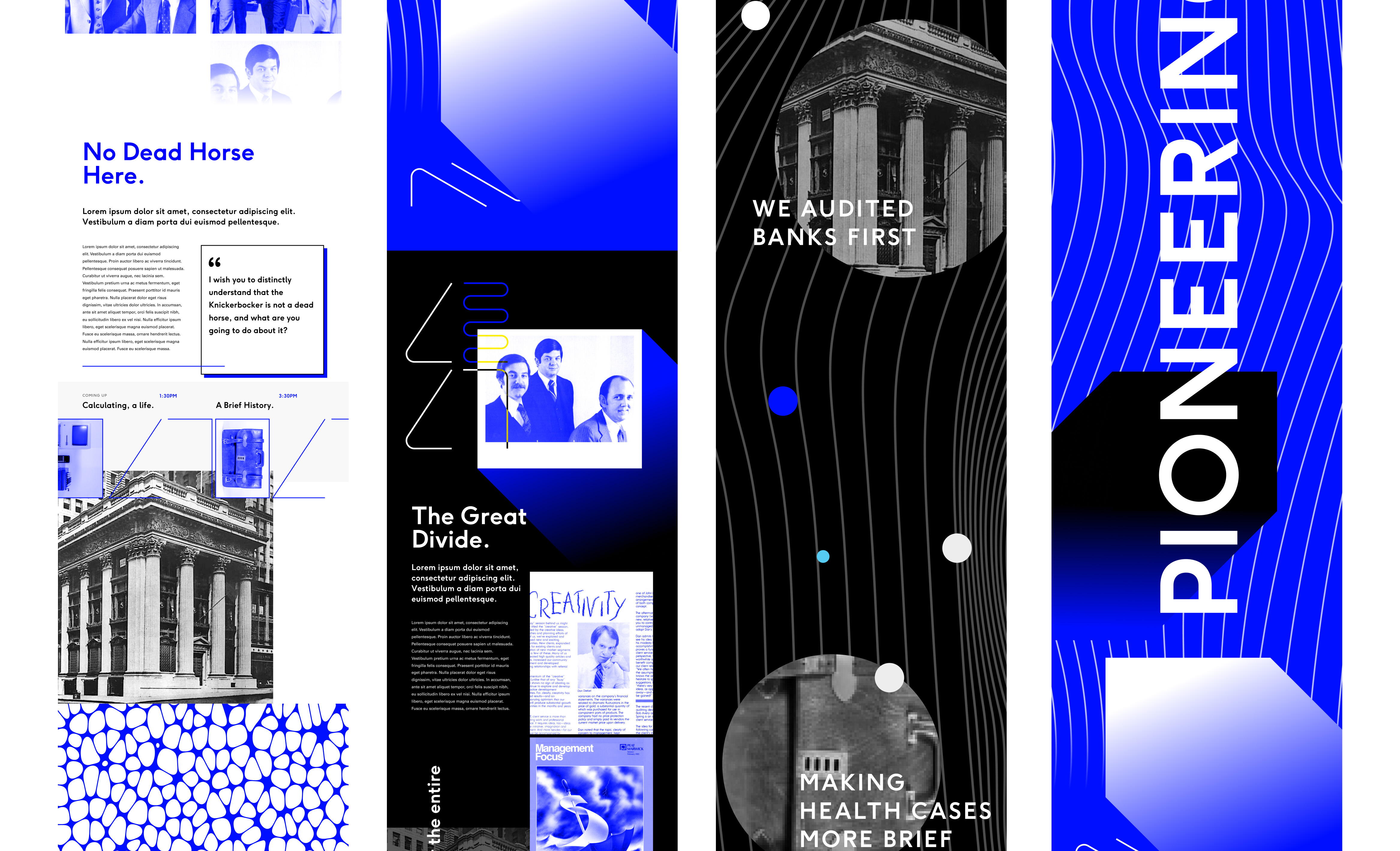
I designed templates with holders for photos, code visualizations, text content, and video content, that could all be managed through a singular system. The templates I created drew from the large depth of artifacts and history that KPMG shared from their archives (none of the KPMG specific content seen here is a final implementation).

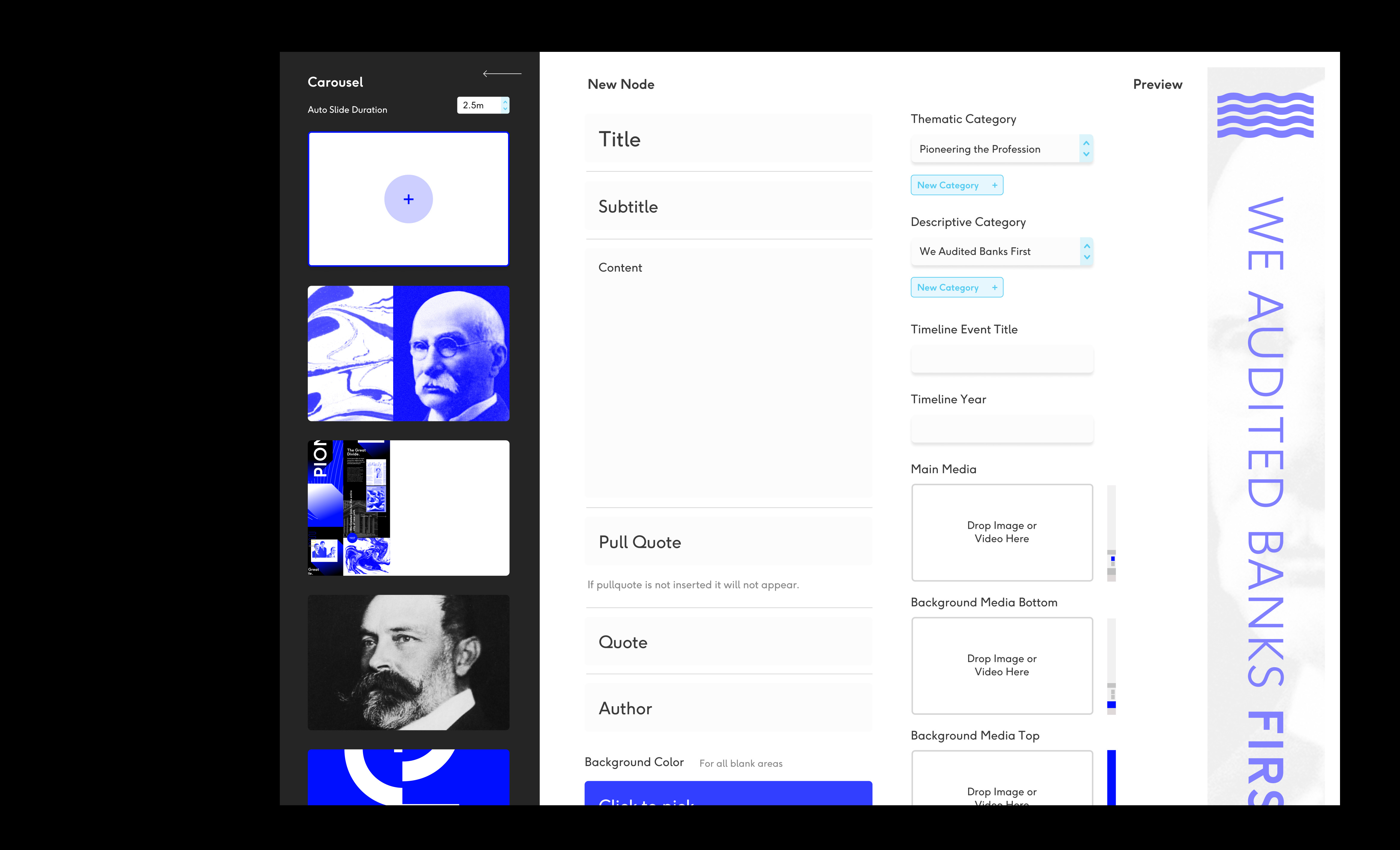
Banner CMS and timeline
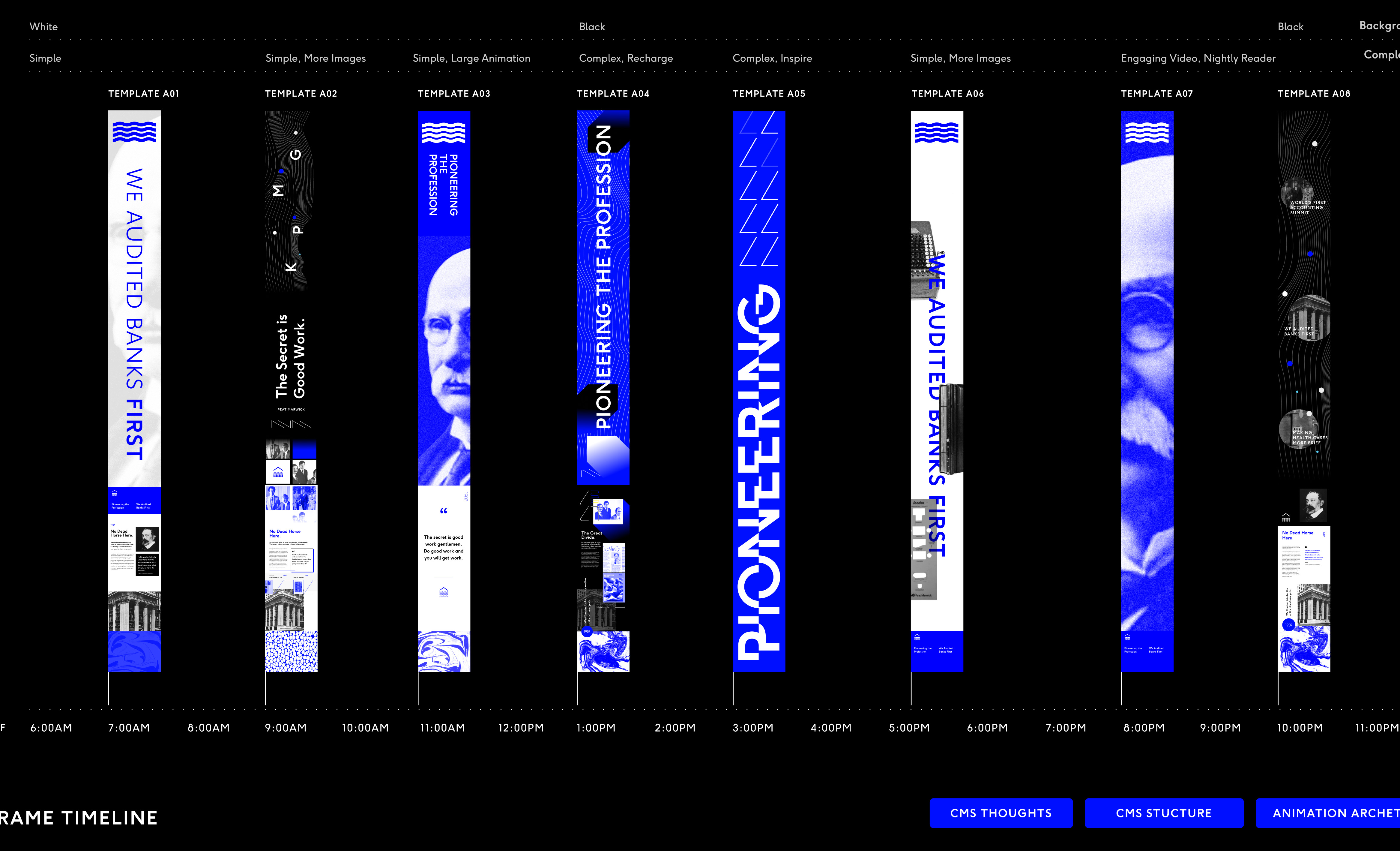
I created a mapped timeline exploration prototype in Figma to view the content wireframes, components, and designs for the cms.
Final panel testing in the lakehouse
The gathering table
The second installation we focused on designing was an interactive entryway table that was designed at 25’ long and 4’ wide. The table would be a main visitation site at the very beginning of a KPMG employee’s stay at the Lakehouse, with continual visits as they passed through the main thoroughfare of the building.
We focused on creating a live mock table that was the same size as the final piece inside of our Cambridge studio during the first week of the project, putting together a structure measuring the same size and dimensions out of foam-core. The foam-core mock was then projected on via two overhead projectors stitched together using Resolume. The resulting prototype allowed us to mock images and sketches at full resolution while inviting research participants in to get feedback and feel the table in a space.
Foam table R&D and Resolume rig
When we interviewed research participants, we ran through a series of sketches with them asking about wayfinding abilities, bonding exercises and games, as well as scheduled happenings at the table. One of the biggest challenges we saw was how to give each person their own space when interacting with functional actions on the table like wayfinding, while also giving them the ability to still play with ambient effects that were a shared experience.
User testing setup
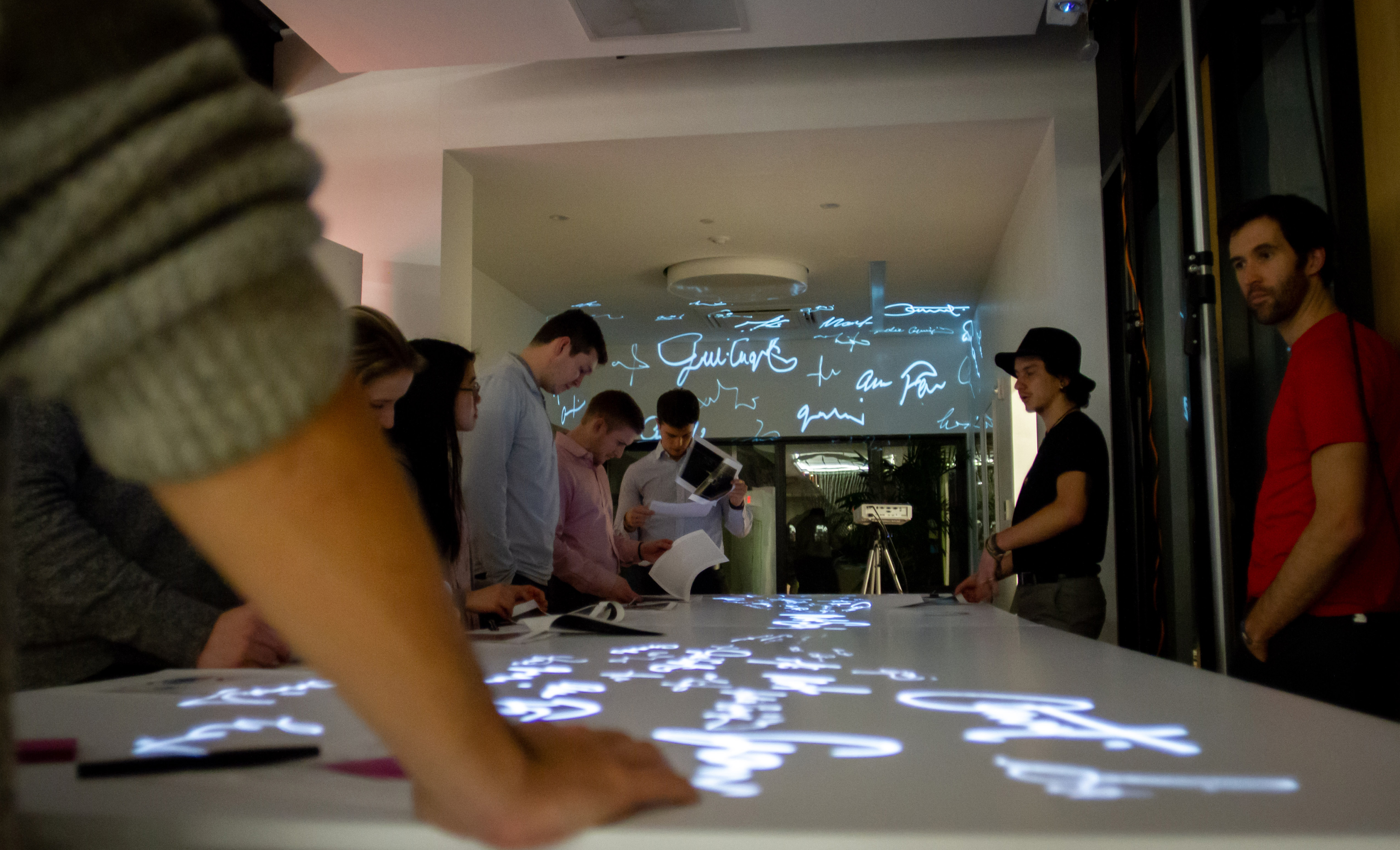
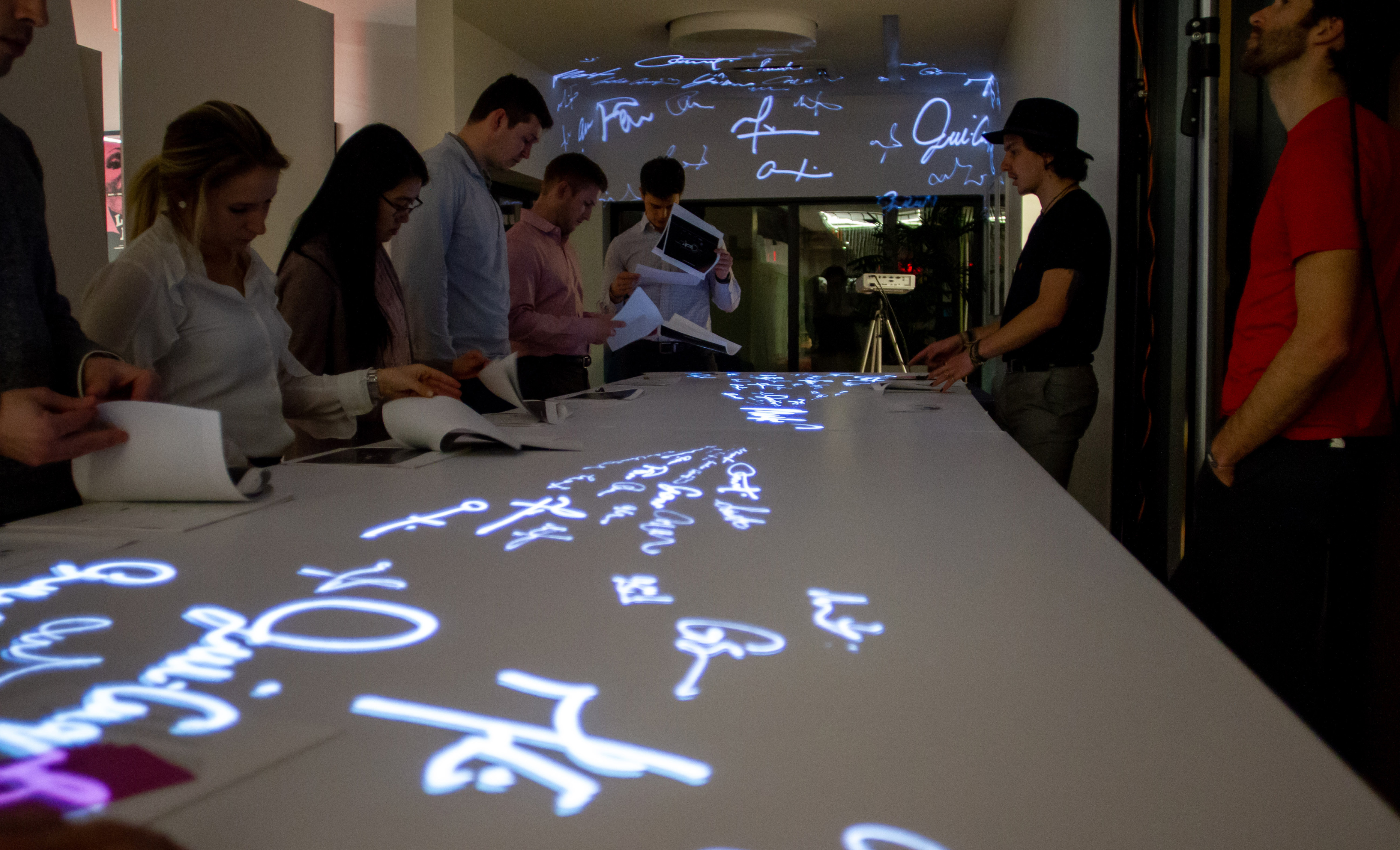
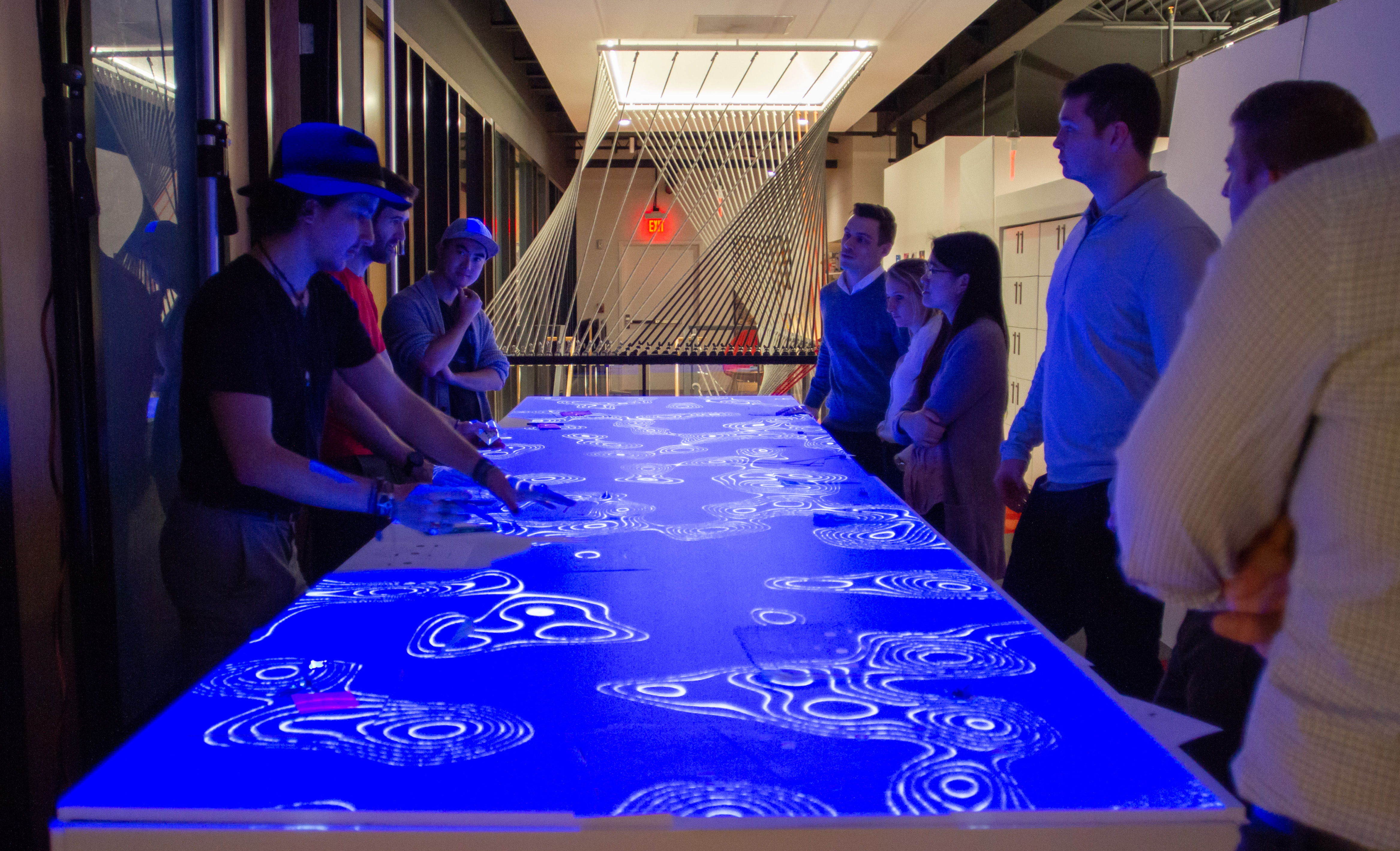
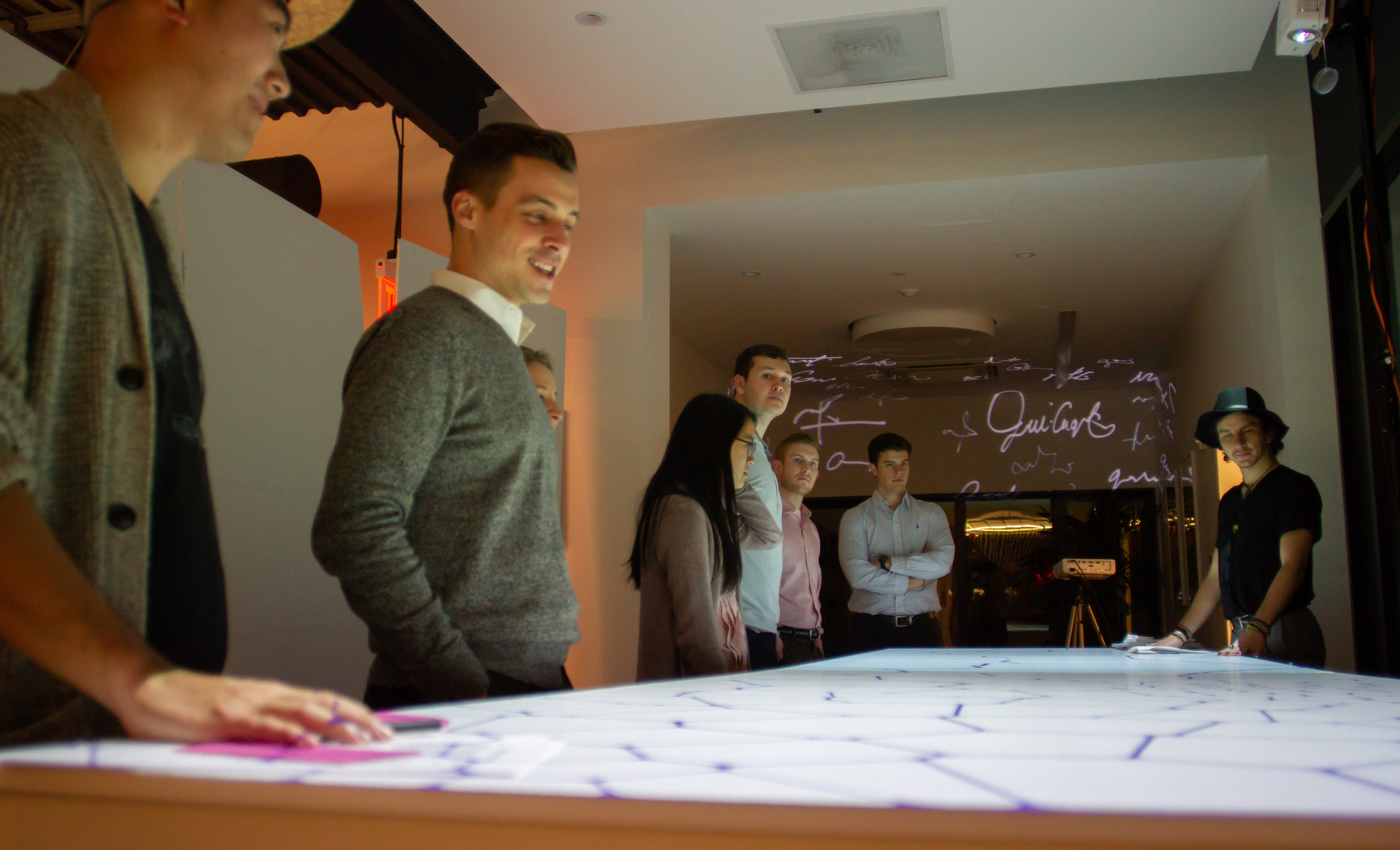
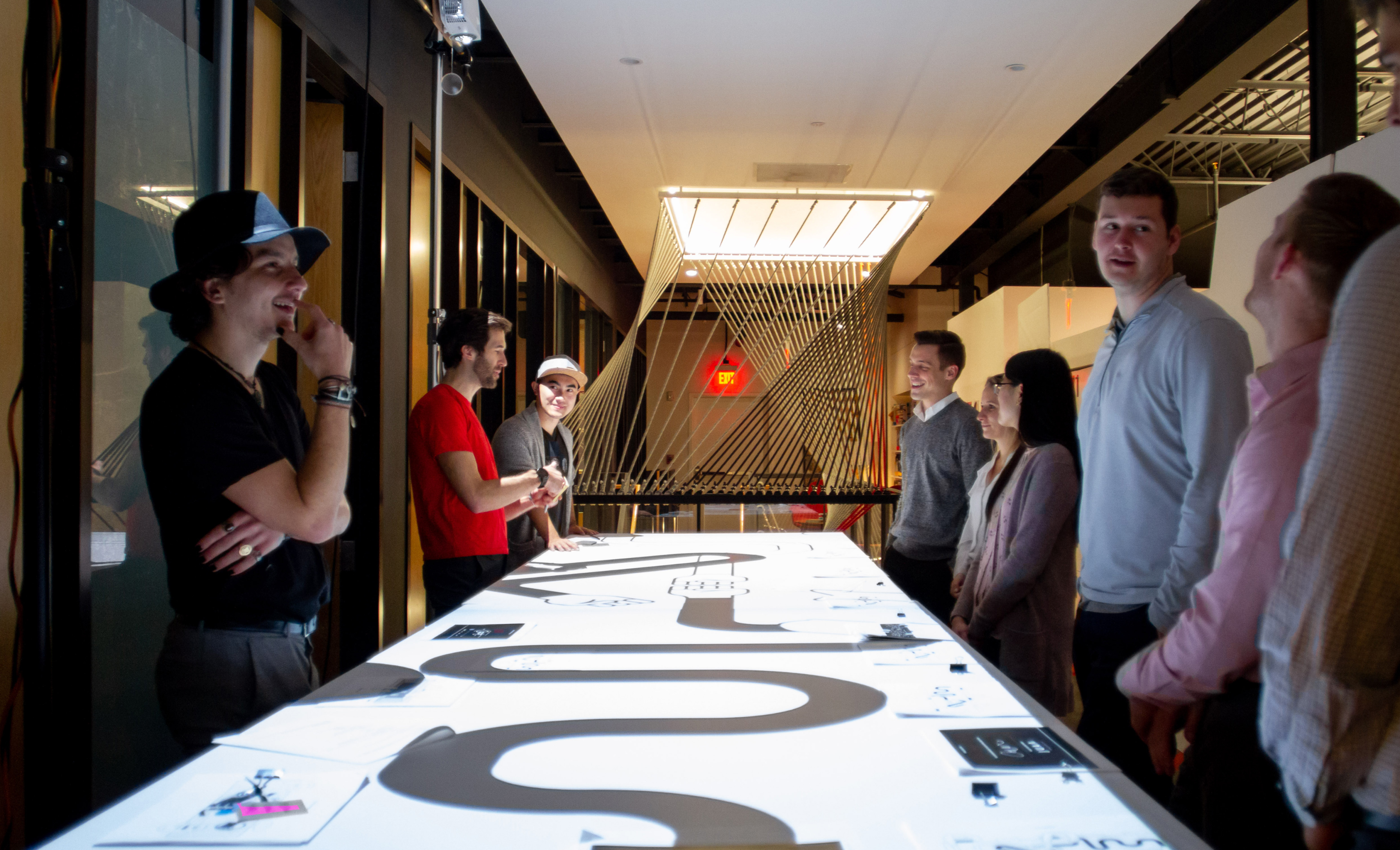
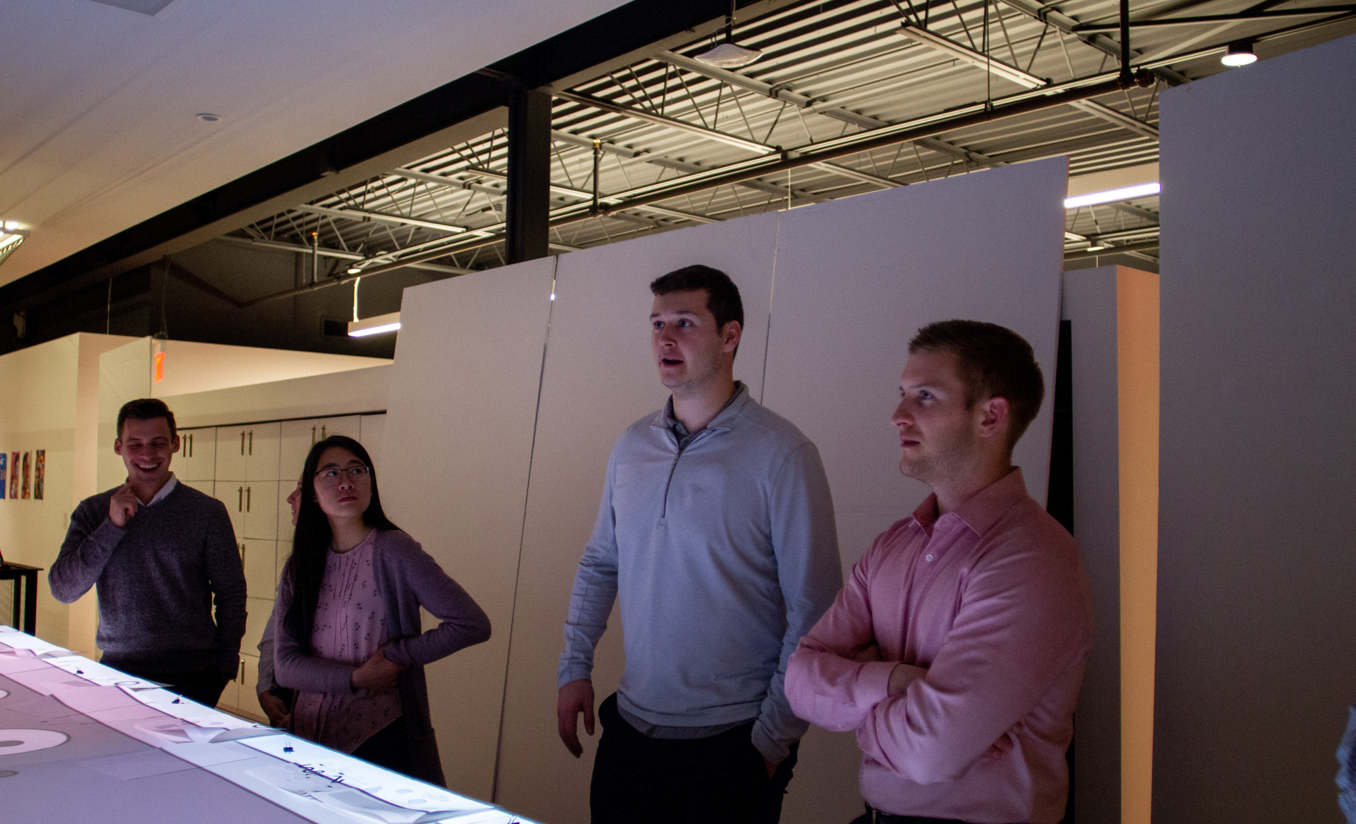
Table build log
The table underwent tons of iterations in our studio, with many user tests and modifications to the hardware and interactions over time.
Early table designs and concepts
The first table concepts focused around wayfinding, sharing happenings and history around the Lakehouse, and fun activities for play at the table.
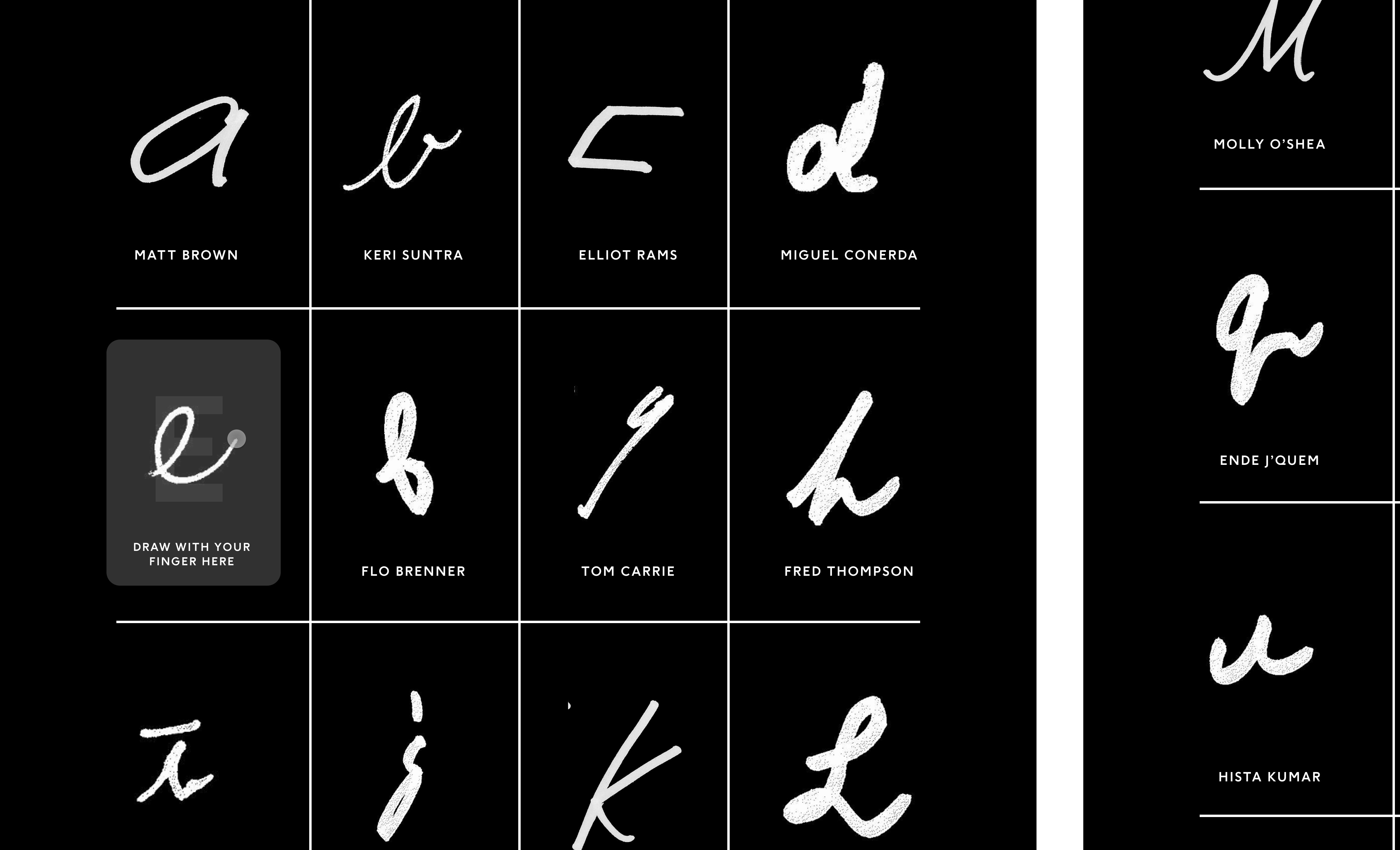
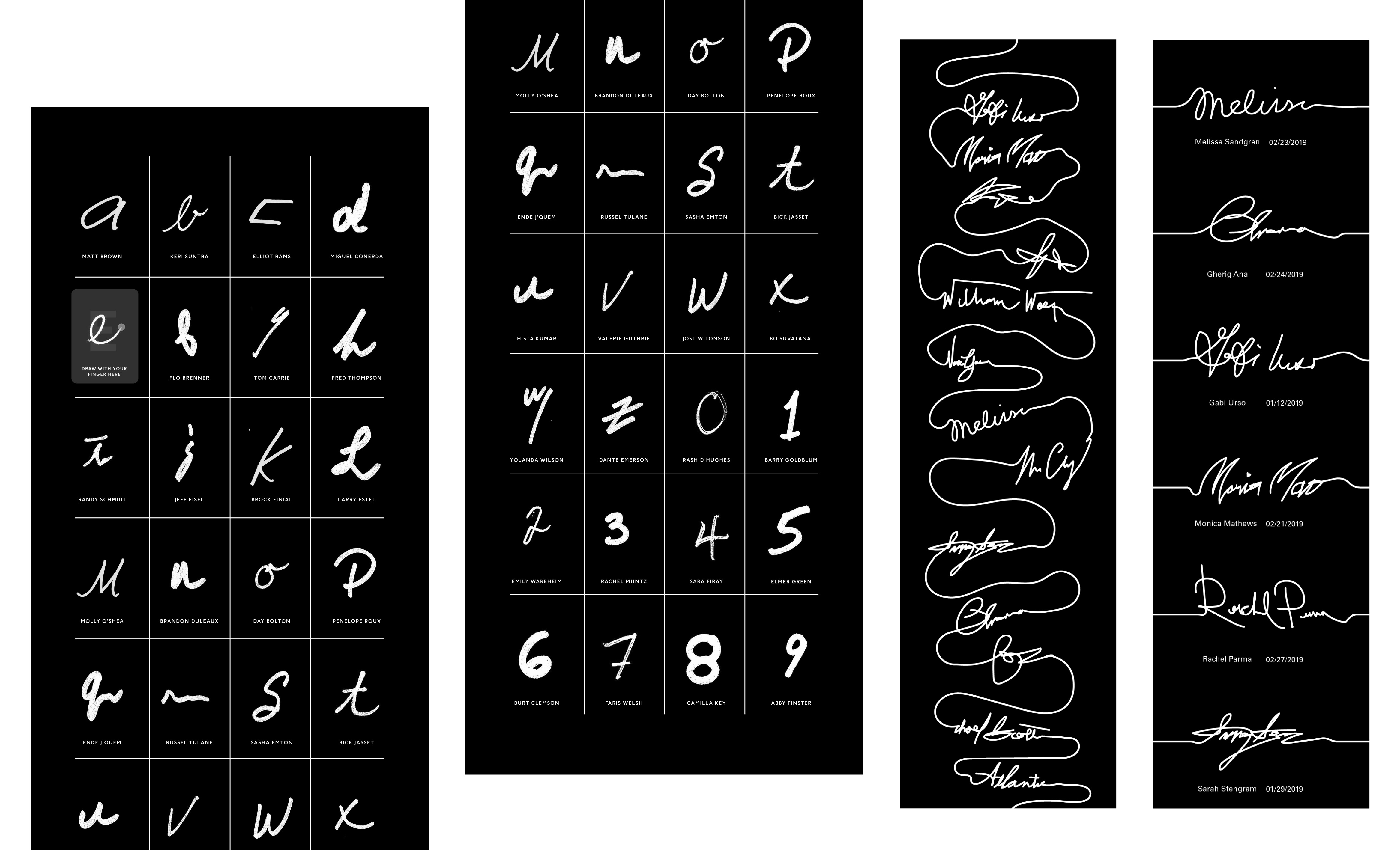
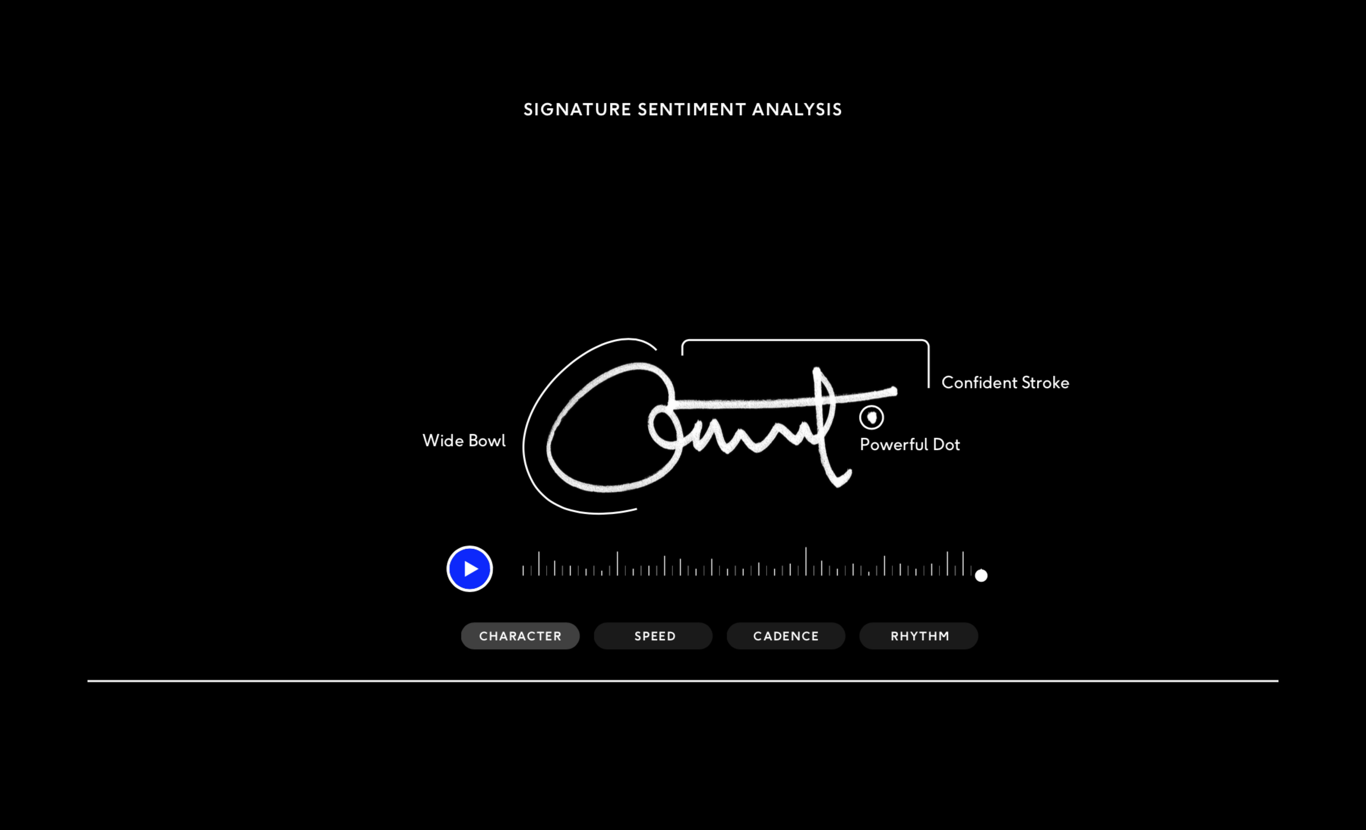
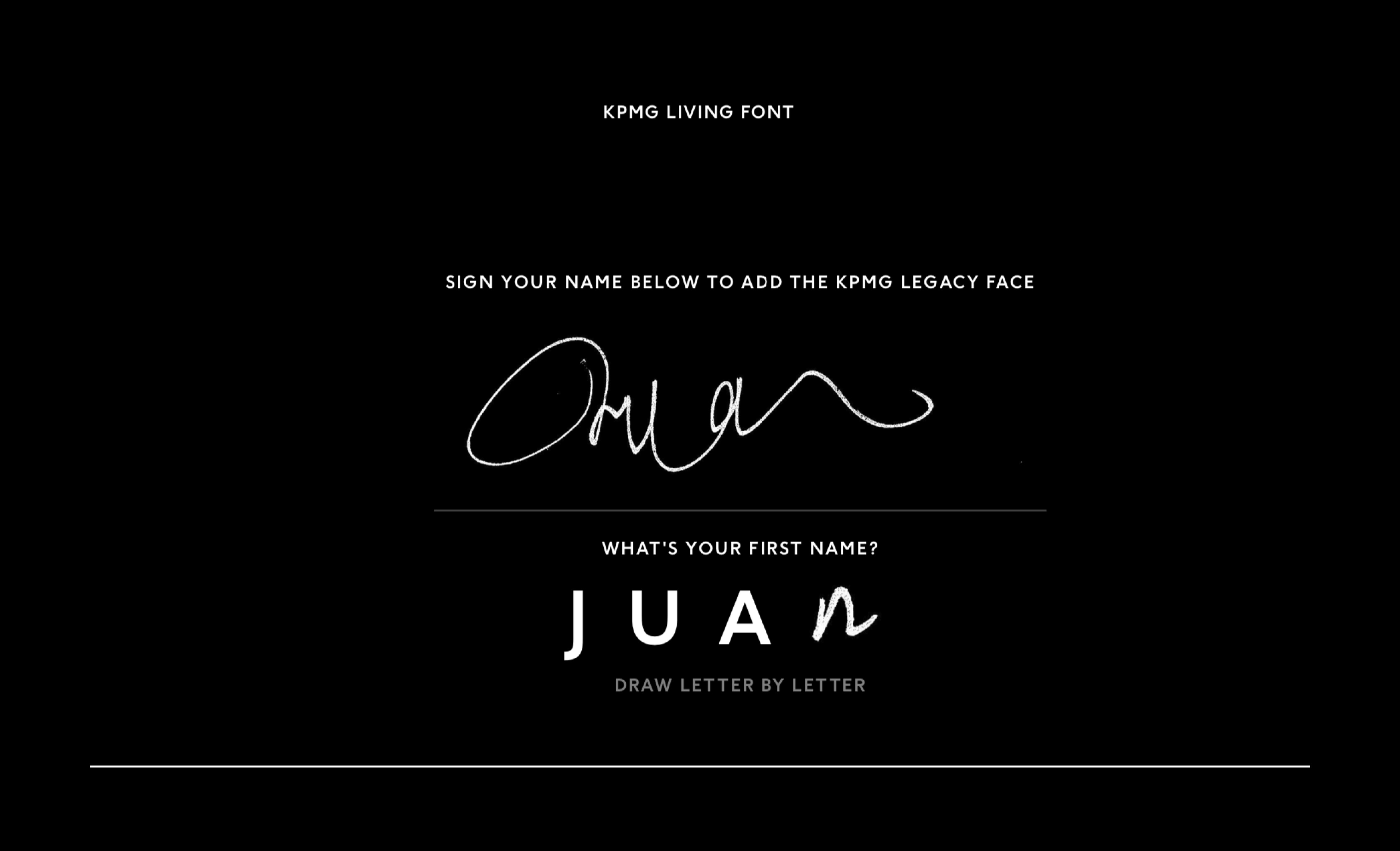
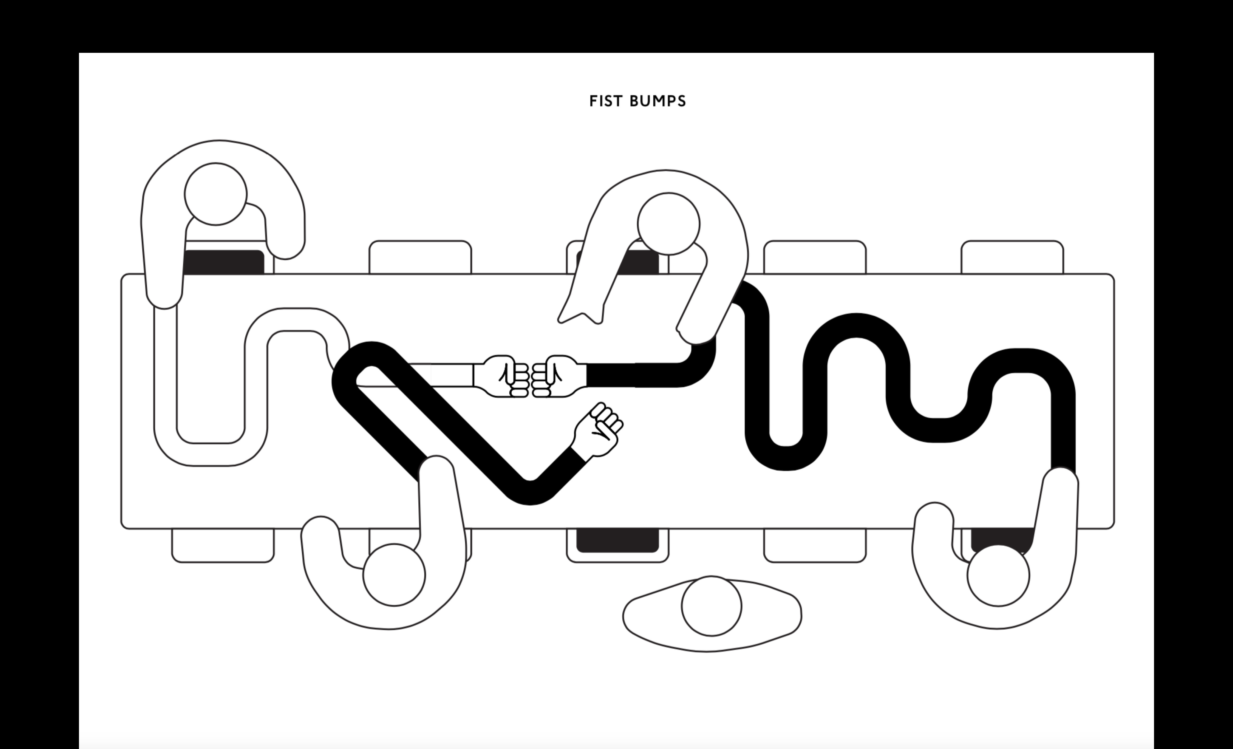
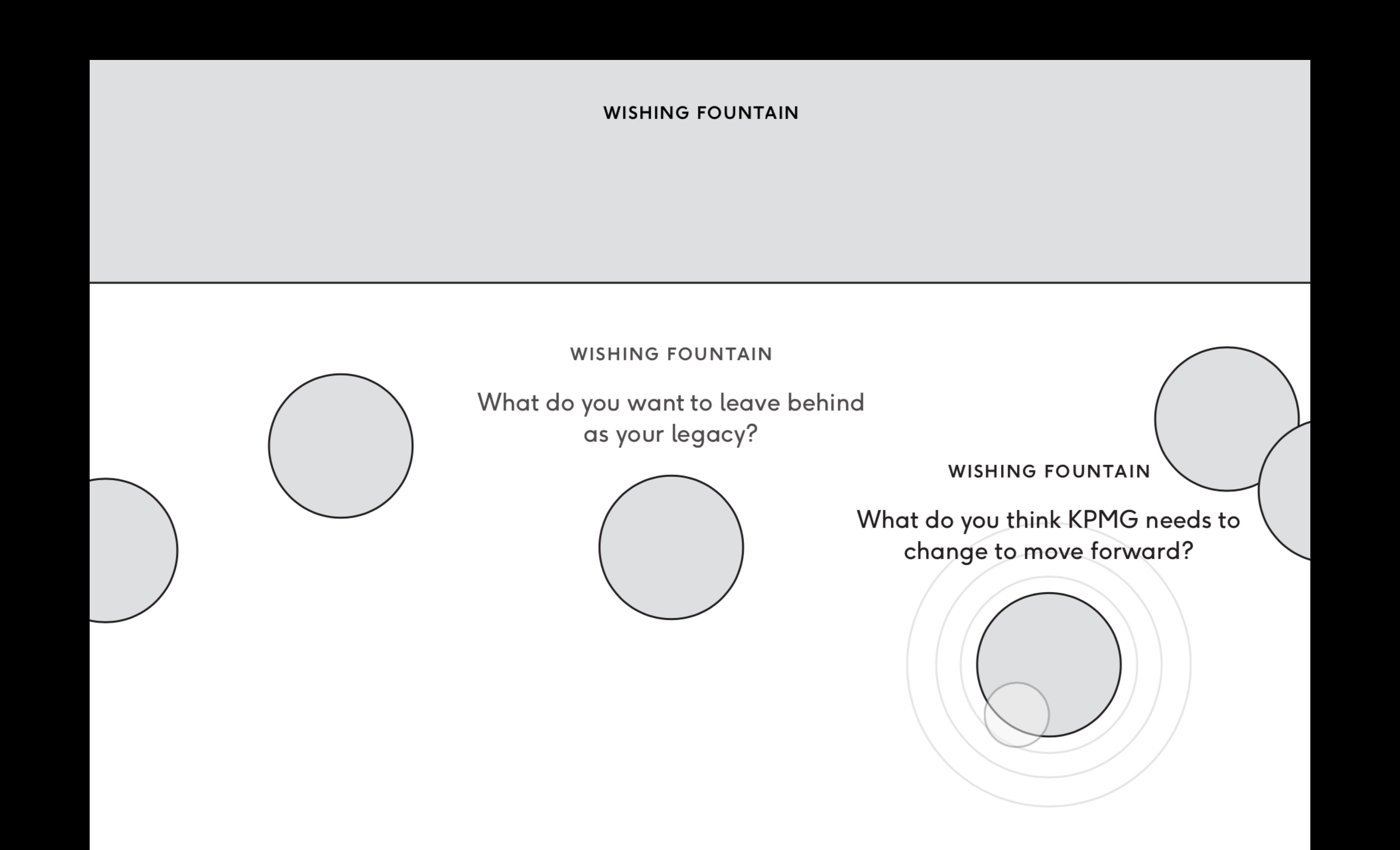
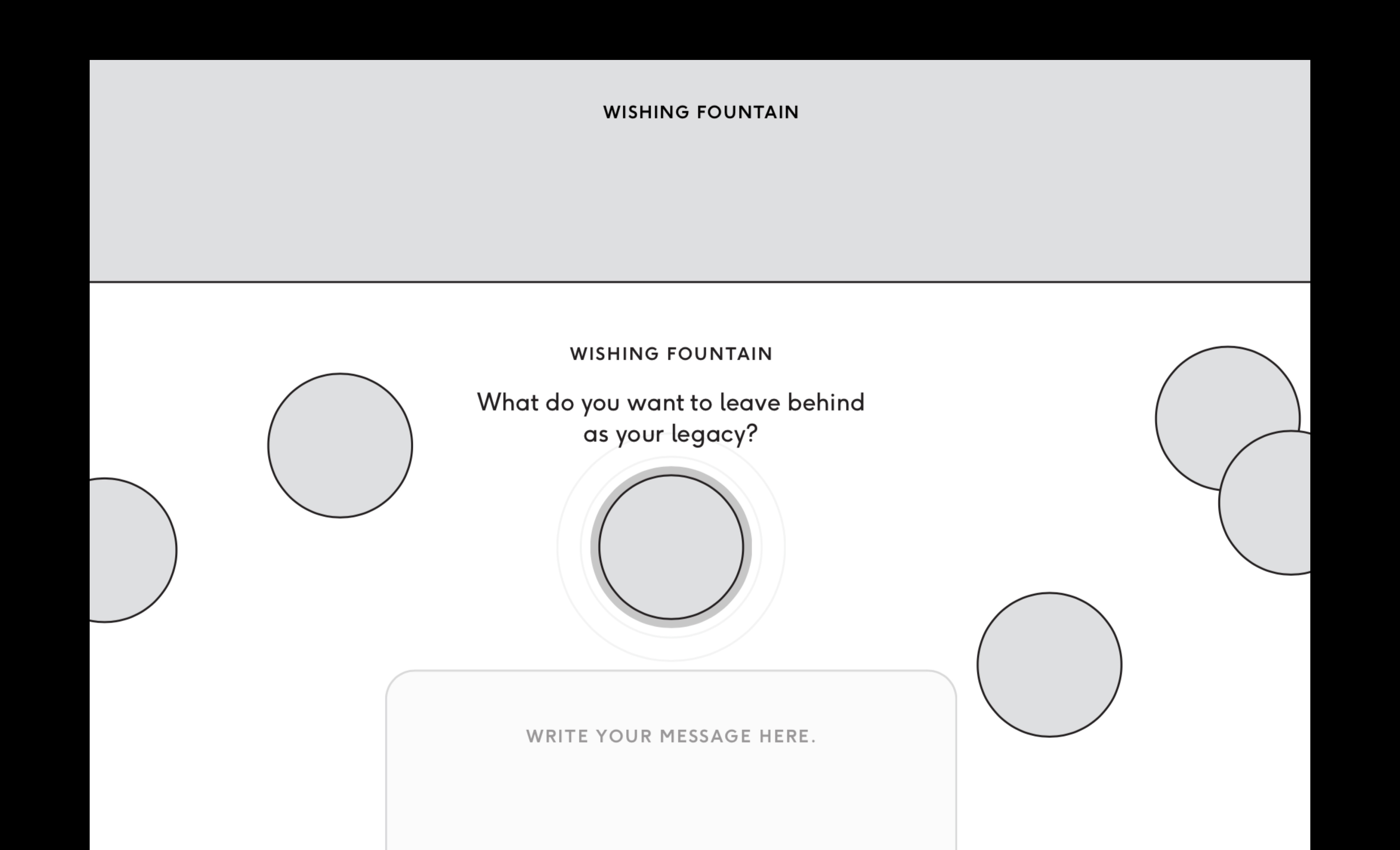
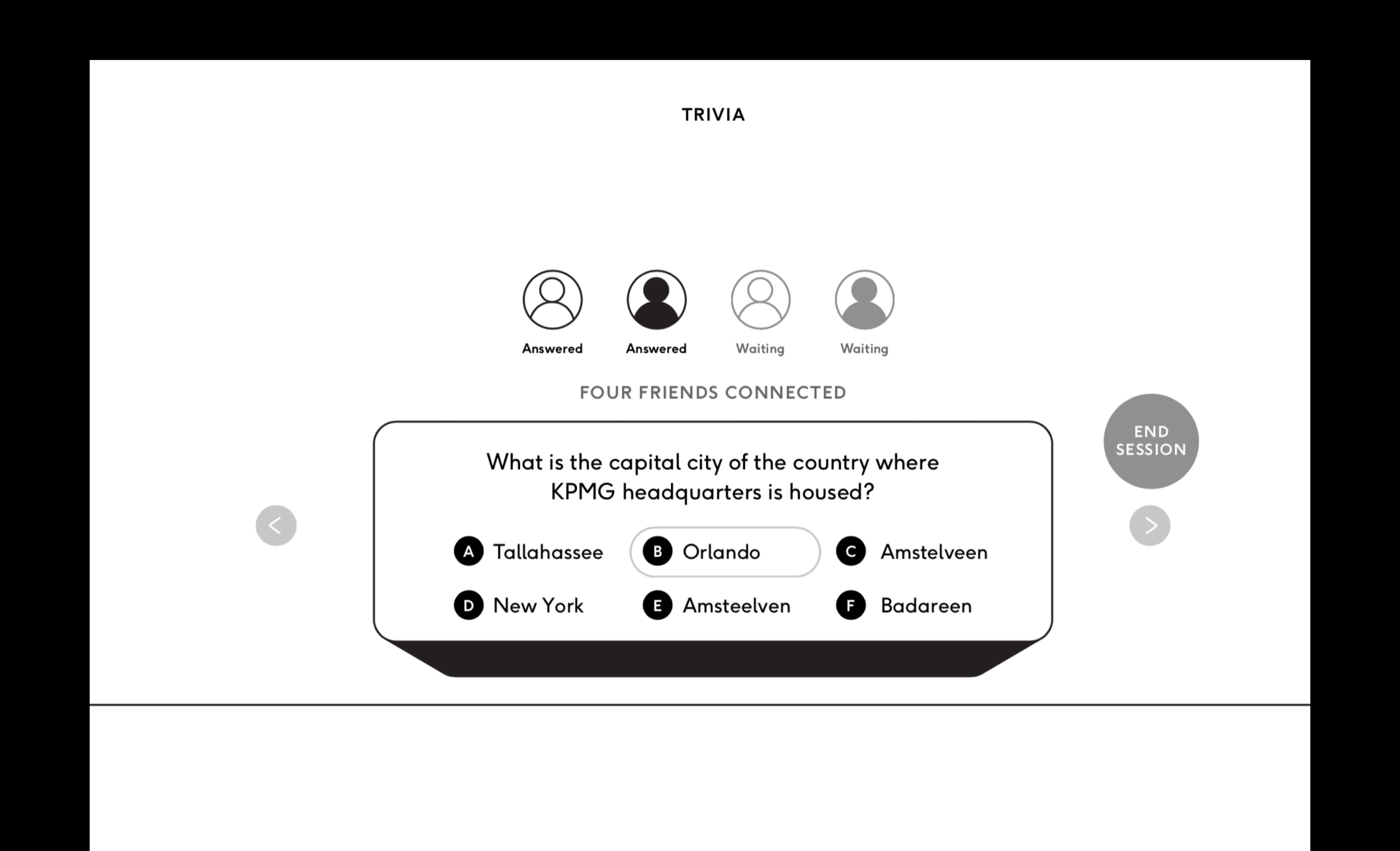
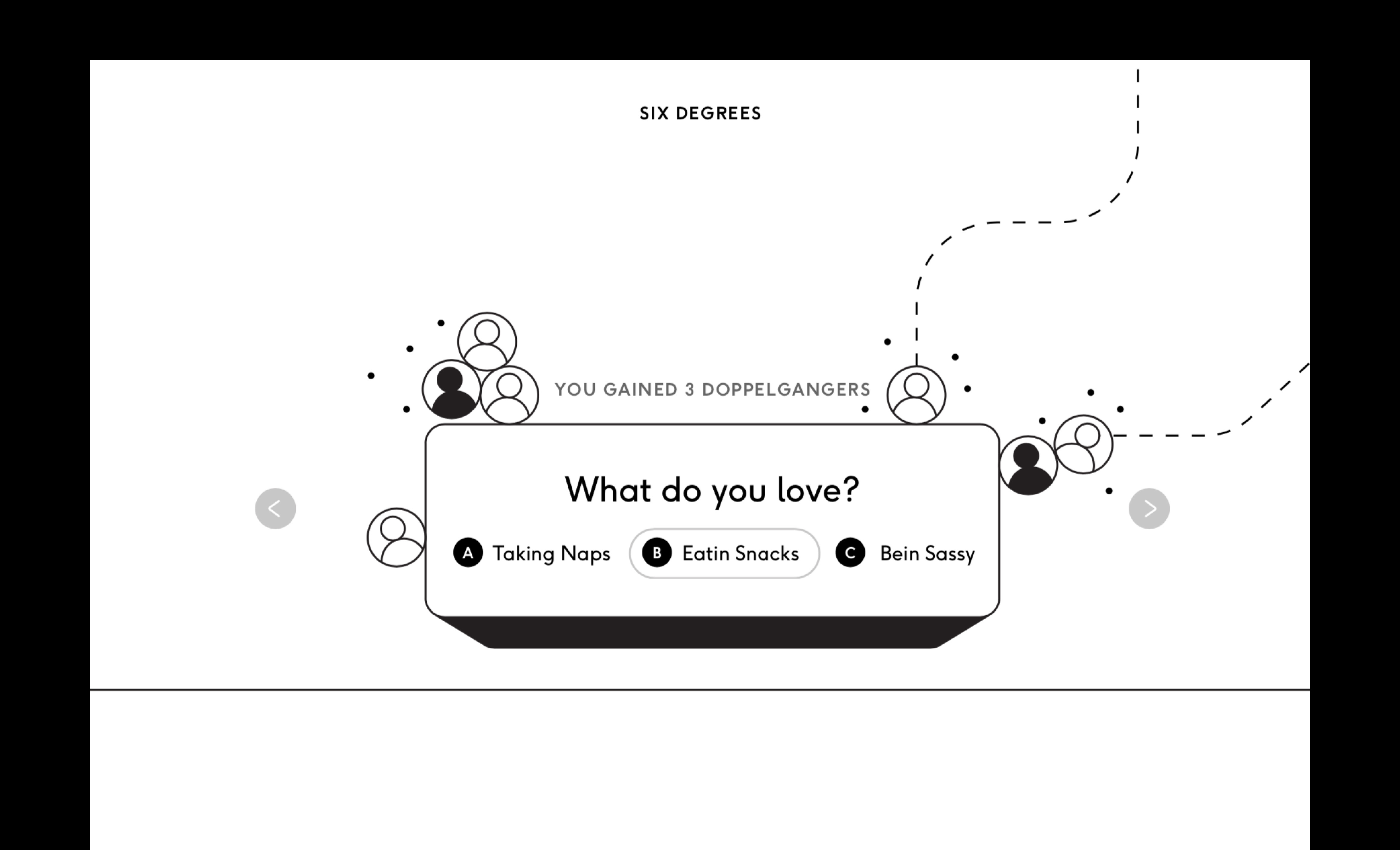
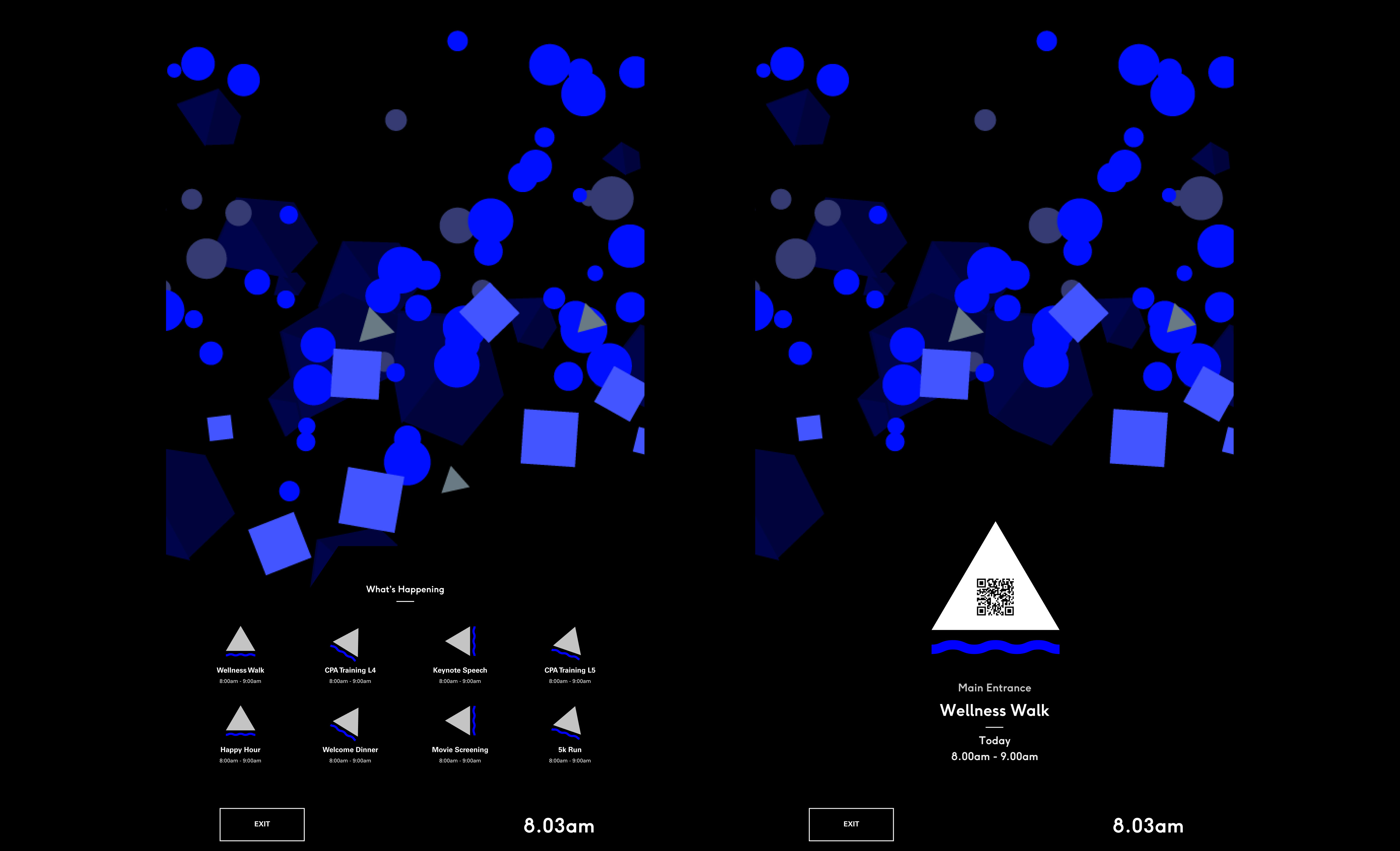
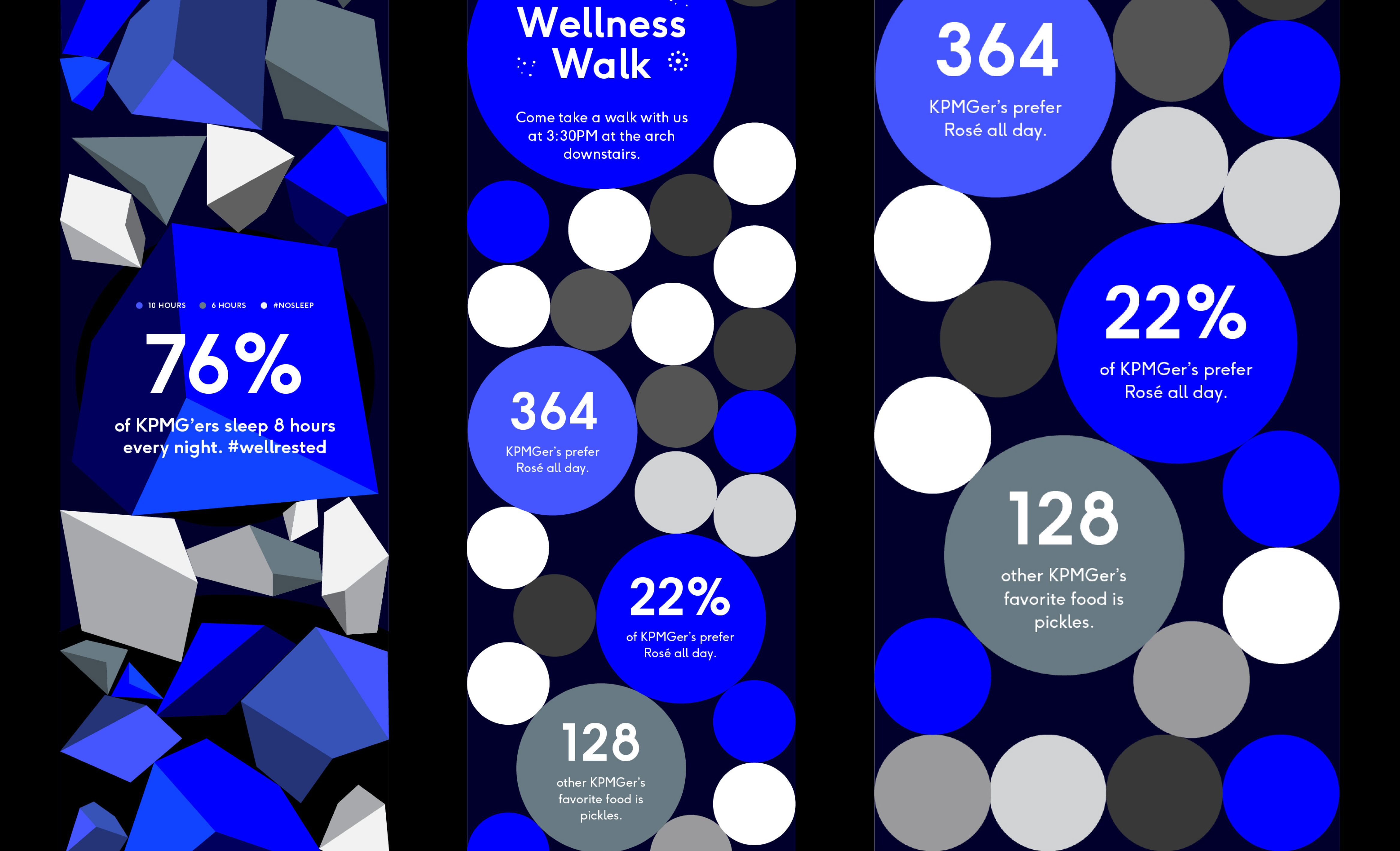
Final table prototype in the studio
We constructed a faux marble surface and captured a storytelling video of the 1⁄3 scale prototype in our photo studio.
The haloes
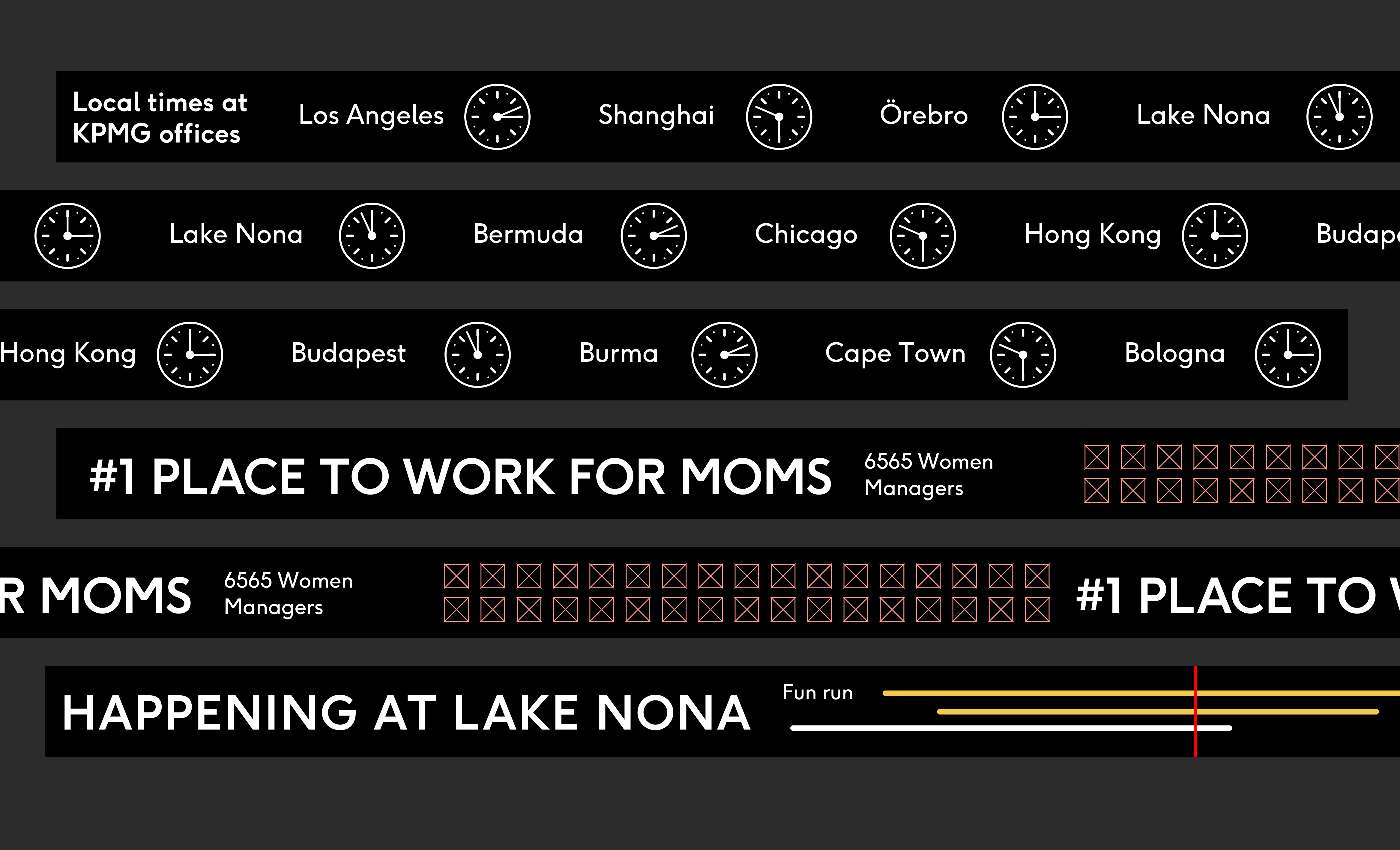
The haloes were the third and final installation we designed and built for the project, a set of 3 30’ round circular screens hung from the ceiling of the a space near the main elevators. After specc’ing super small LED pitch for maximum resolution, we realized that constructing and driving the displays would require almost 30 individual LED panels to go all the way around the structure.
YC, a mechanical engineer on the project, worked with a fabrication company to create a 15’ half halo prototype that we could install within our Cambridge studio to see how the displays would behave in the space, and find limitations on hardware for driving the massive display. Once we had hooked it up, we had a fun build day in the studio and strapped it up on pulleys.
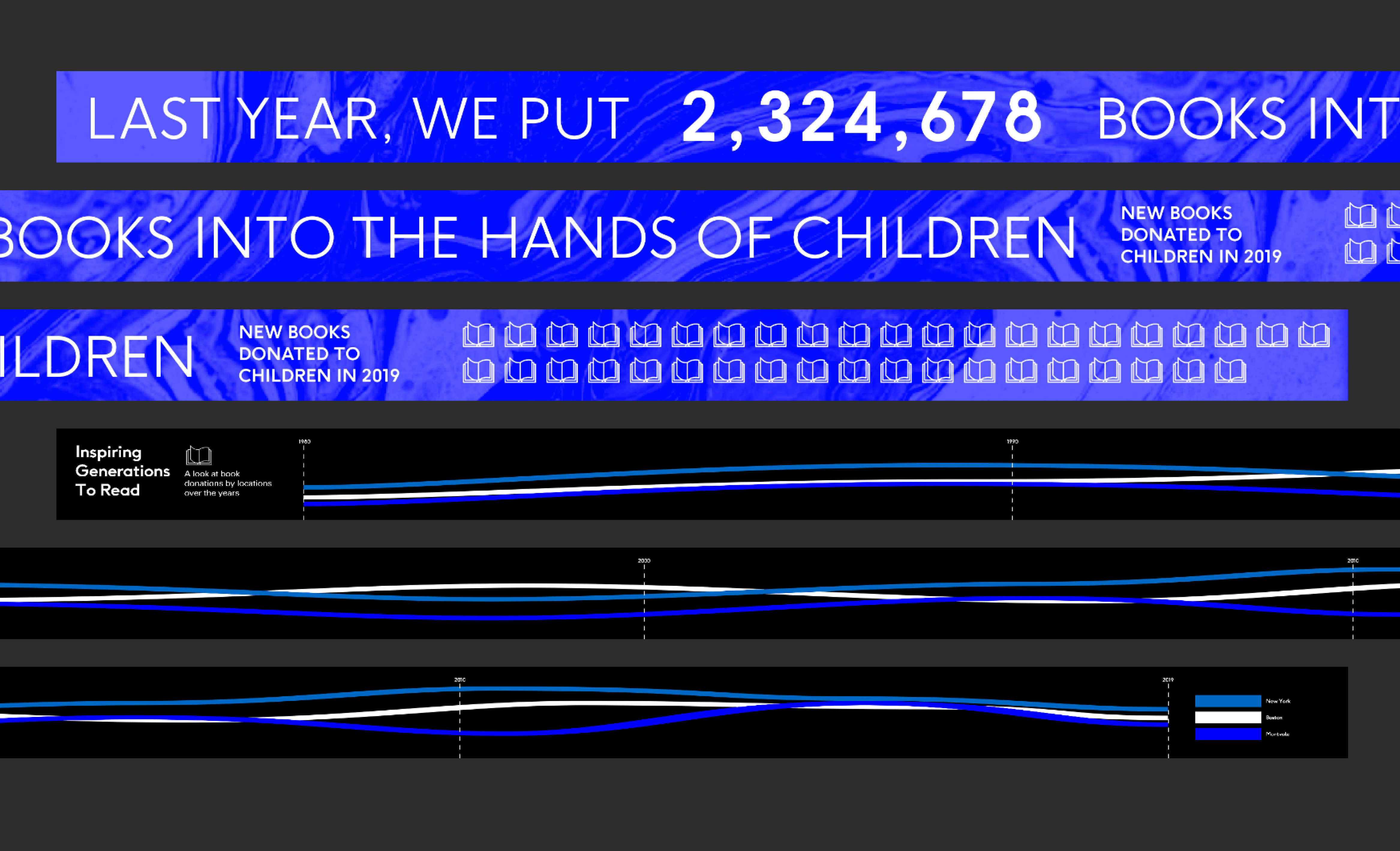
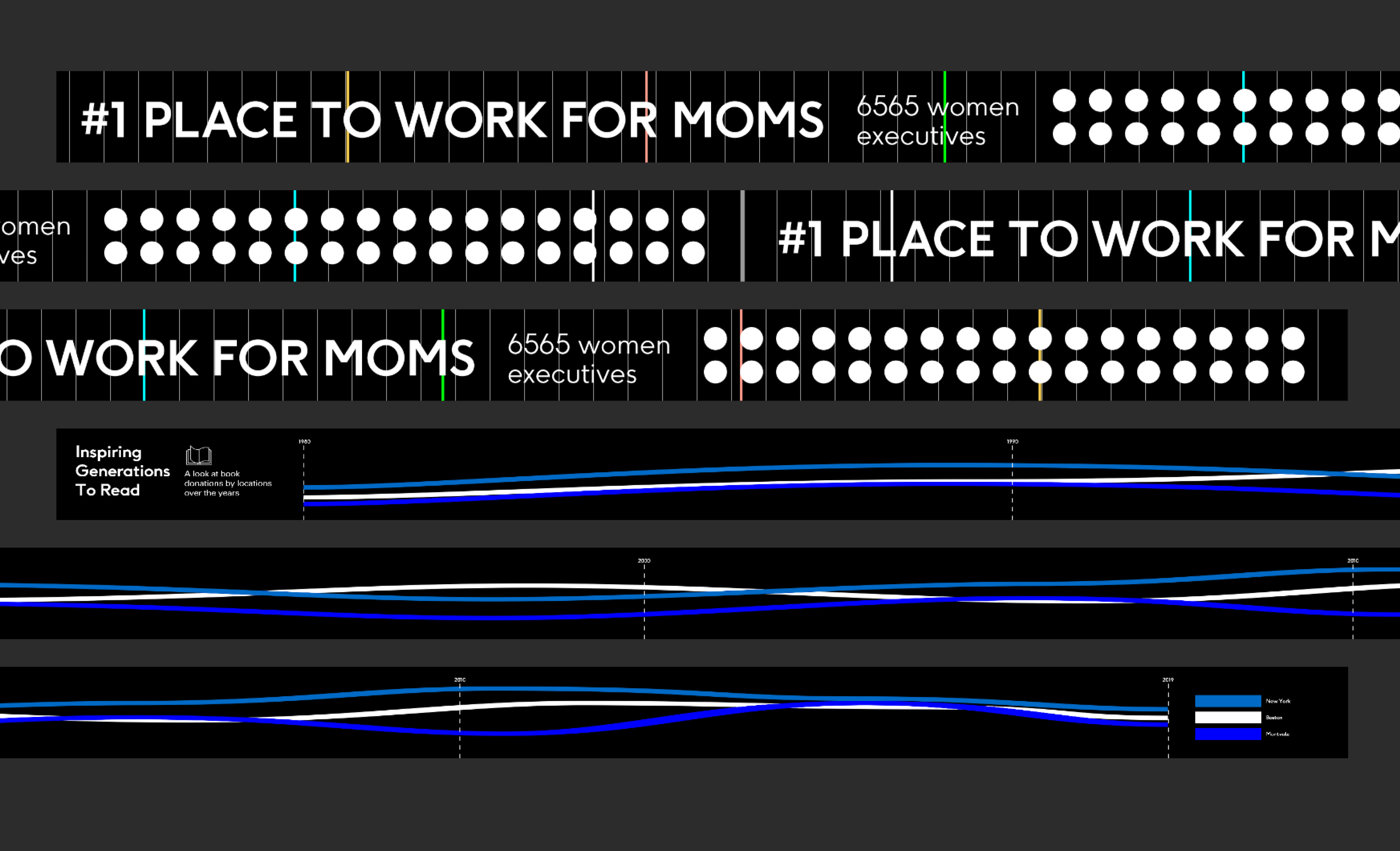
The video files sized for the halo were some of the craziest dimensions I had ever rendered, considering it was about an 11 to 1 W:H ratio. The haloes housed news information and visualizations in the form of abstract digital art pieces created by Todd Vanderlin. Our original sketches included moving infographics on the panel as well as inspirational quotes in the content queue as well.
Early Halo Designs and Experiments
The VR experience
During the entire build, we updated a VR version of the space for our design needs and also to allow the client to experience the space first-hand. It was the first time I had ever worked on something this large, so being able to see all of the installations at scale was an amazing asset. To keep up with the rapidity of iteration on our brand assets, we used a unity plugin that allowed for mapping web-browser windows to textures in the Oculus headset. This allowed us to specify assets in the digital port of the space to be connected to the live updating prototype pages of our Figma documents for each legacy screen. When the clients would come in to collaborate, we could make edits to our Figma documents in realtime and they would be automatically reflected in the VR map that they were standing in. Below is just a locked recorded view of the same VR map. The actual map was controlled using an HTC Vive controller to change your standing position, giving you free-roam access to the scale model of the space.
The vitrines
I sketched prototypes for a transparent screen interaction that would power digital museum vitrine experiences that overlaid content on top of physical artifacts. Jenna Fizel and Tom Kershaw iterated on the implementation of the tech.
Initial vitrine designs
KPMG Lakehouse grand opening
The Lakehouse opened to stunning reviews, with KPMG creating lots of their own media coverage for the massive space.
The final table
The final table was implemented by our manufacturing and software partners, they produced a video of the final table piece as it sits in the Lakehouse today.