Jacob Waites
I design, prototype, and build brands and interactions full of expressive type, fun motion, bold colors, and minimal line-work. Sometimes I write and speak about design. My craft is the way I speak to the world, I work to help others find their voice and make them successful.
Take 10
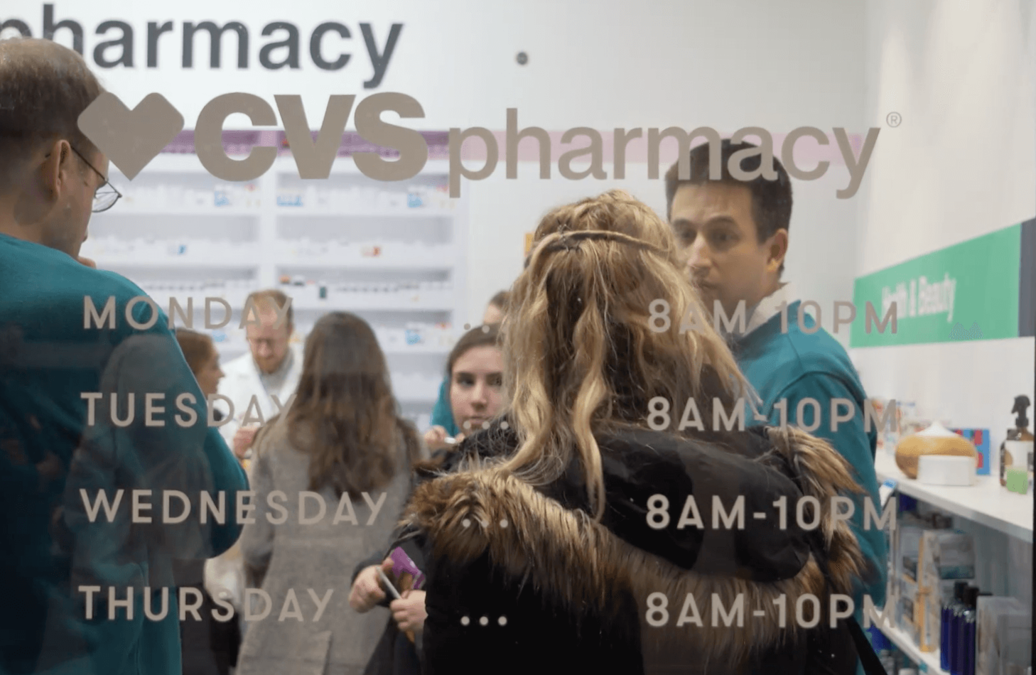
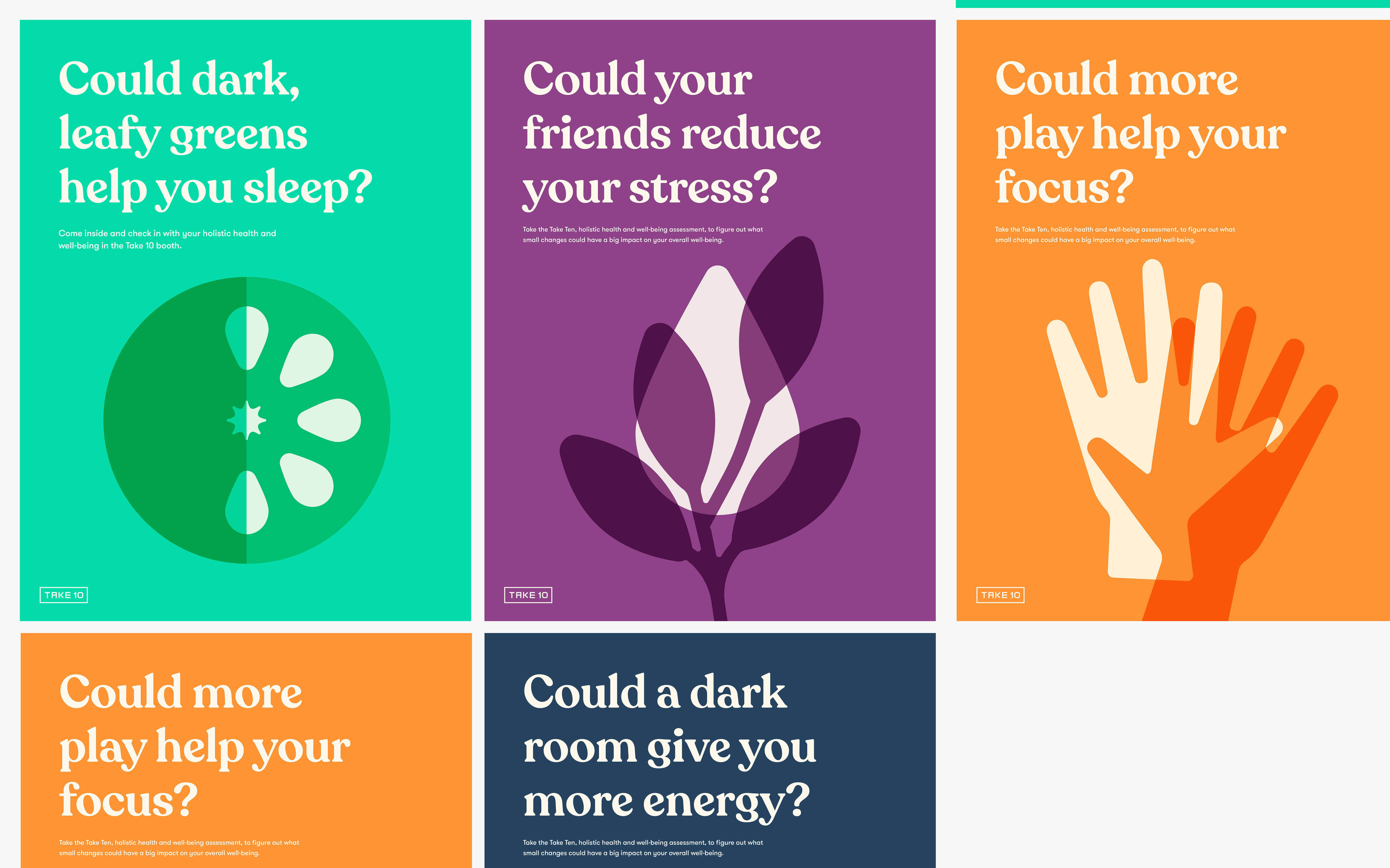
A quiet moment during your day for you to focus on the most important factor in your life: your personal wellness. Aetna and CVS come together to create a space for their customers to focus on their health and well-being.
The Experience
The take 10 experience combines a 10 minute digital assessment, physical booth experience, and health expert consultation into a single trip to the pharmacy. With Take 10, customers can identify small problems with their habits that lead to much larger medical issues in a way that doesn’t directly point out their flaws, but instead celebrates the little activities they might not have thought about that can give them a much needed reset.
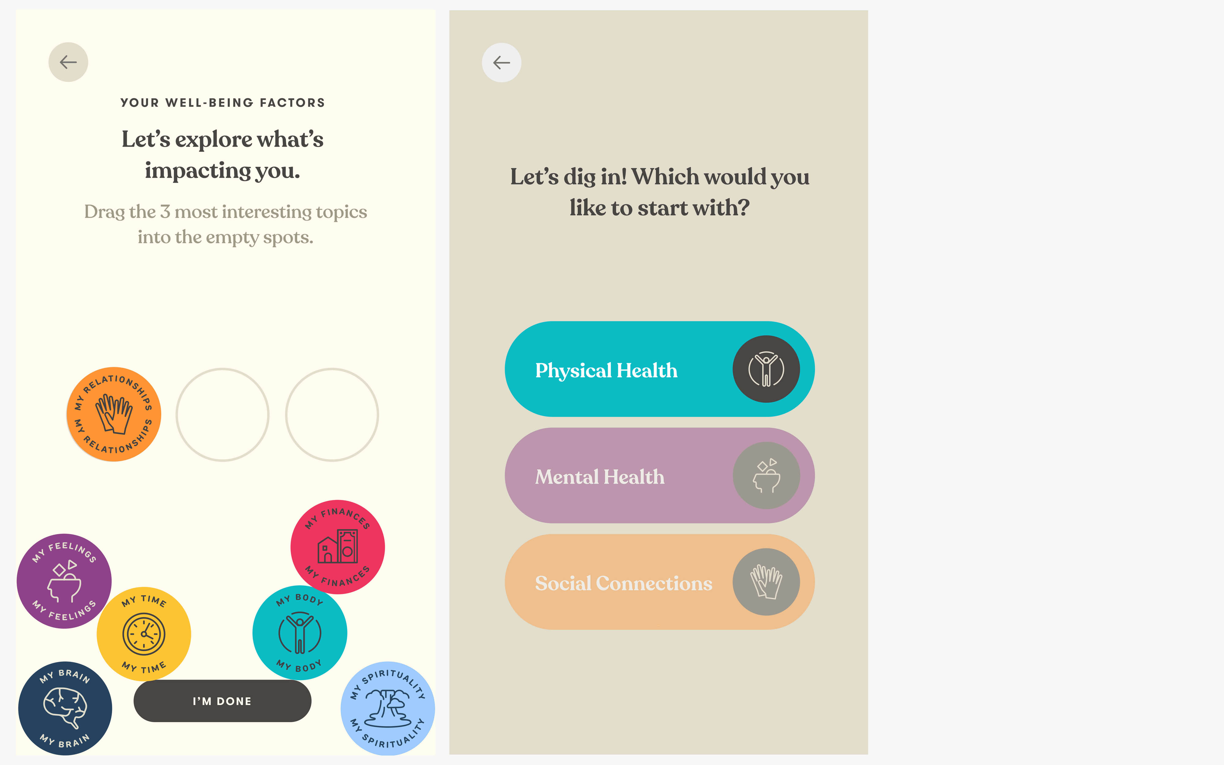
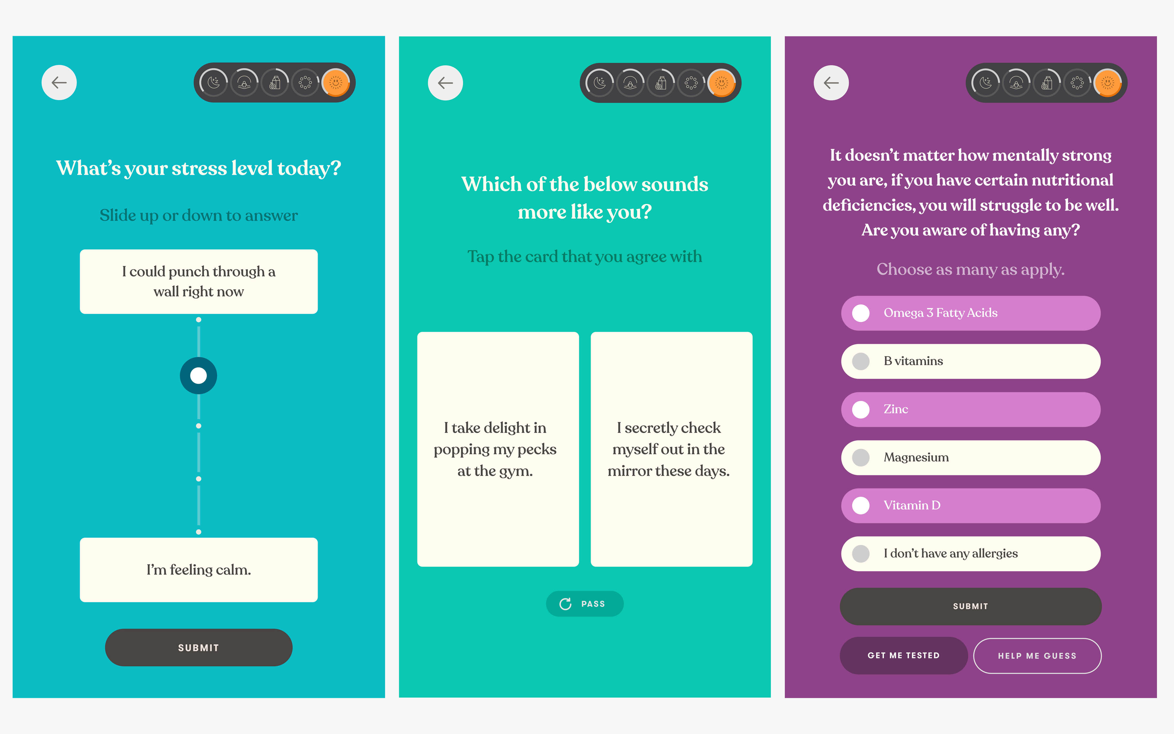
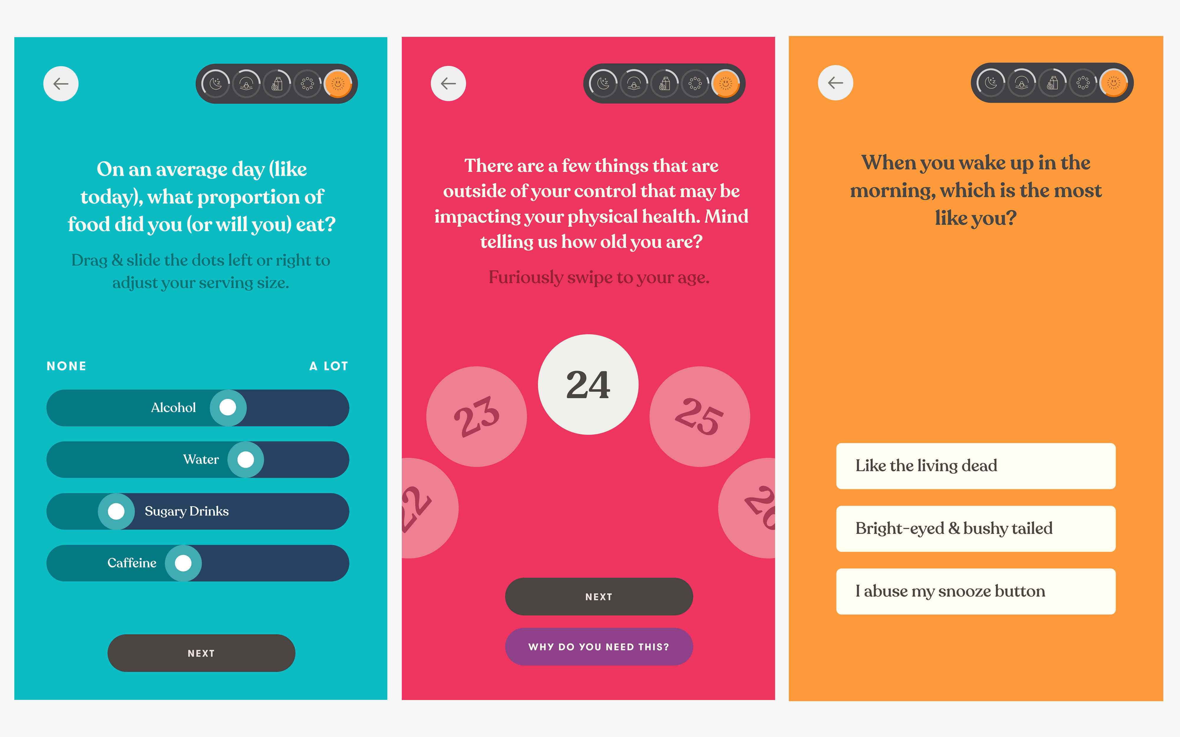
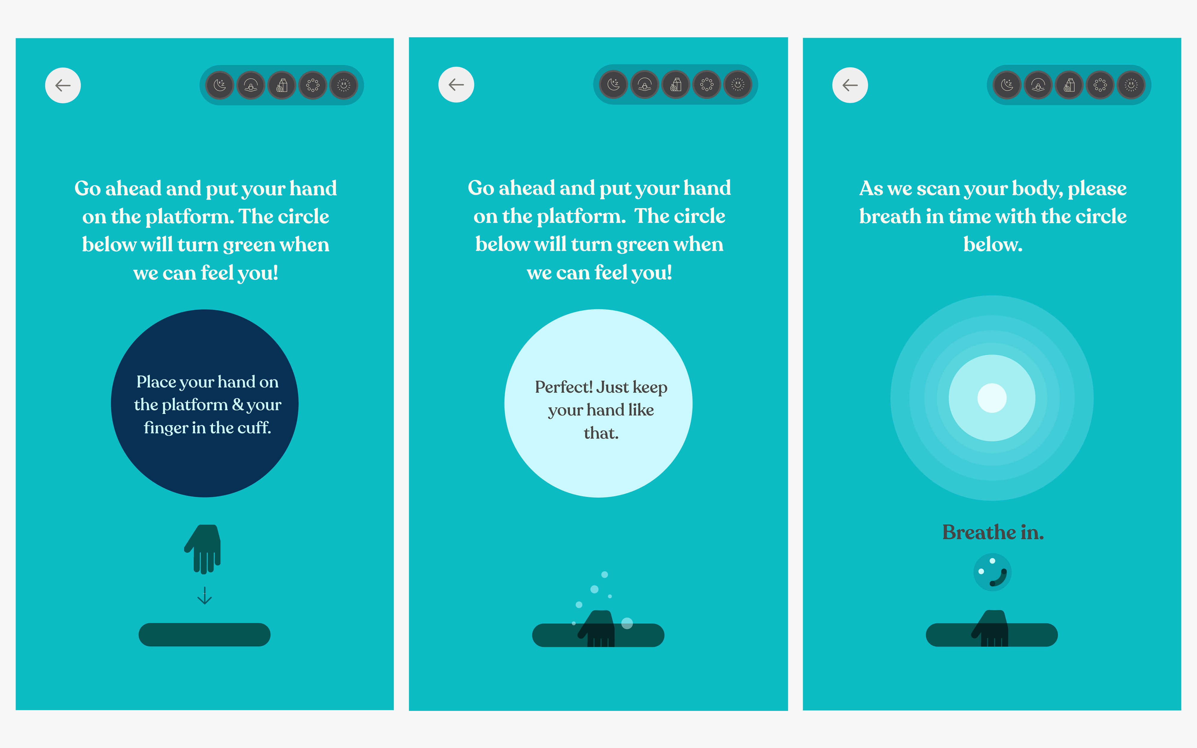
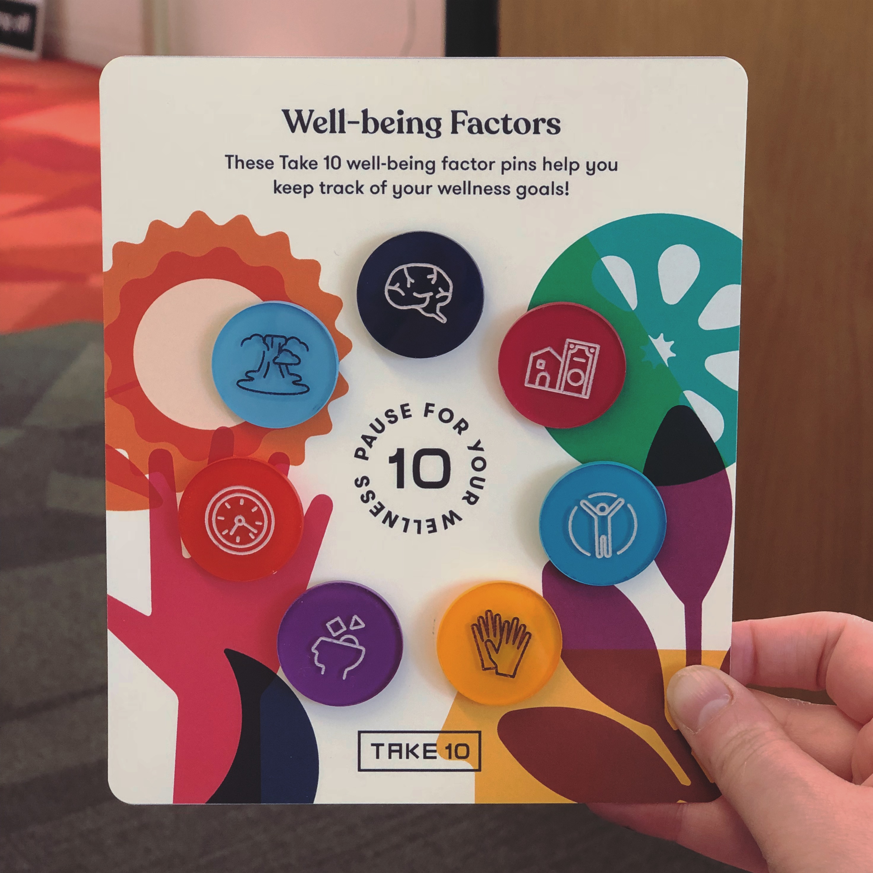
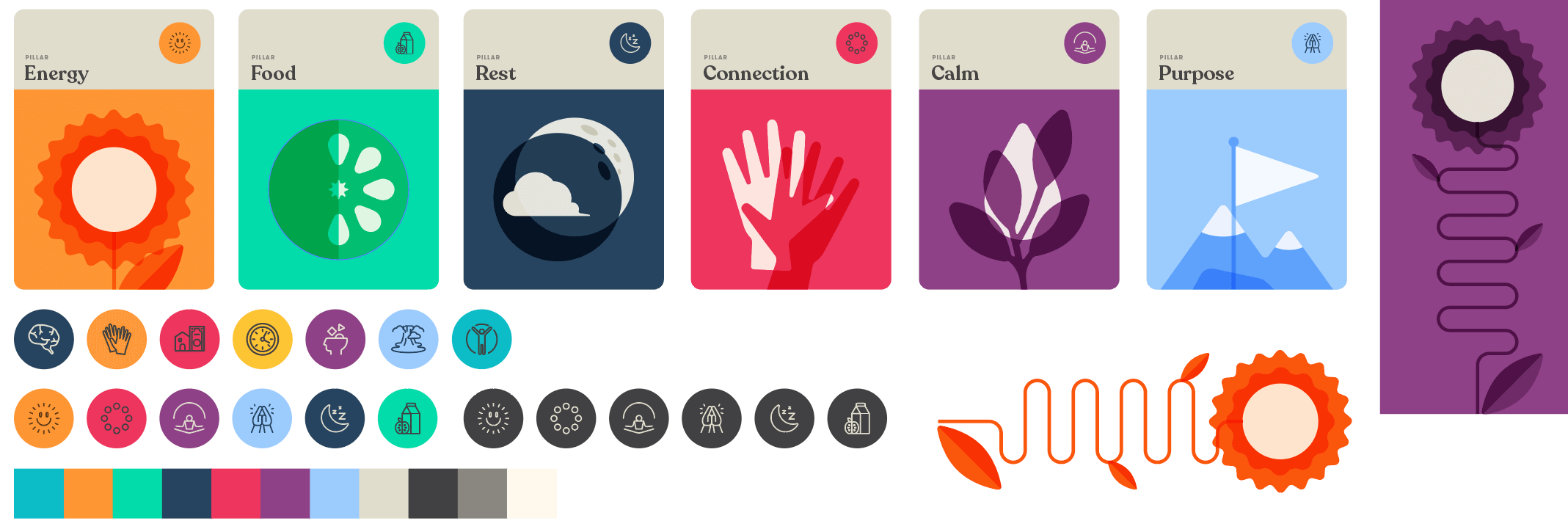
Your well-being factors & health assessment
The assessment was crafted with experts in all realms of health factors, internal medicine, psychology, social science, and spirituality. We crafted questions that allowed users to reflect on their daily habits and choices, unearthing the problems that aren’t usually solved by a doctor’s diagnosis. Problems with things like sleep and nutrition can be major factors in many health problems later down the line, we focused not on replacing a doctor, but by adding a layer of expertise before entering the healthcare system.
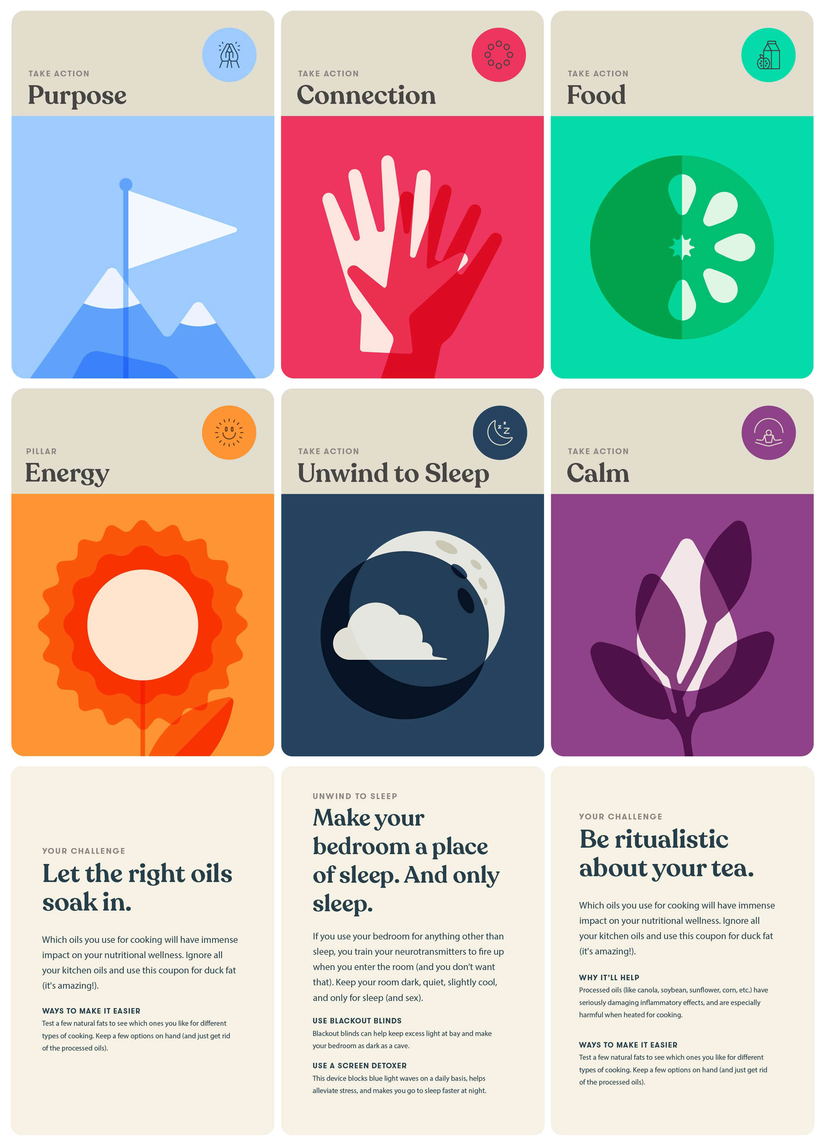
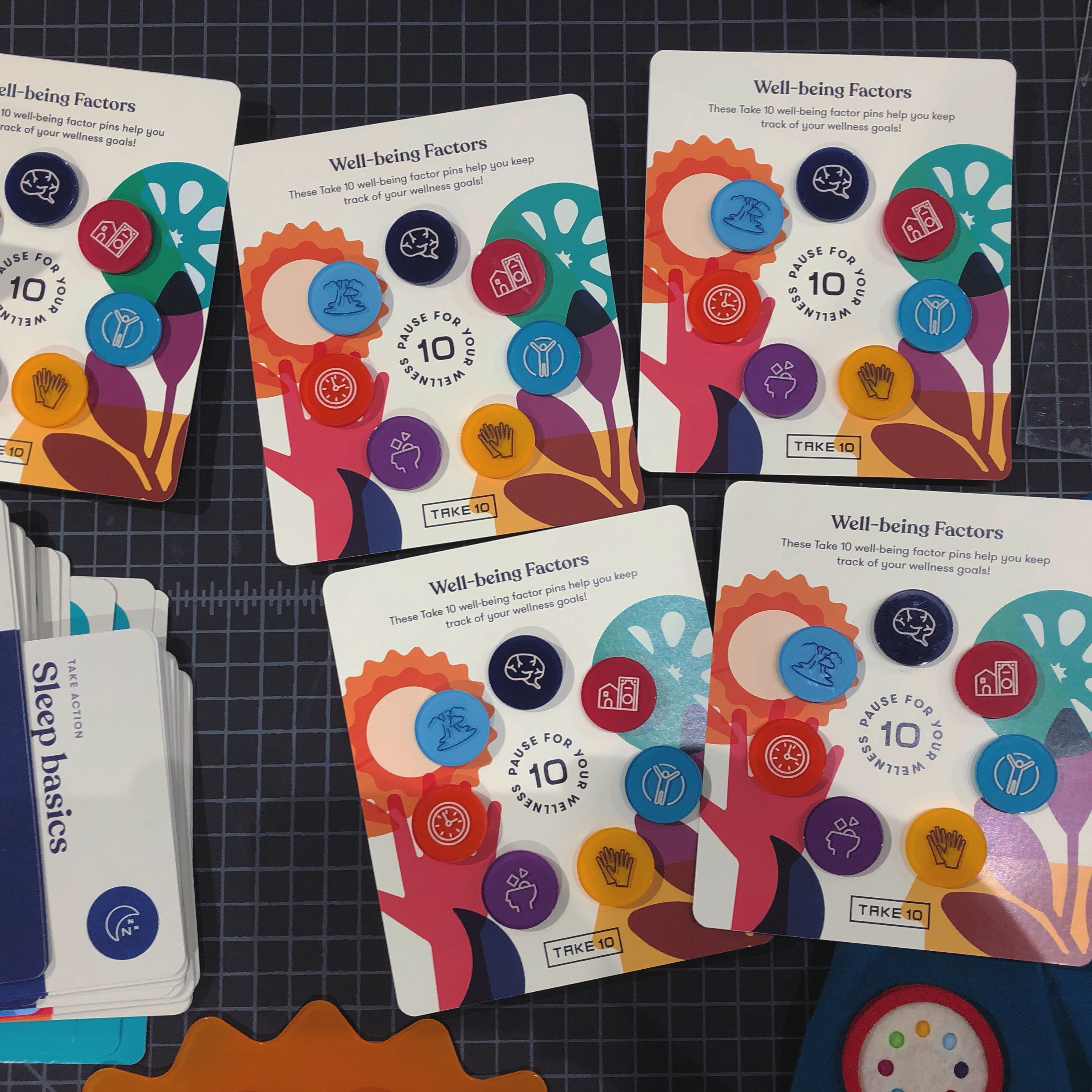
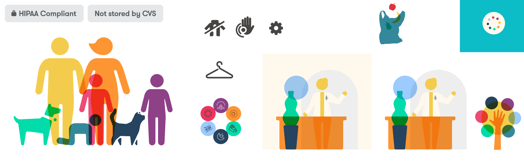
The assessment focuses on 7 key well-being factors that make up holistic wellness in a persons life: cognitive health, social connection, mental health, physical health, spirituality, financial stability, and time management. For the digital prototype, we created the first test, the physical assessment, to identify and recommend habits and change moments for sleep and nutrition.
Interaction archetypes
Magic Moments
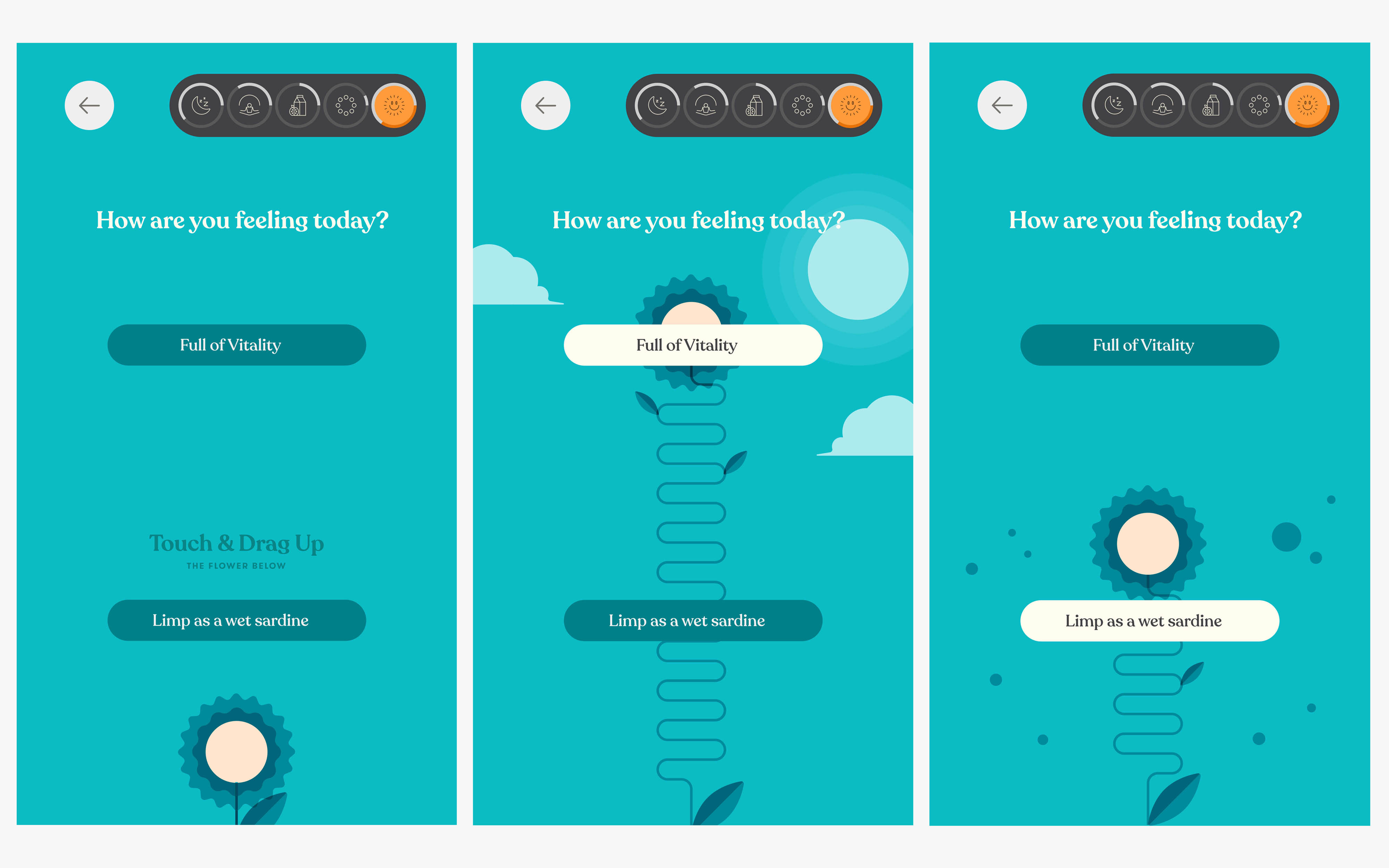
The assessment combined many magic moments and sound design elements in its ui and interactions to create an engaging experience for customers backed up with a quick sensor enabled vitals check and deep learning about their health habits. I created multiple live html and css animations using SVGs that were triggered by javascript during the experience to keep weight for the application down, all visual elements were powered by the browser and no video or canvas elements needed to be used.
The Power Slider
One of my favorite magic moments is the power slider, it gave a fun and reactive archetype to express different forms of the user’s current reflection on energy, mental health, or other factors.
A Receipt Takeaway
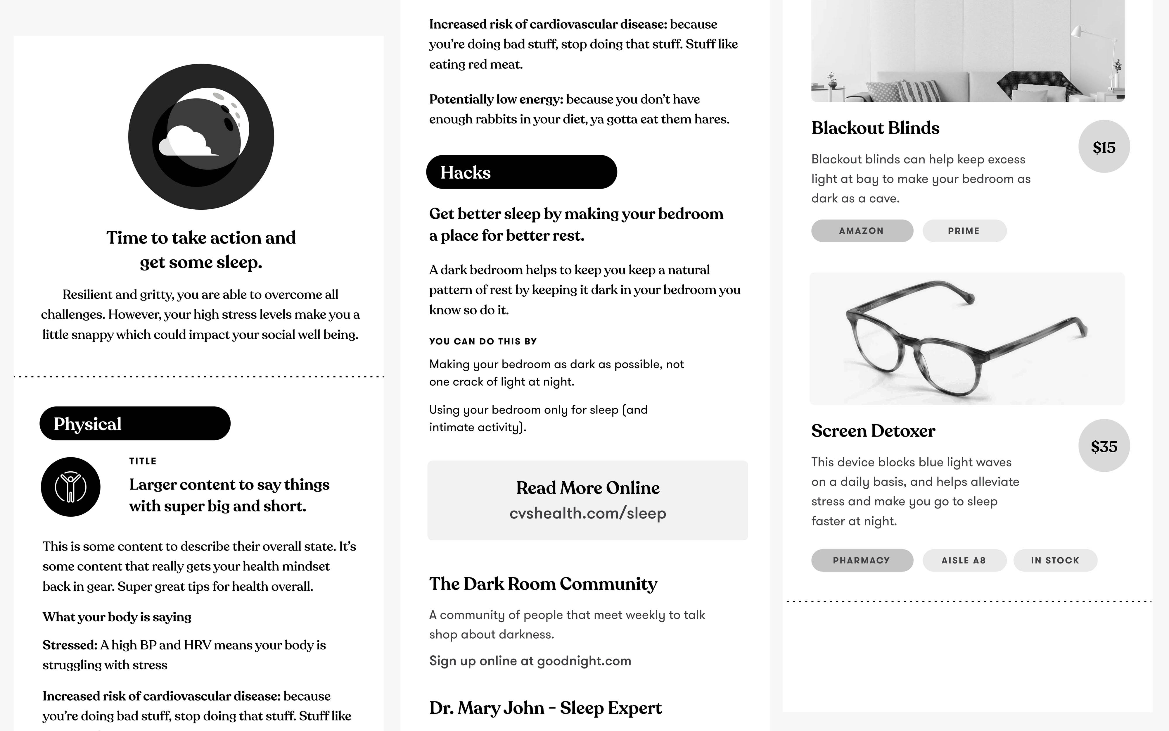
After the experience ends, the user leaves with a receipt style takeaway (this is after all, CVS.) with a summary of the days visit and their recommended action steps, along with products that can help them achieve their health goals. It also contains a url to link their visits to an online health dashboard if they so choose.
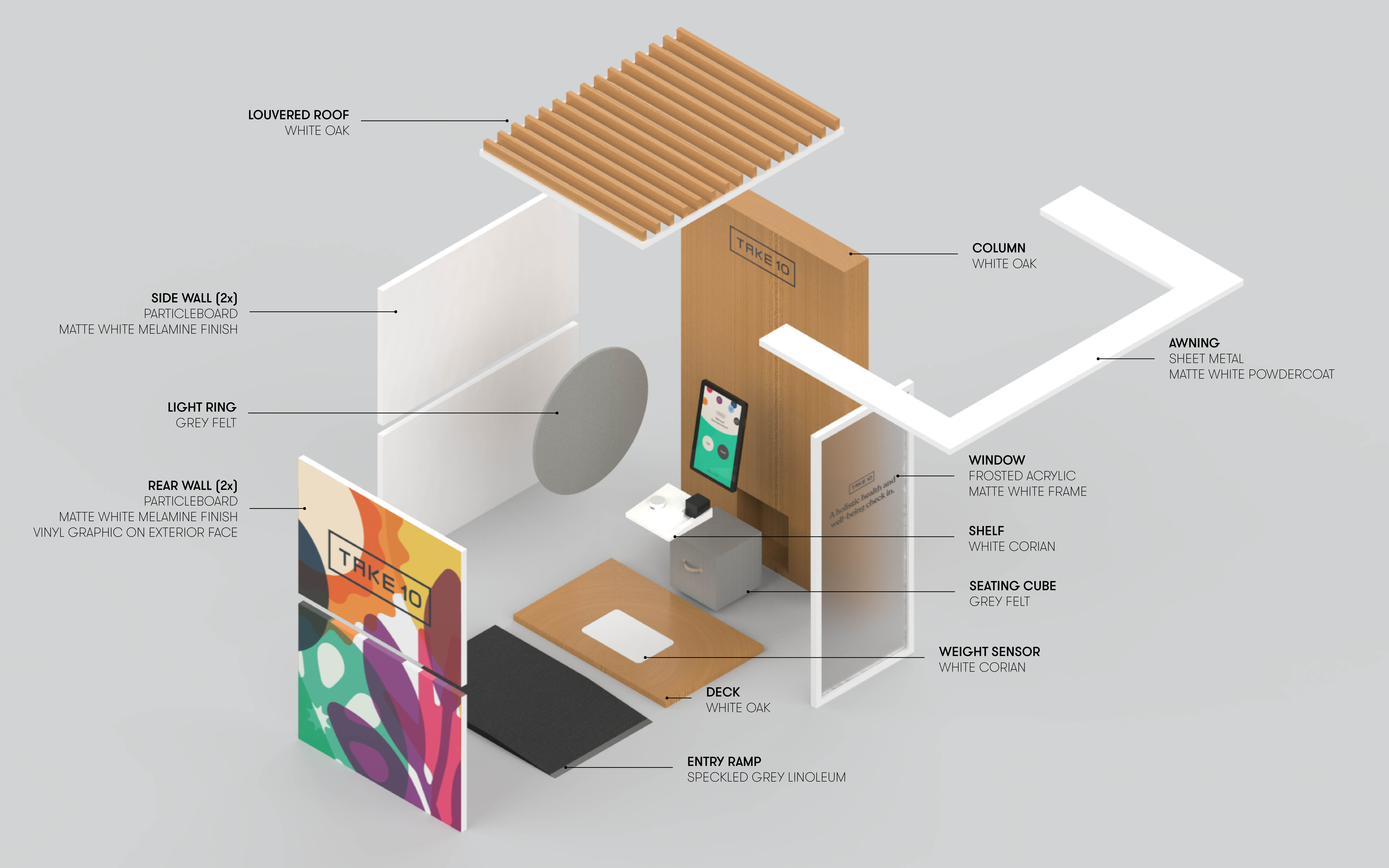
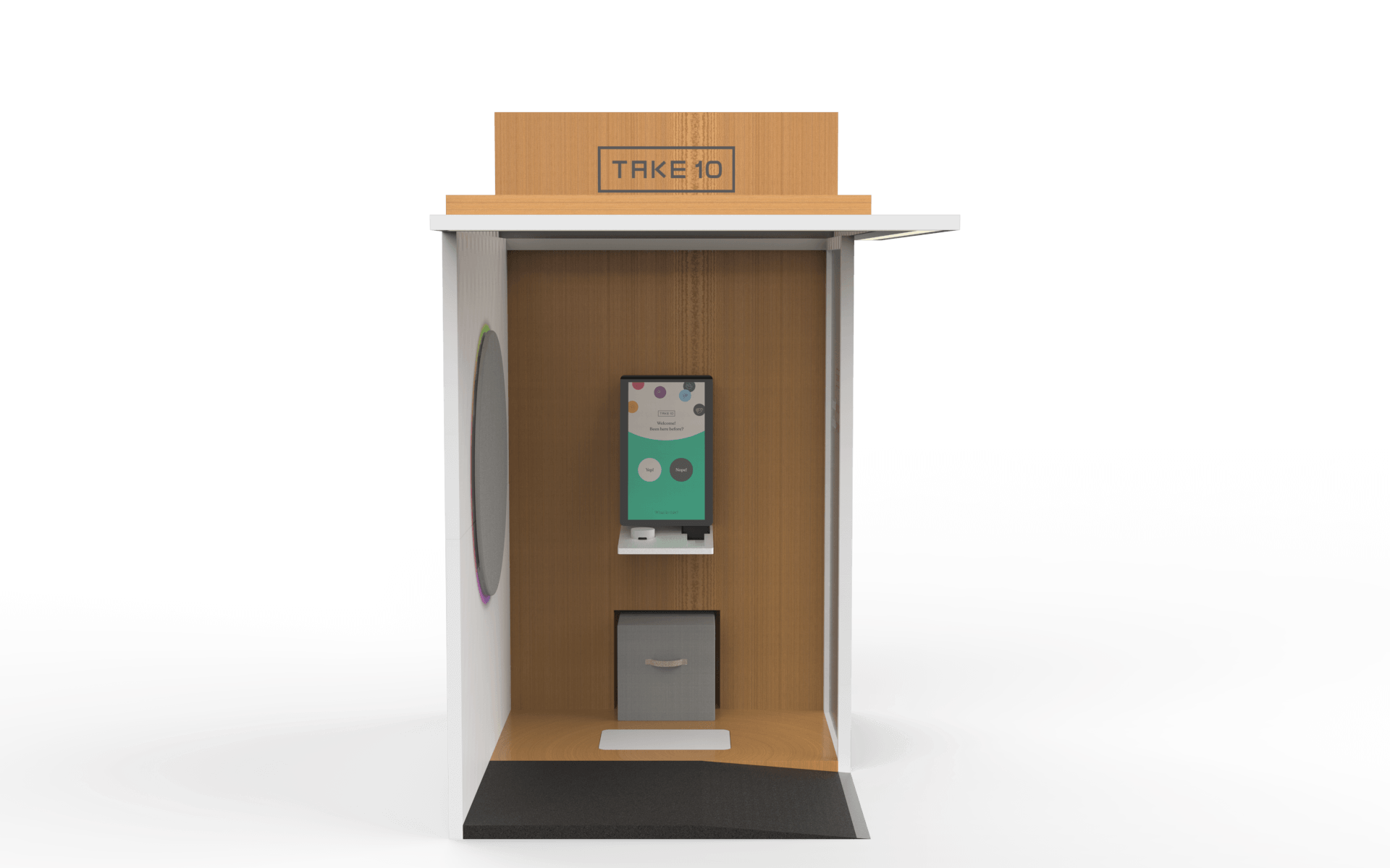
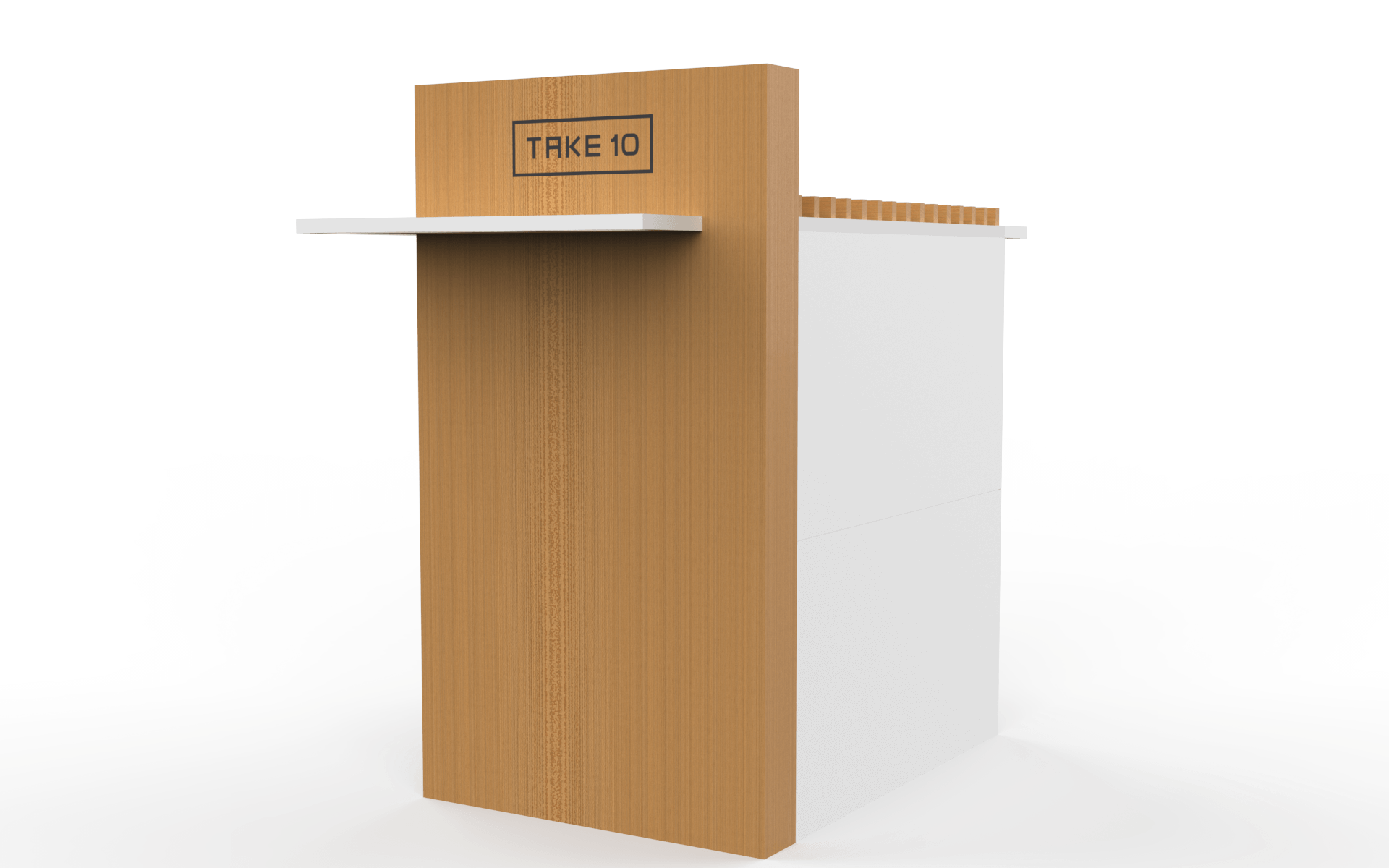
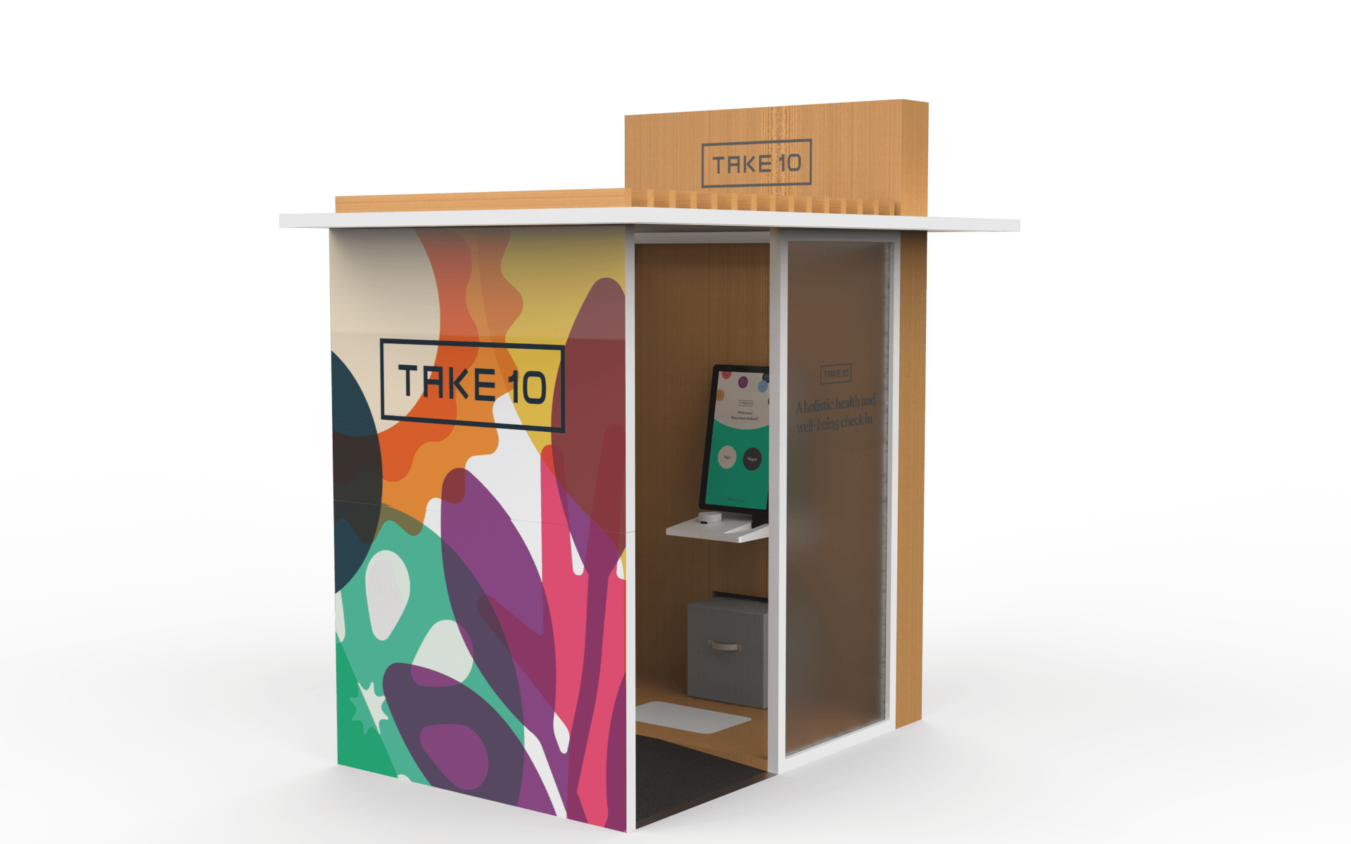
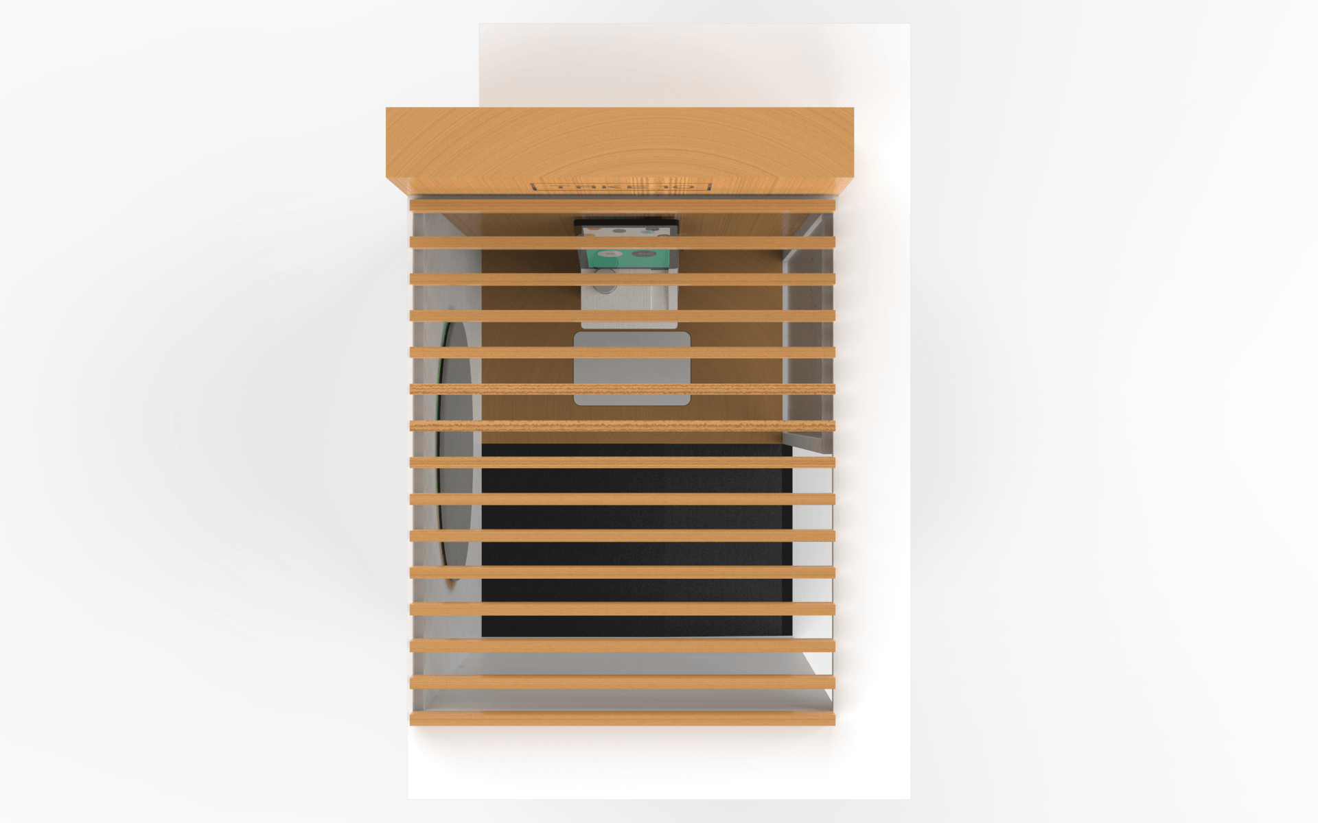
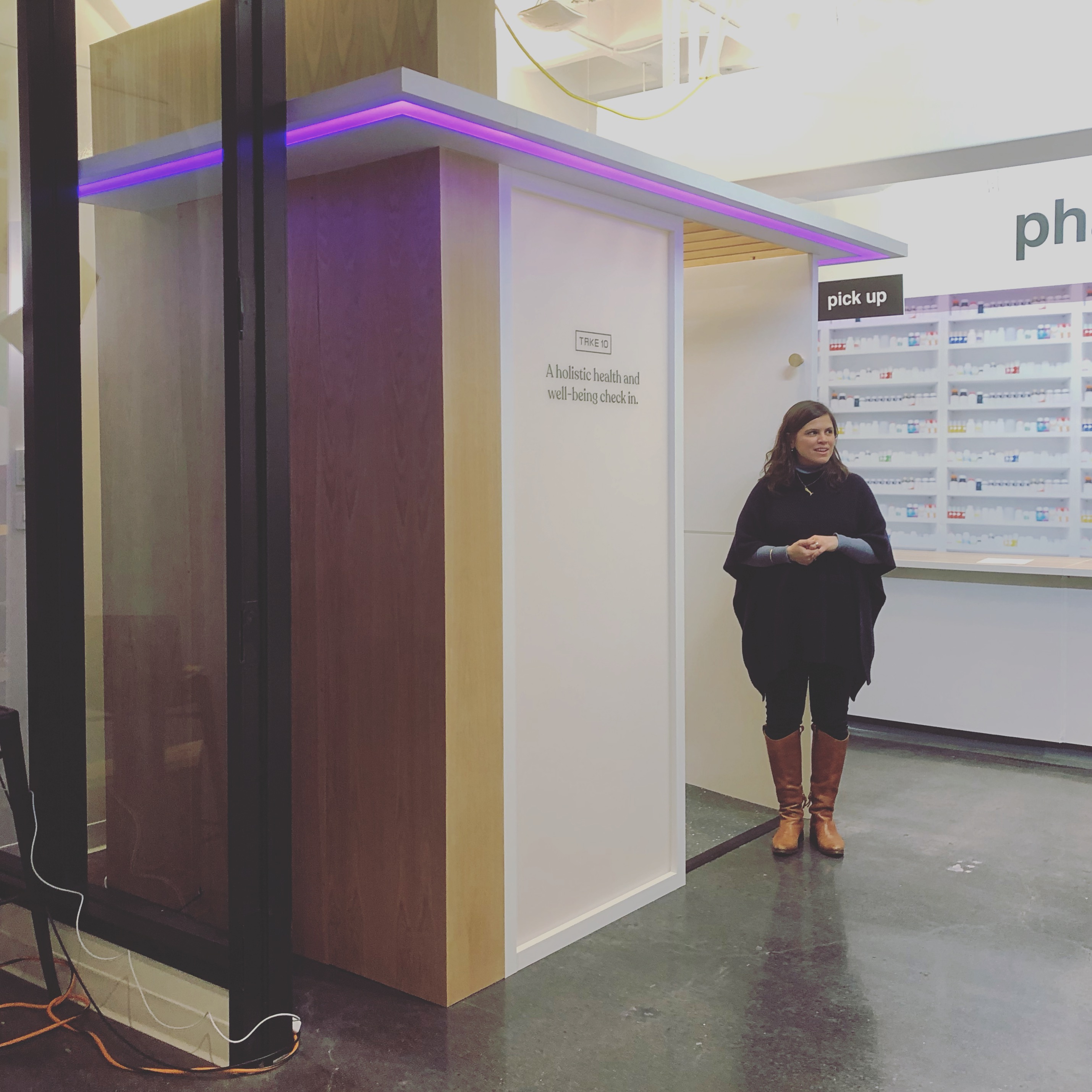
The Booth Experience
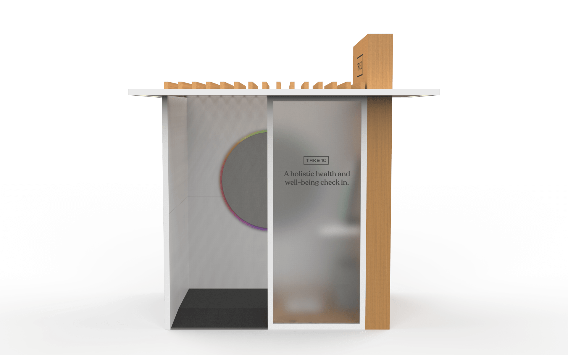
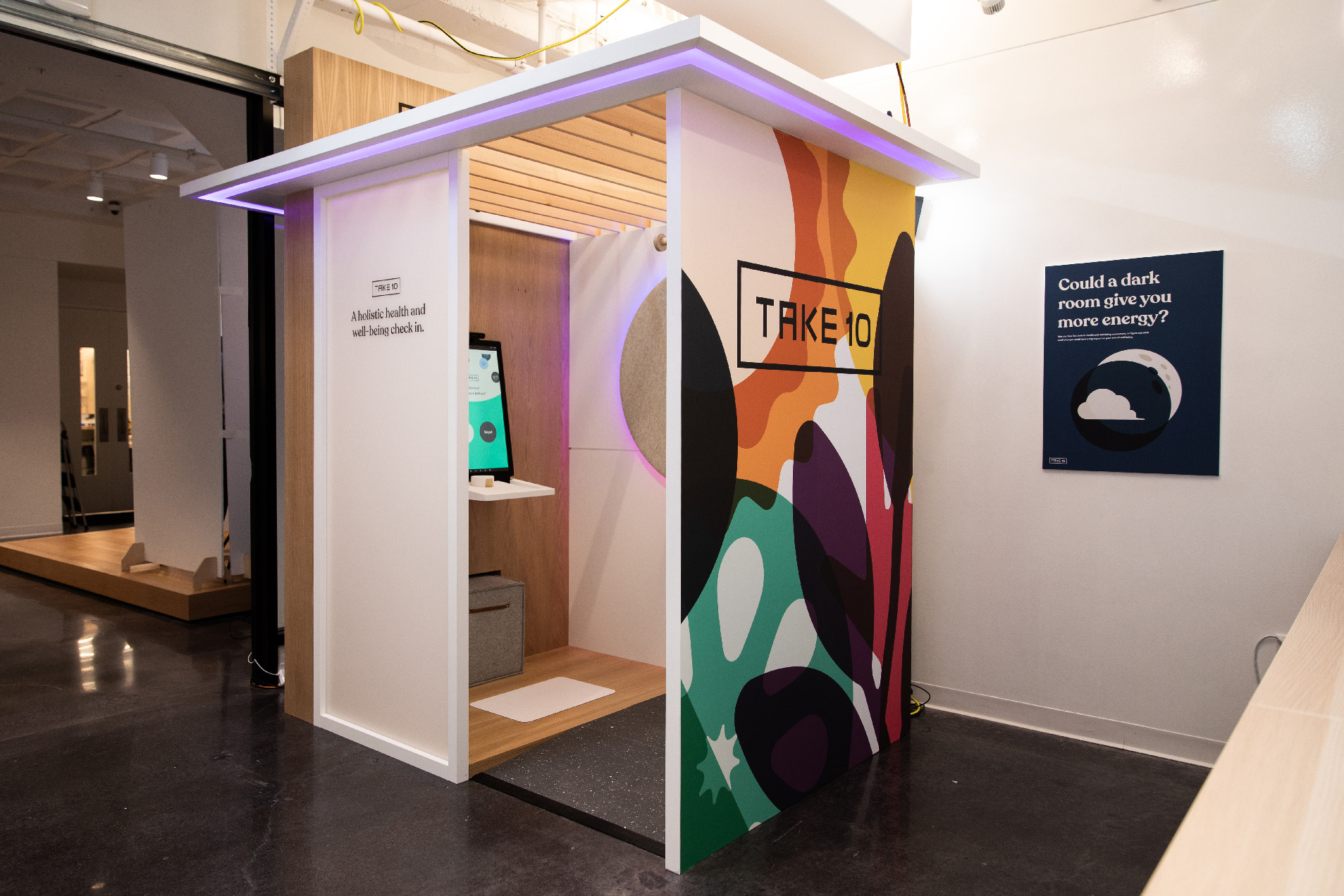
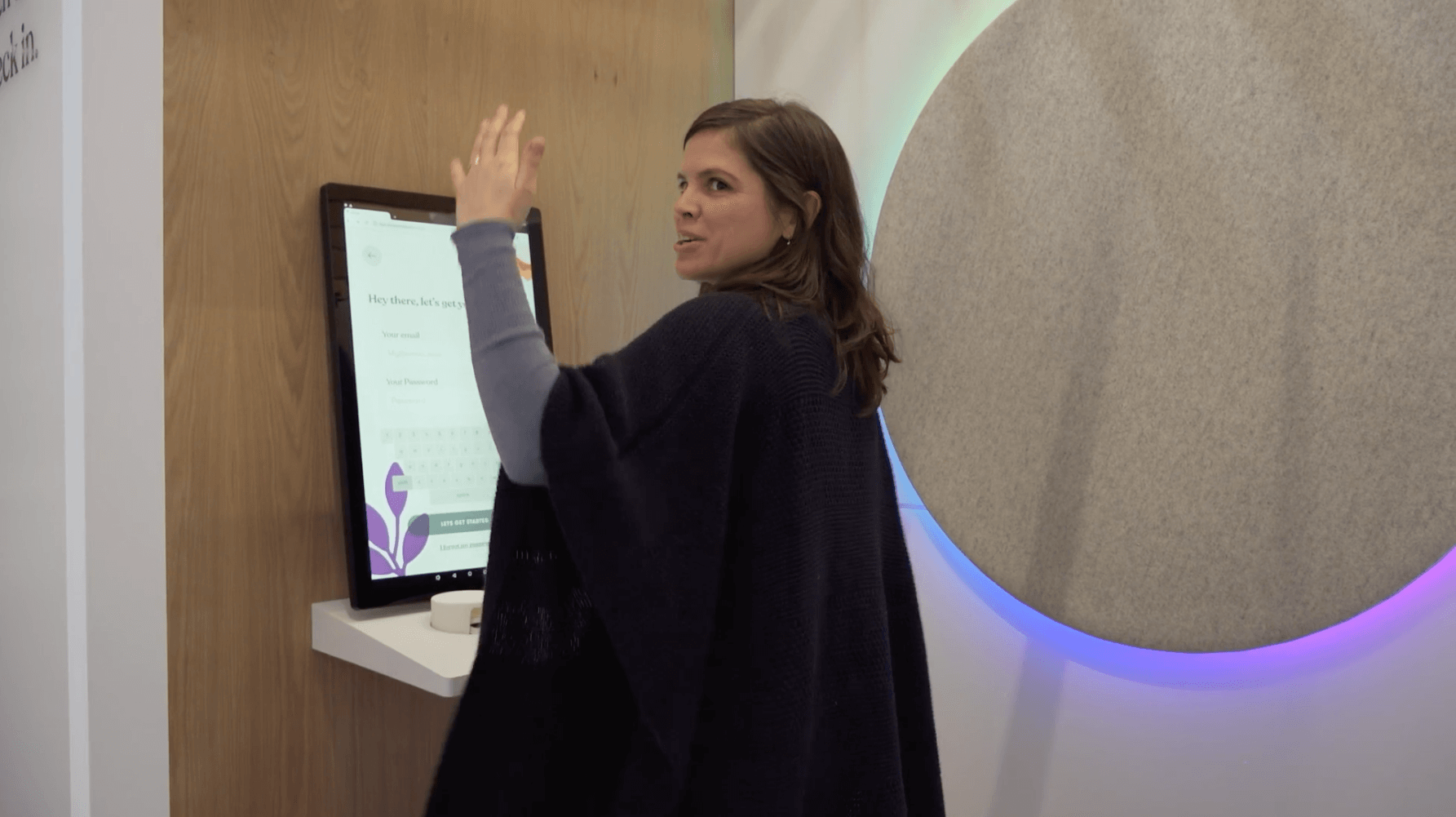
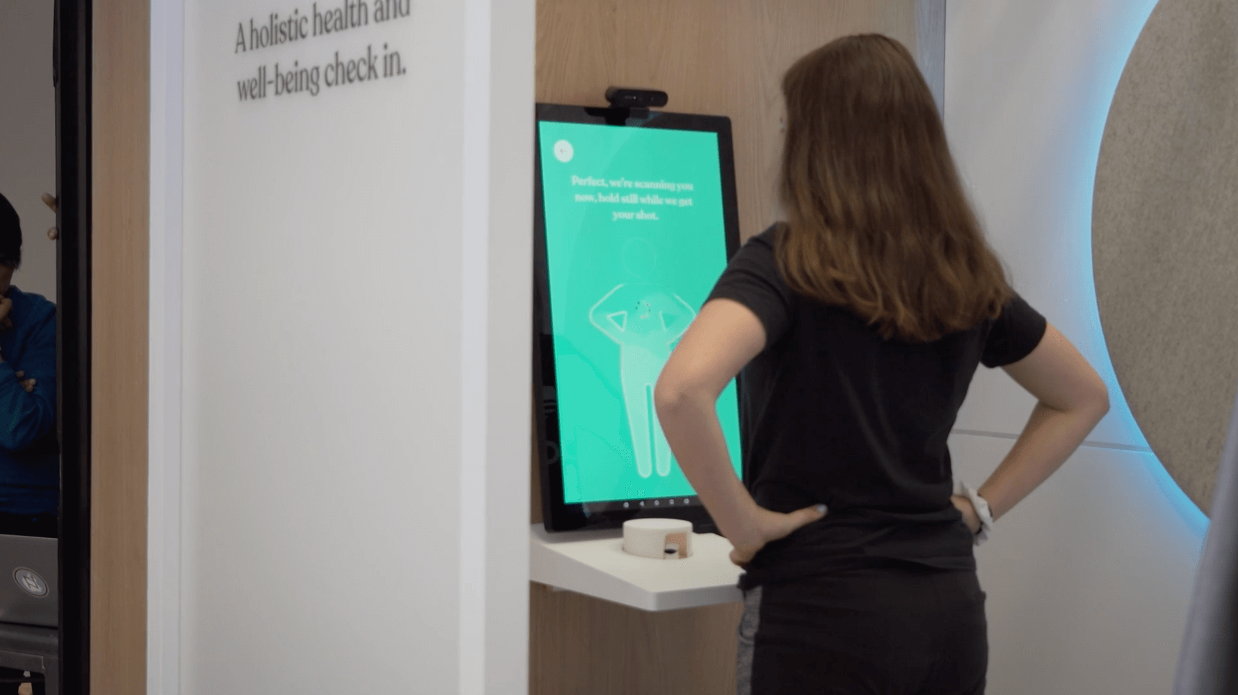
Given our busy schedules, we often don’t have much time to take time for ourselves during the day. The team was inspired by the unexpected break of routine that pop-up experiences give us, and the more strict routine we might have with alternative health rituals, to sketch out the idea of a booth experience installed inside of a pharmacy. The booth is meant to be part technology, part meditation space, giving you confidence with a detailed health readout, while also giving you meditation exercises to provide clarity during your busy day. The booth’s outdoor edge lighting indicates whether or not it is occupied, along with a drawn curtain interaction that starts the experience.
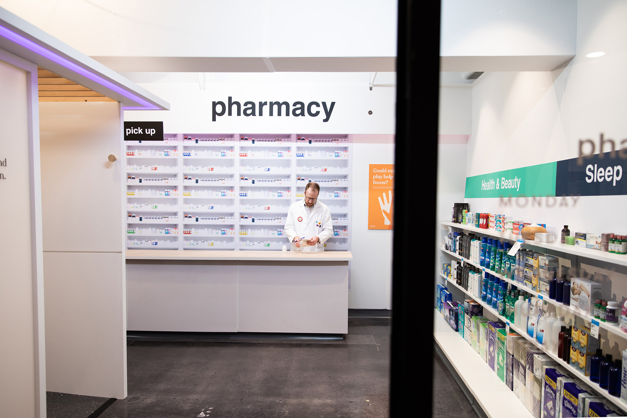
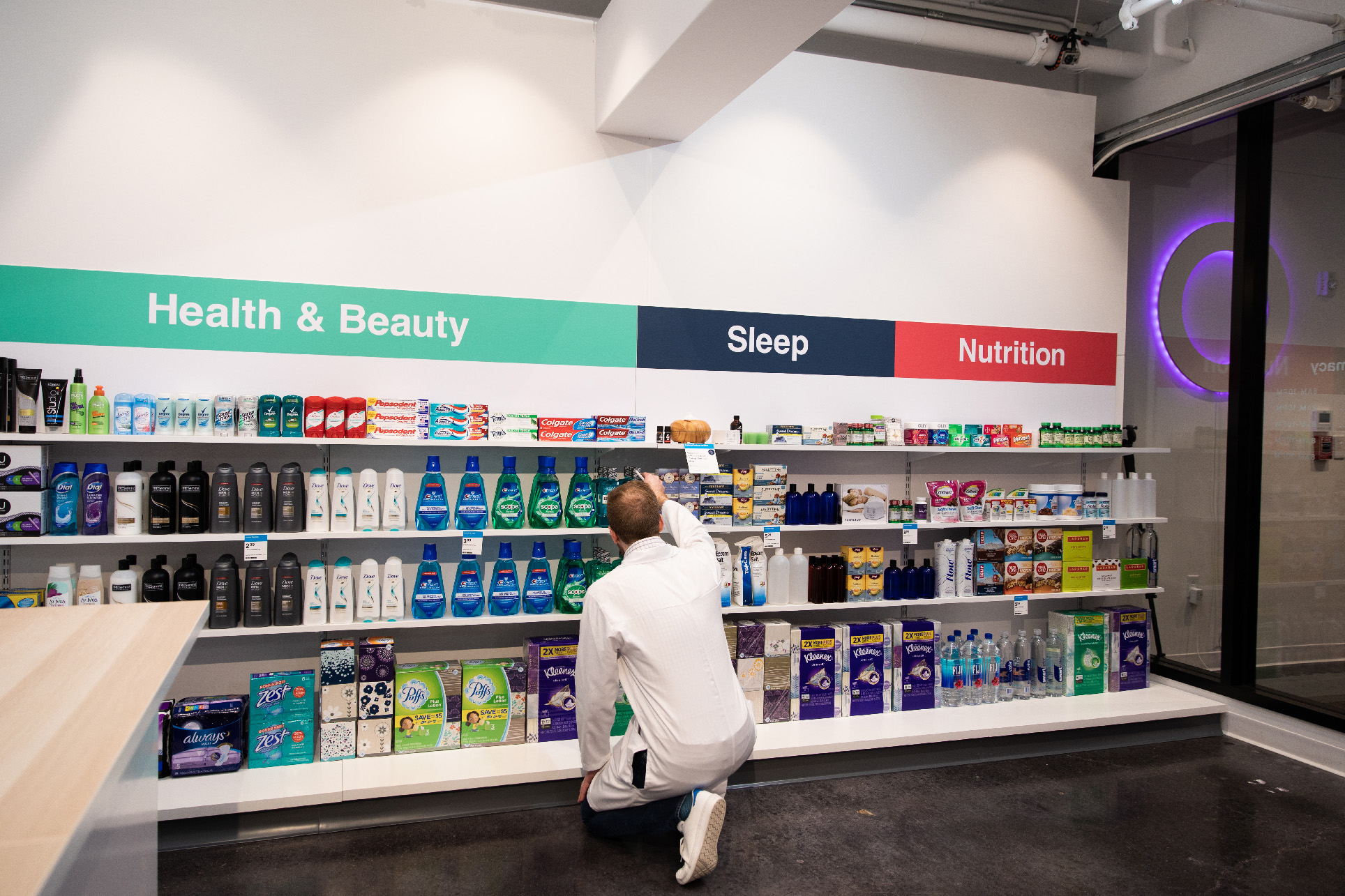
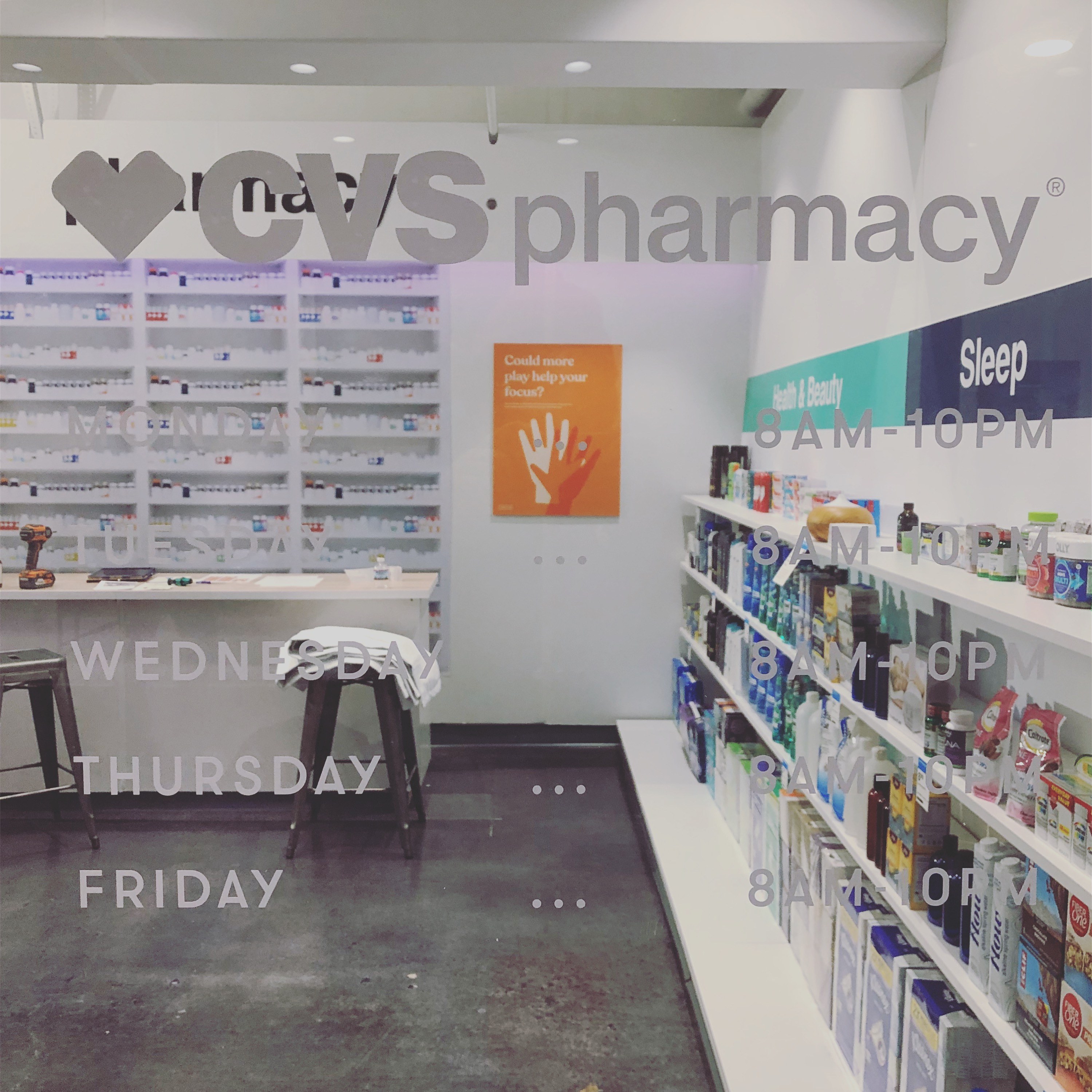
The prototype pharmacy
The project ended with a live prototype of the Take 10 experience with research participants inside of a mock pharmacy complete with a wellness coach annex where participants could talk to a real doctor about the Take 10 wellness factors. The prototype was powered by custom built hardware made in a 4 week span after finalizing the health assessment. The boot contained sensors and was designed to be ADA compliant and easy to sanitize after use.
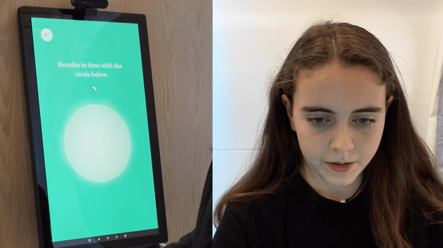
Ambient Disc
A key highlight of the booth experience is the large glowing disc attached to the wall that acts as a live simulation of window reflections from the outside world using custom software. During the experience, the disc changes color and patterning during meditation exercises, and acts as a lighthearted theatrical moment during sensor read moments. An example is when the user reaches the height and weight portion of the physical assessment. When the patient steps back onto the weight sensor built-in to the floor, the disc begins to glow teal and breathe to match on-screen instructions, creating an environmental element to the experience. All of the sensor readings take place within seconds, but the experience creates a sense of whimsy with an exercise that offers a moment of meditation.
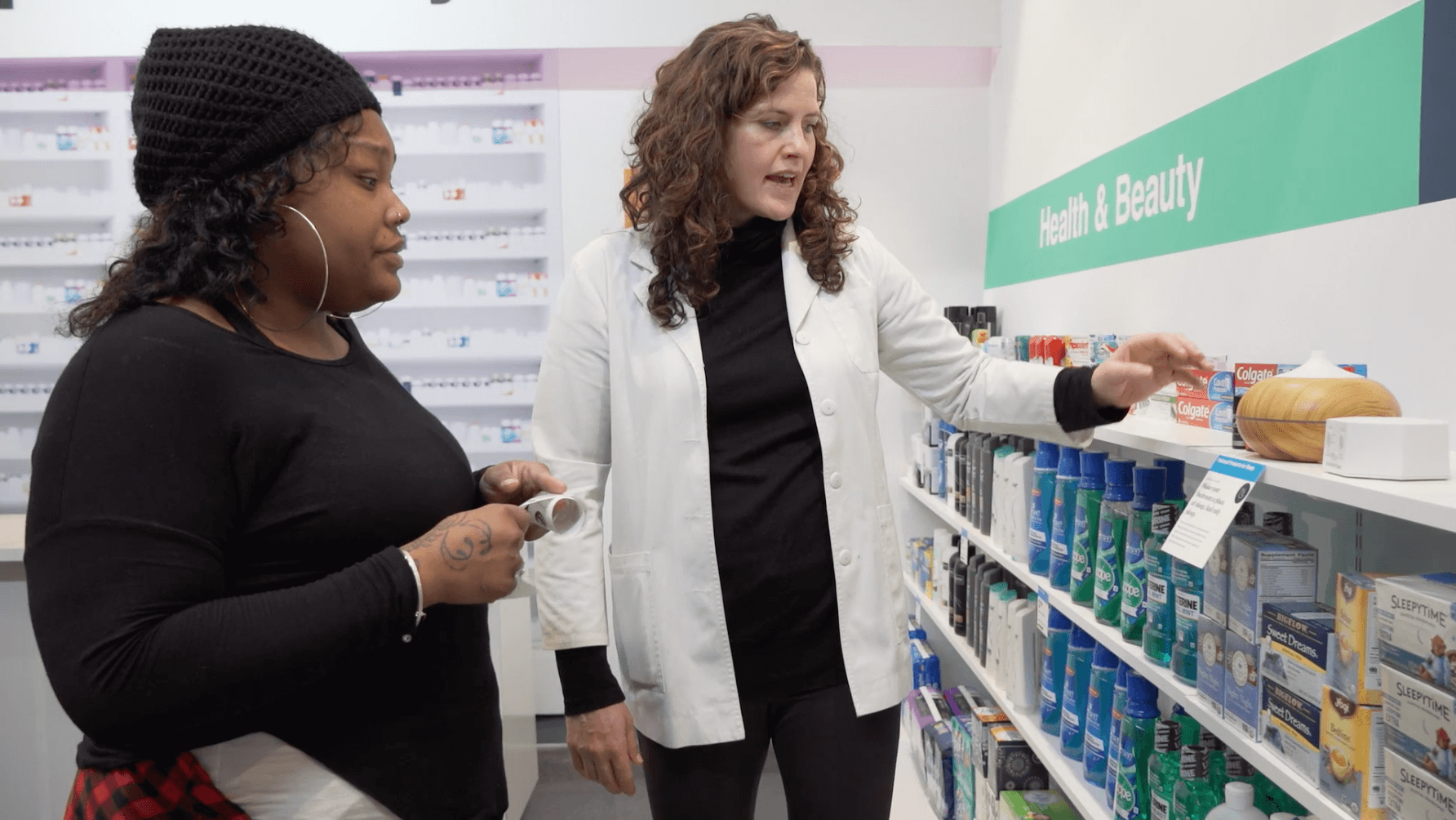
Recommended Products
The participants were able to sample the types of products that would be recommended to them on their wellness takeaway, printed out on a receipt printer at the end of the experience. These products are researched and recommended to users by CVS experts, with the hopes of creating a feedback system for more personalized recommendations.
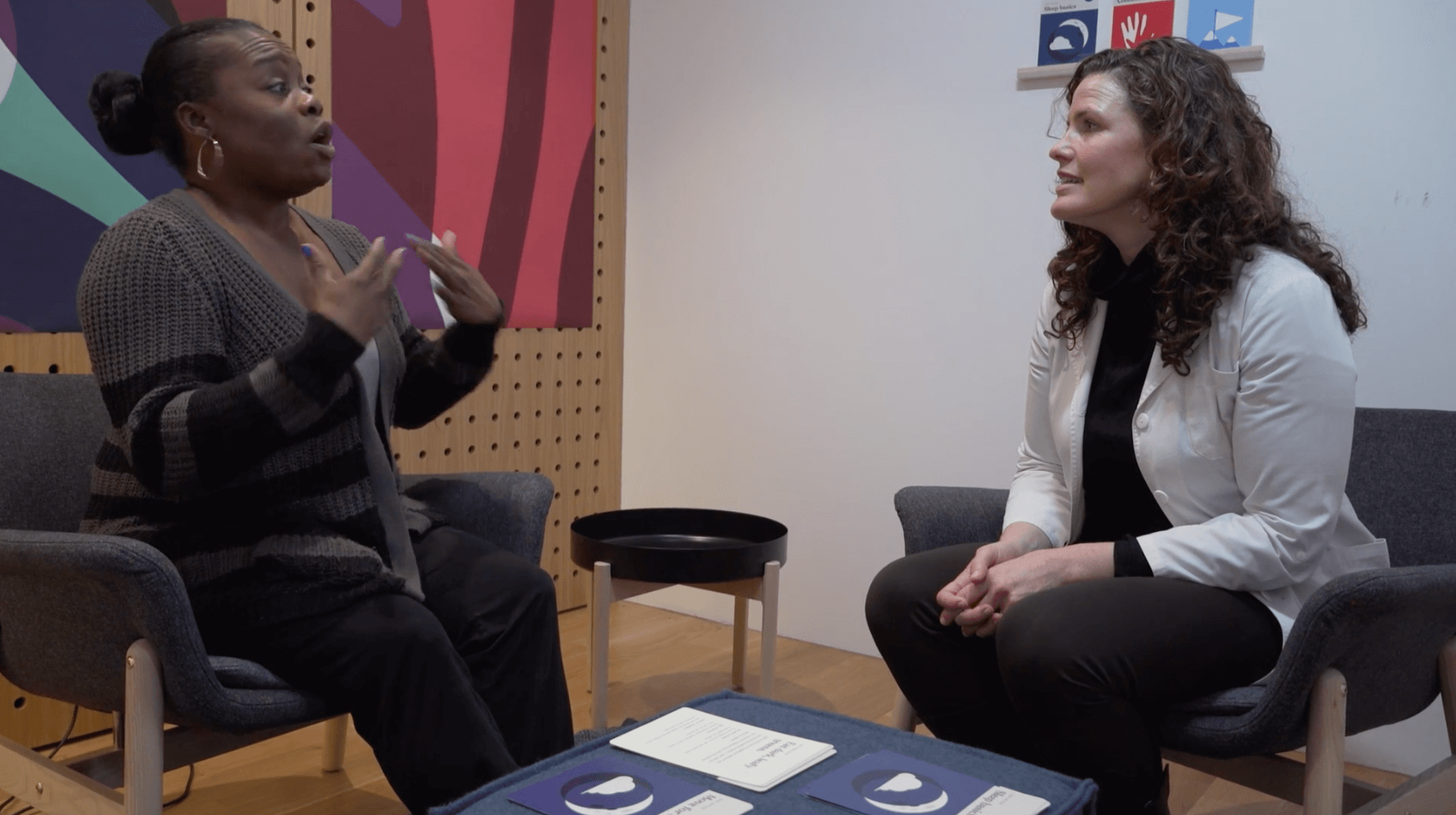
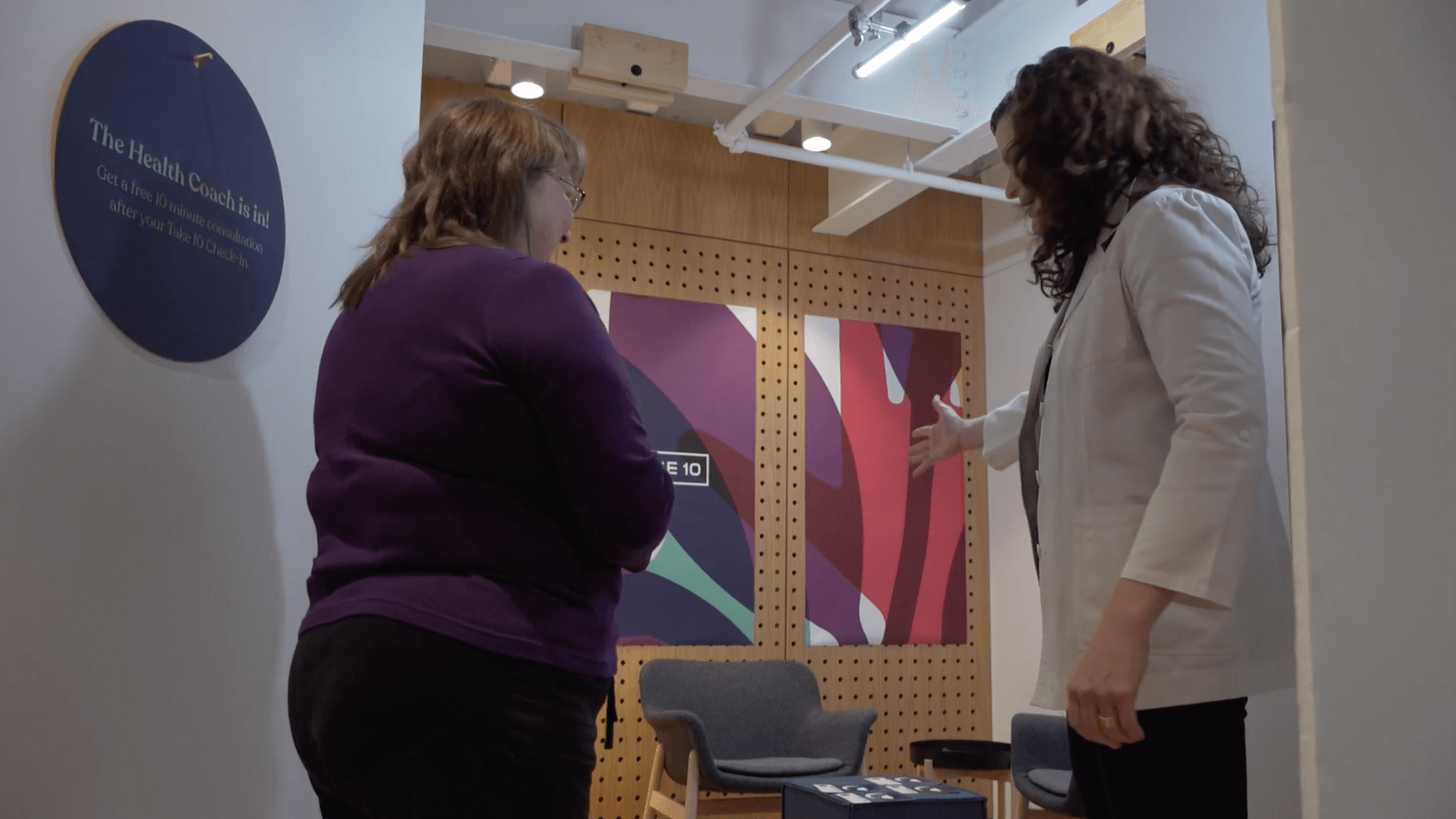
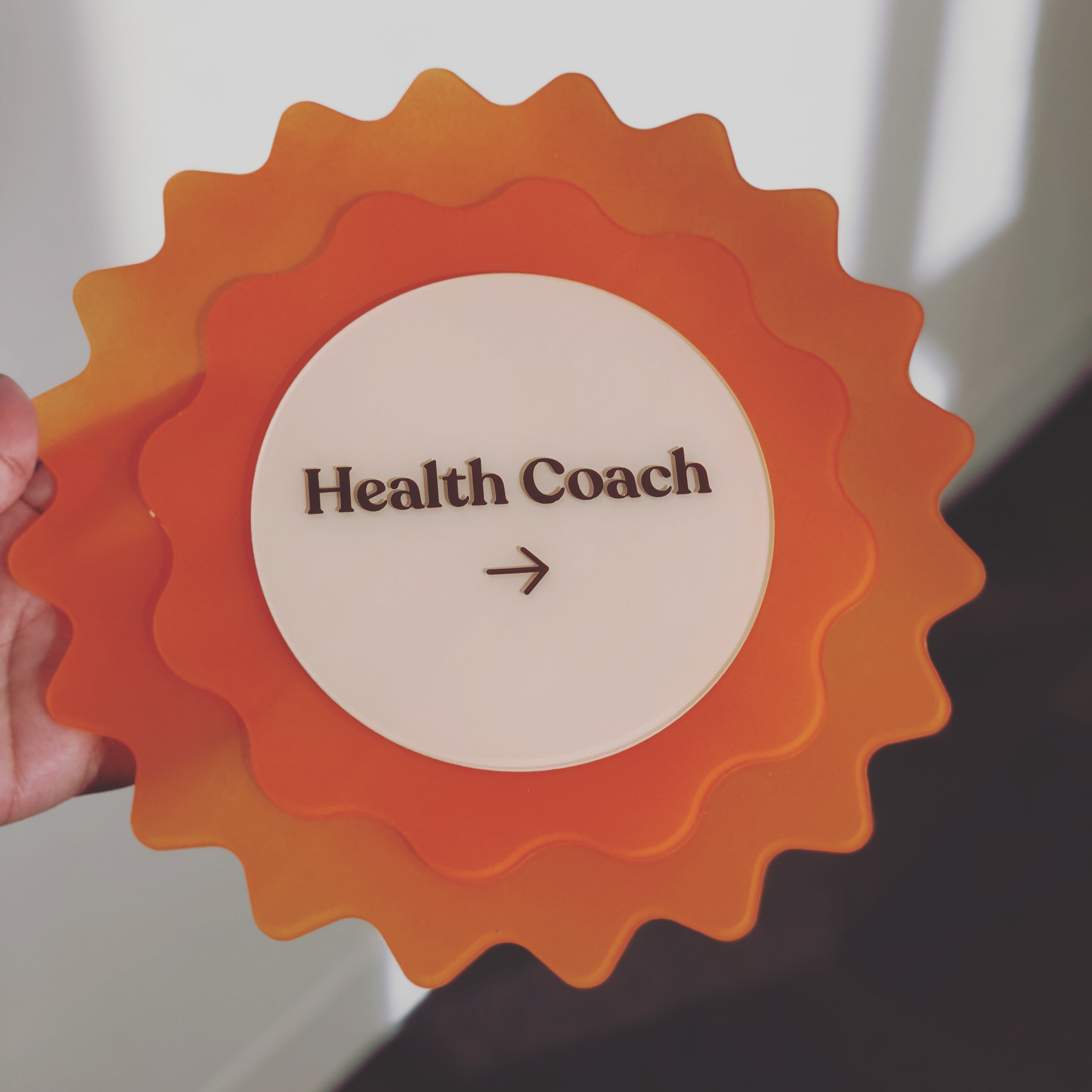
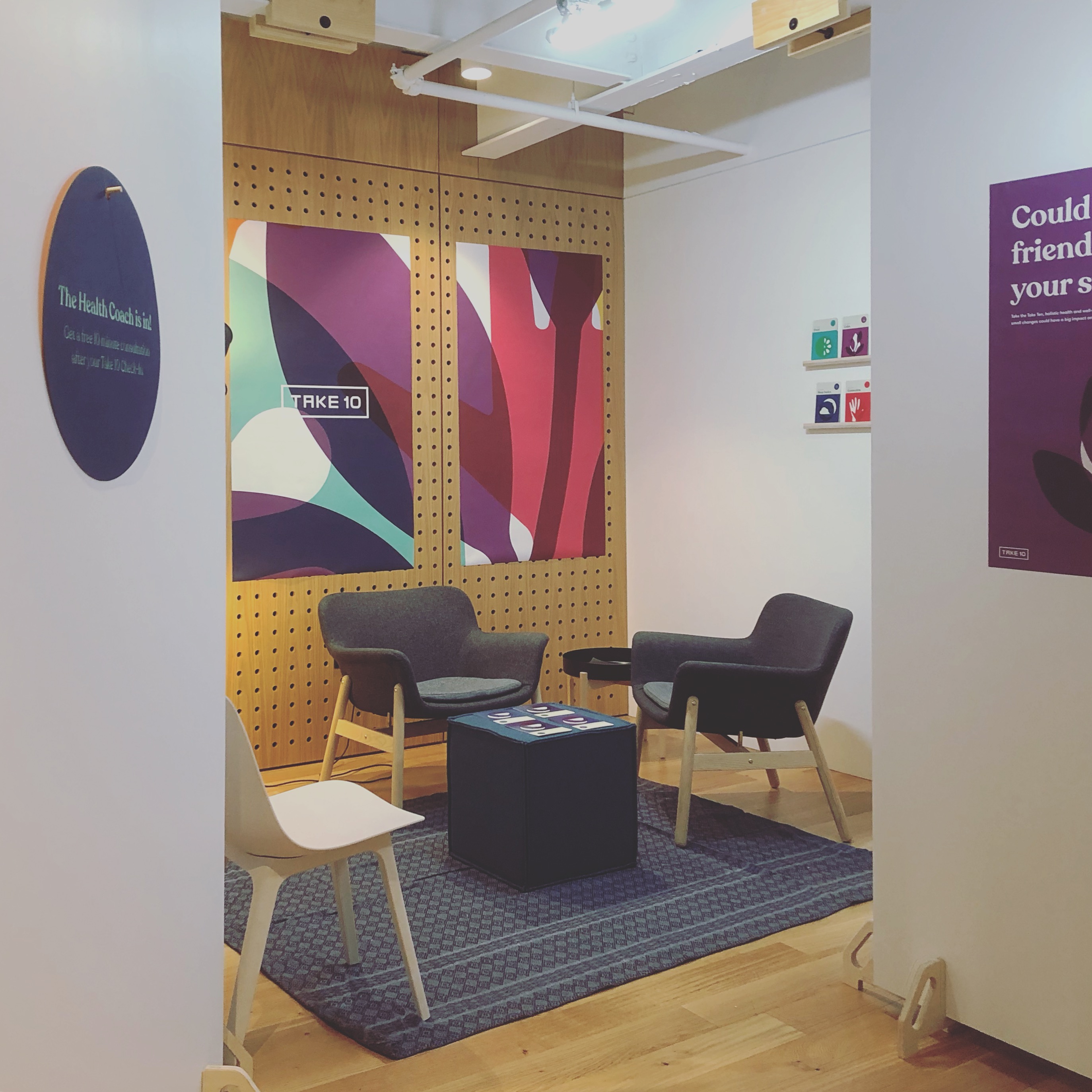
Your Wellness Coach
The wellness coach is available for customers to discuss their assessment results and get tips for how to work different, better-for-them habits into their lifestyle. The wellness coach provides a person that lies before a doctor, but above a friend or neighbor in terms to investment in their health. This experience is facilitated by habit and health factor cards that the coach can give to the customer to provide actionable takeaways that aren’t coupons or ads.
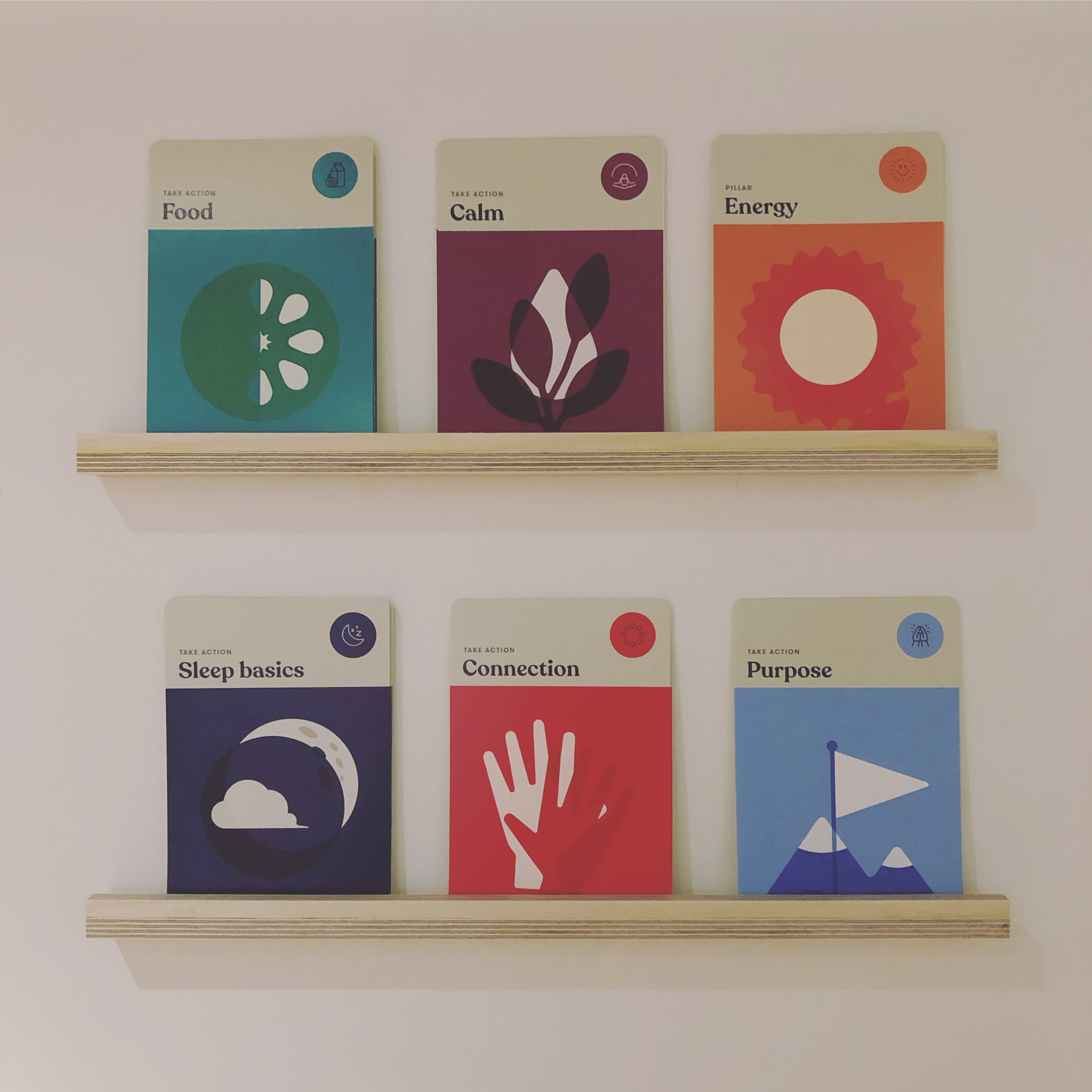
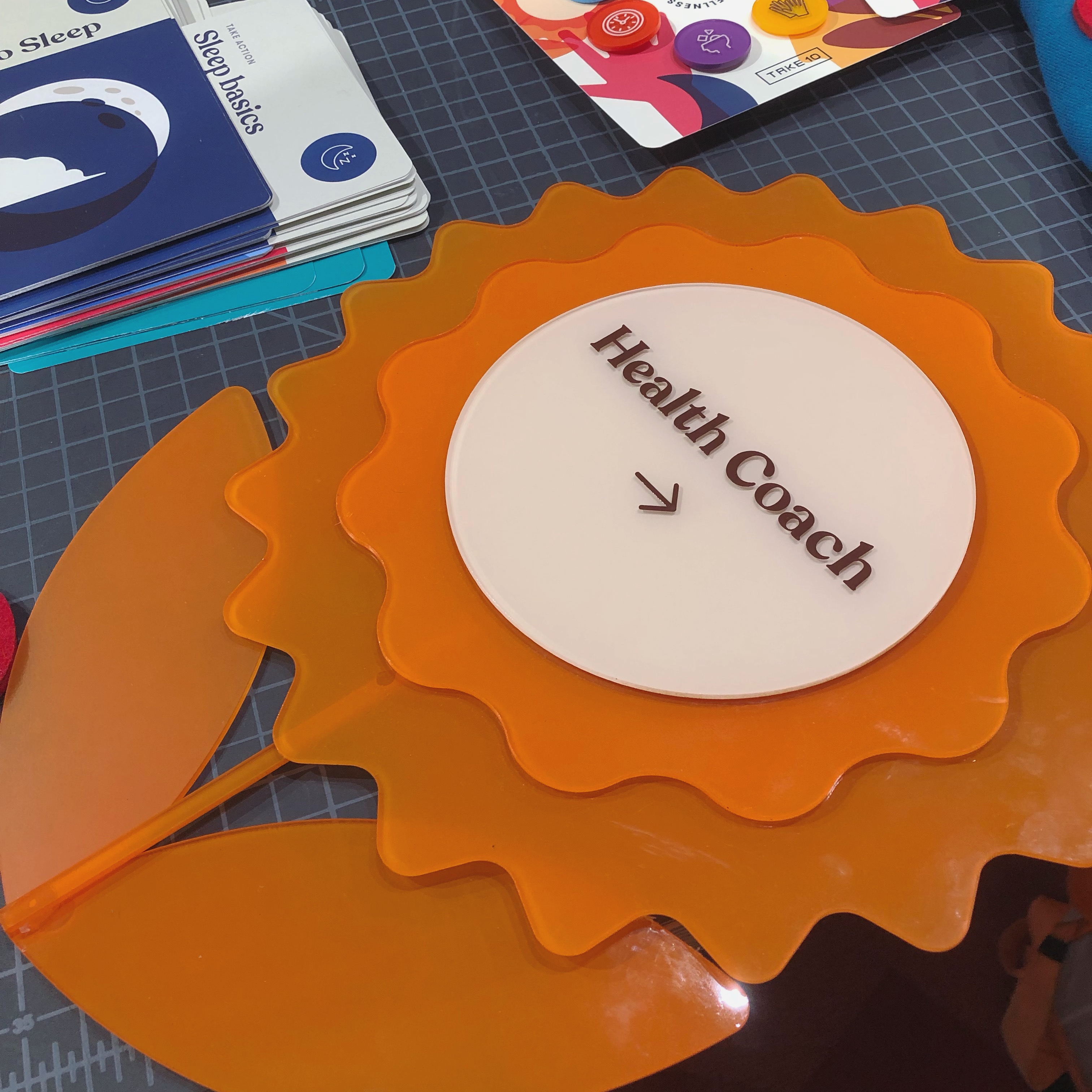
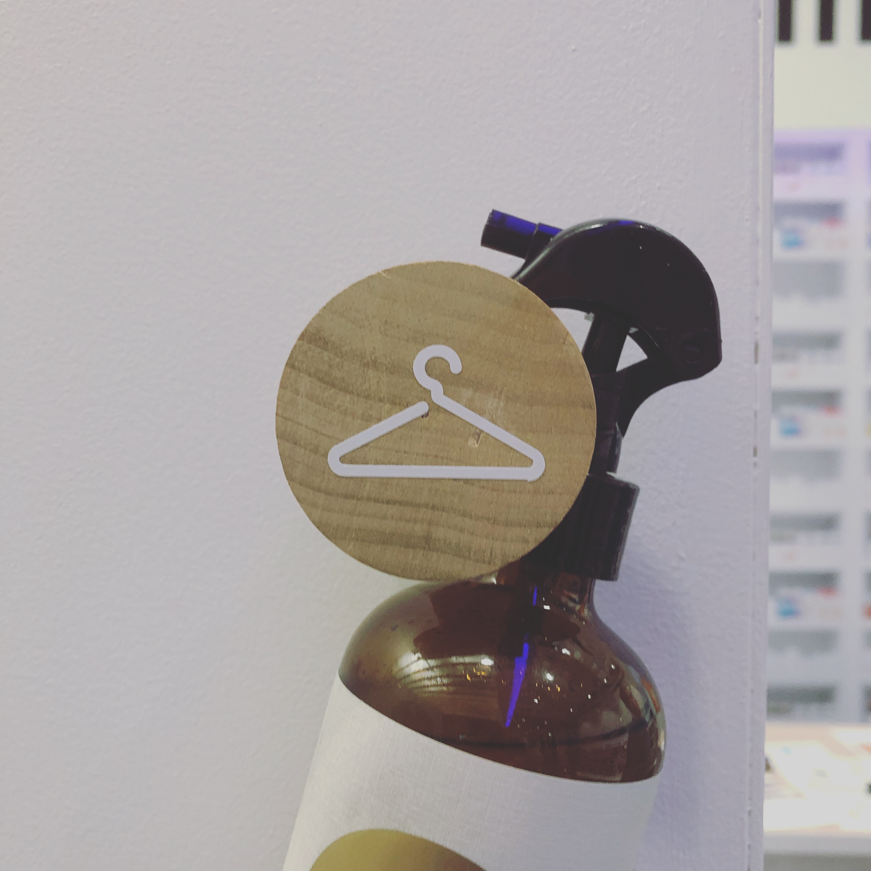
I created production design and application to the set for the entire experience (in addition to the brand design and interaction design) and was excited to create small details that made the sets shine like uniforms, vinyl signage, pin sets for participants, and cut acrylic pieces.
Felt badges for uniforms
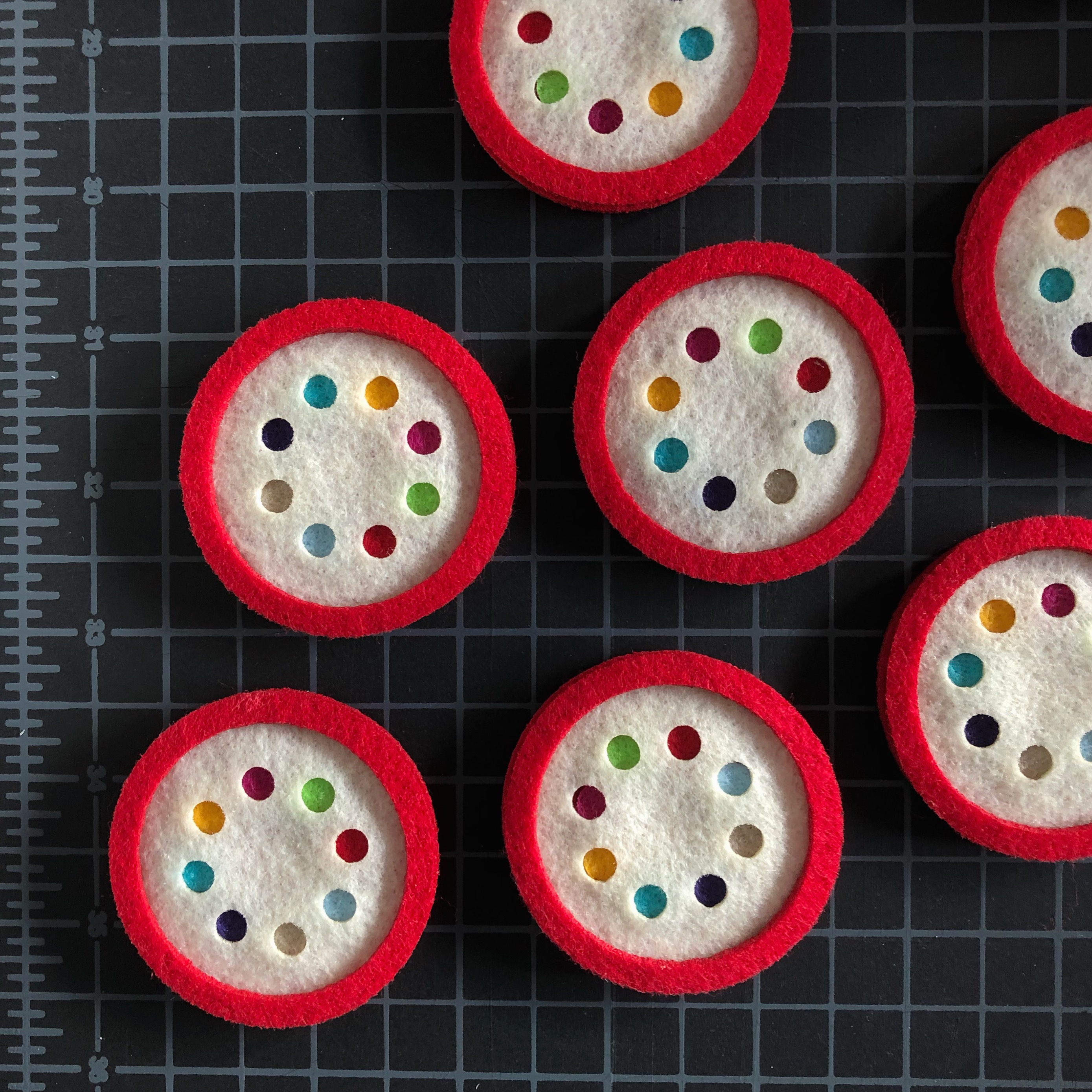
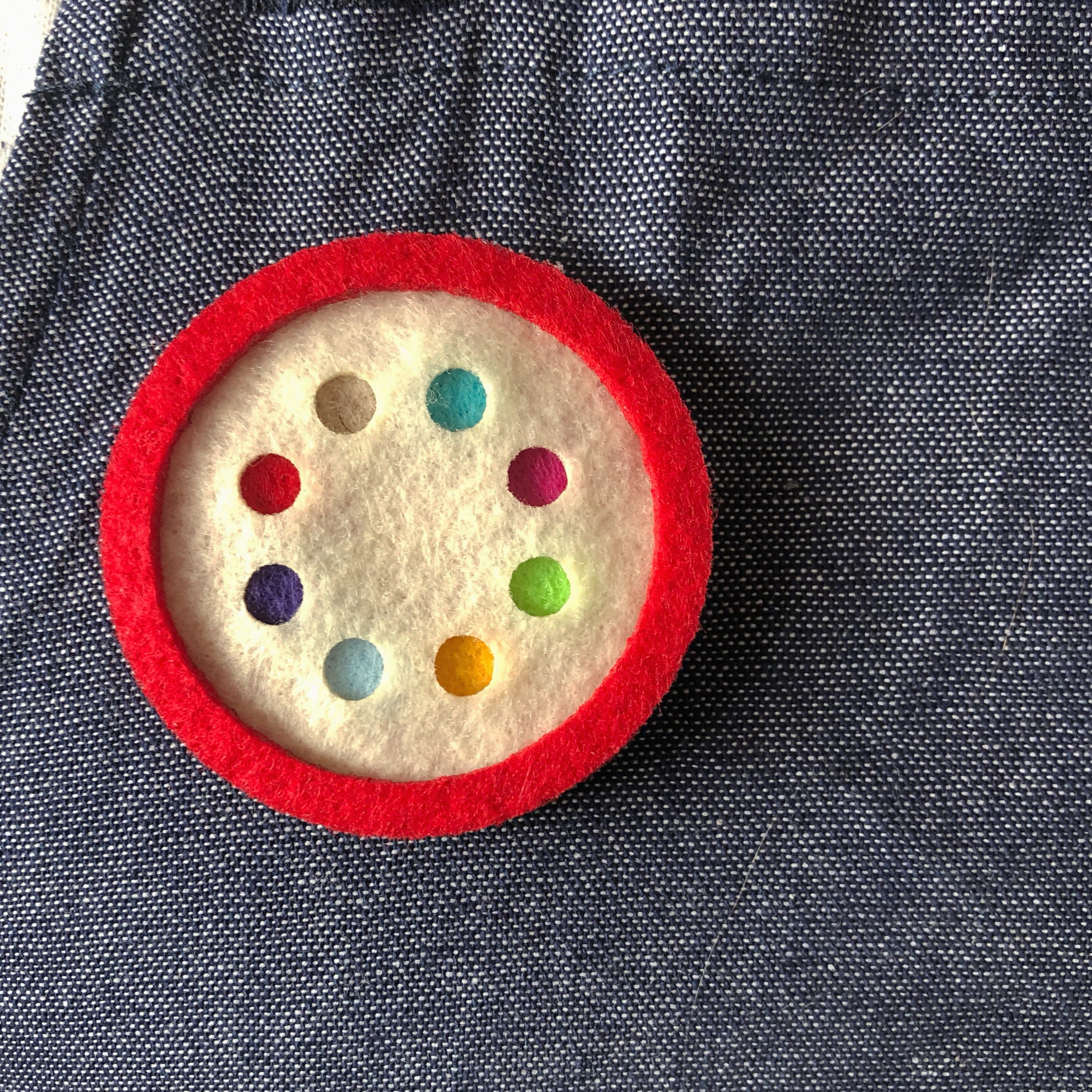
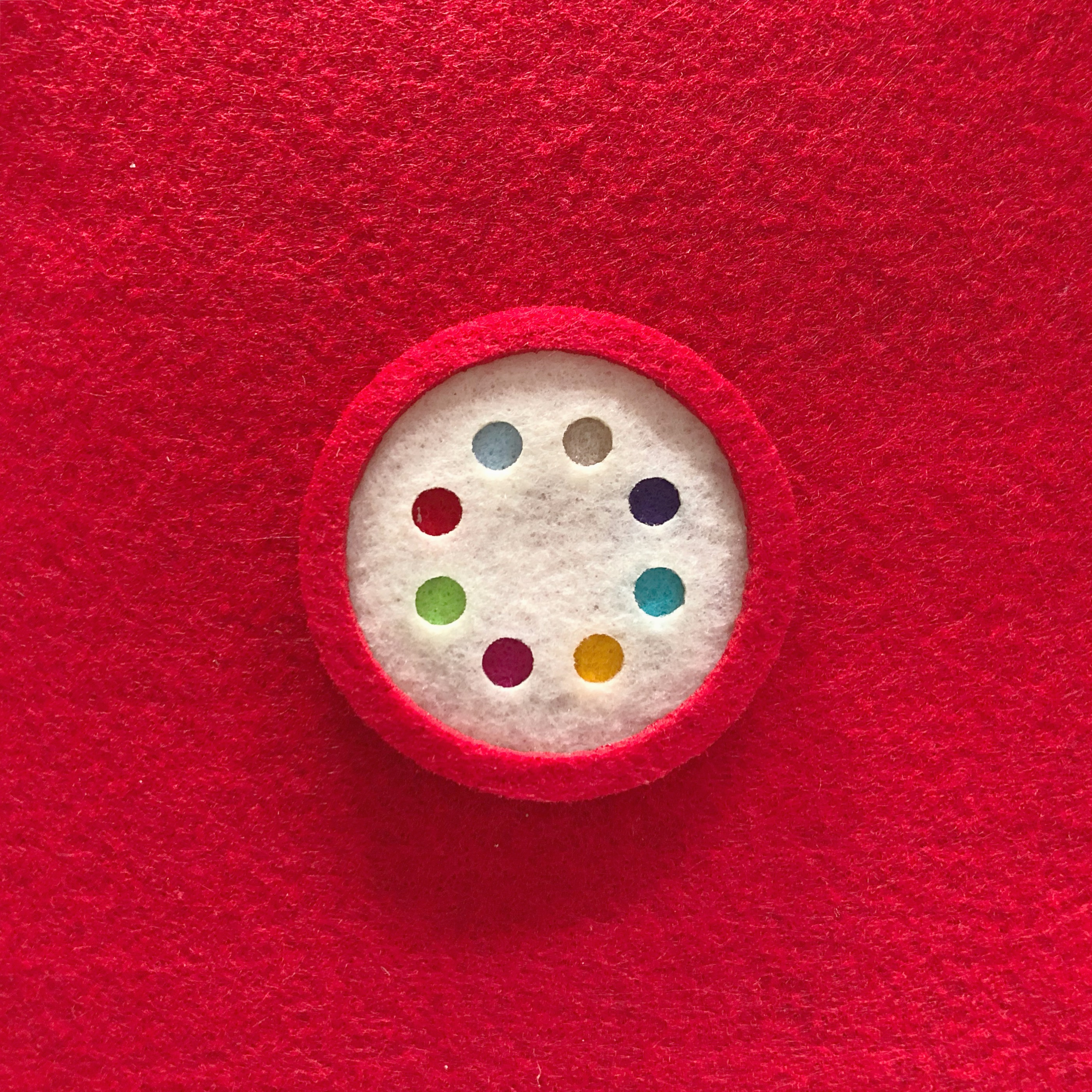
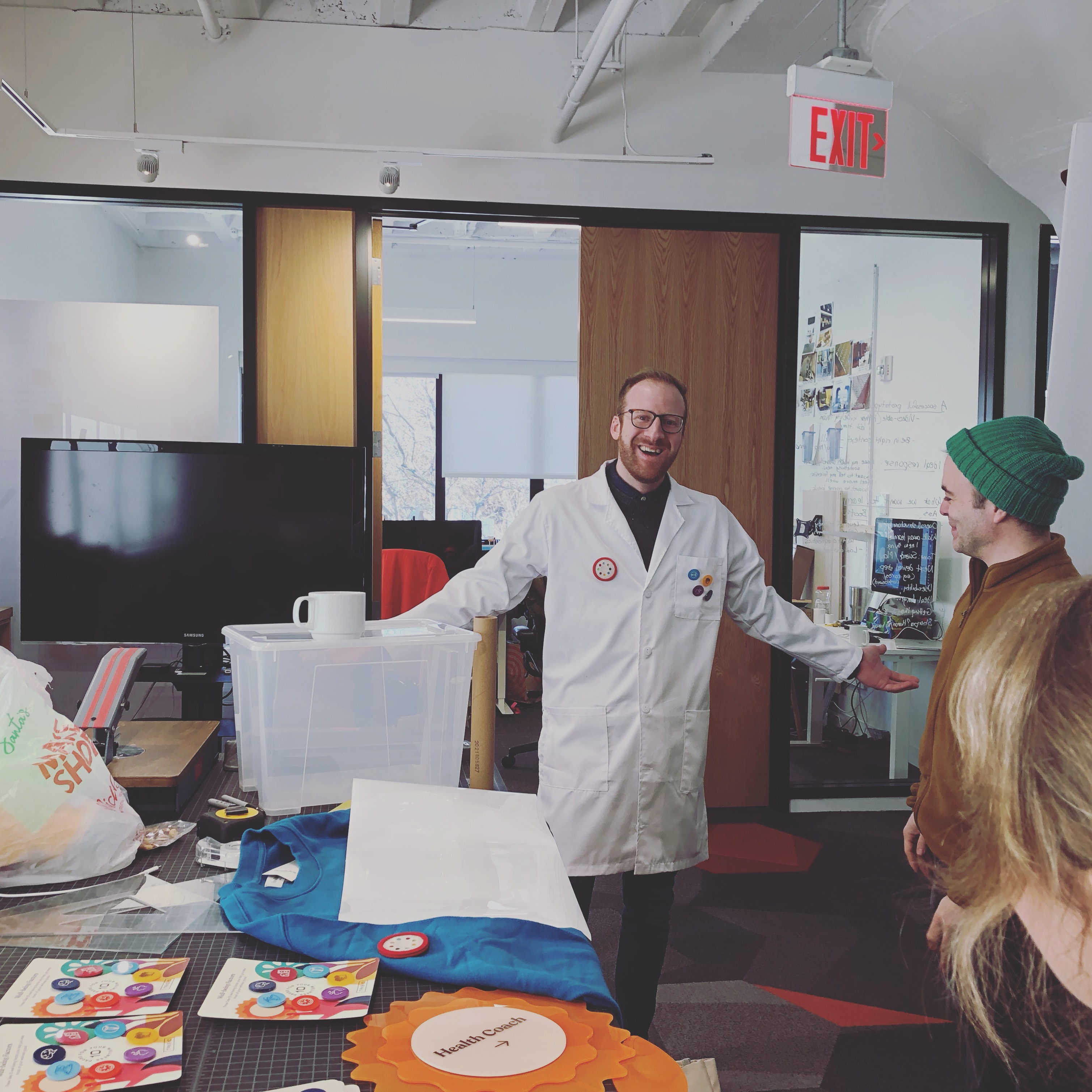
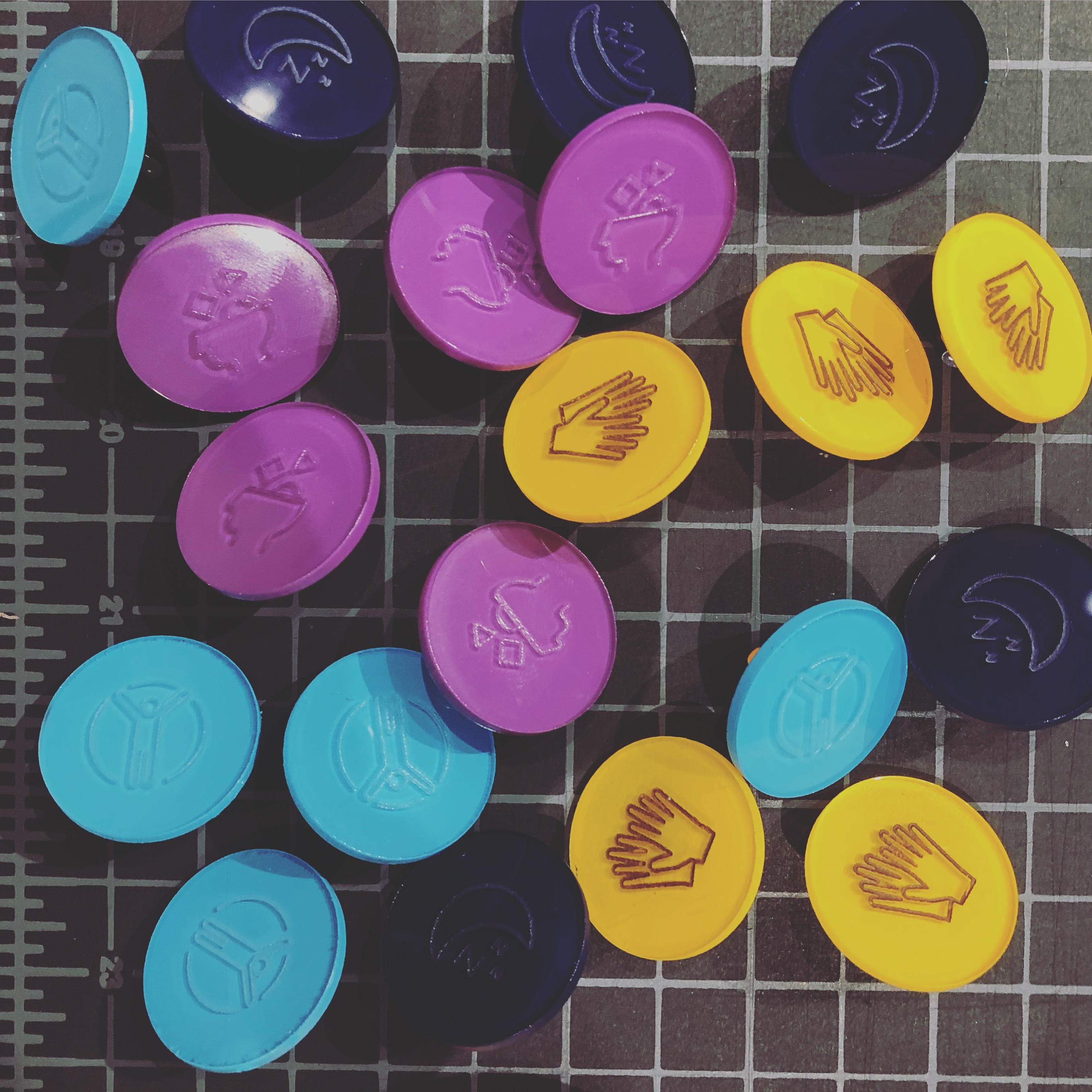
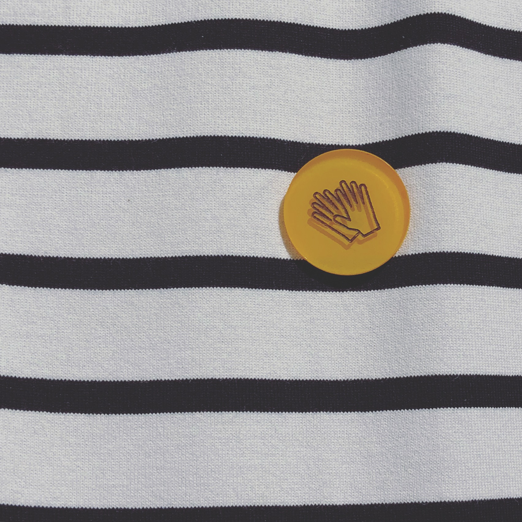
Pin sets for participants
Health Coach Directional Sign
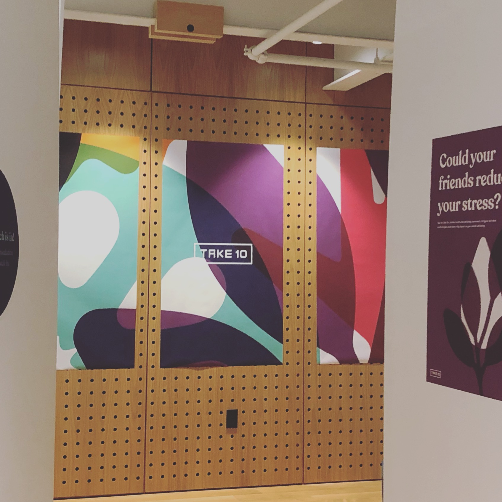
Health Coach Annex
Booth Details
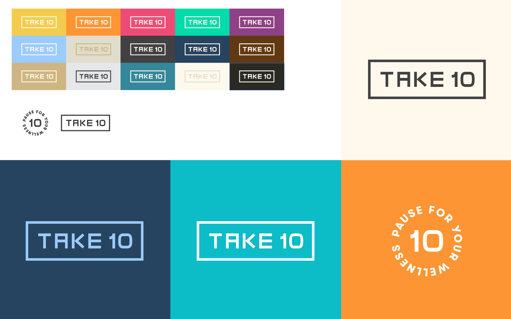
The Brand Evolution
We iterated through many visual styles before reaching the final Take 10 identity. We adapted characters from the japanese phrase “Chotto Matte” ちょっと まって meaning, “wait a minute”, to craft a sharp symbolic wordmark that is rooted in slowing down and reflecting.
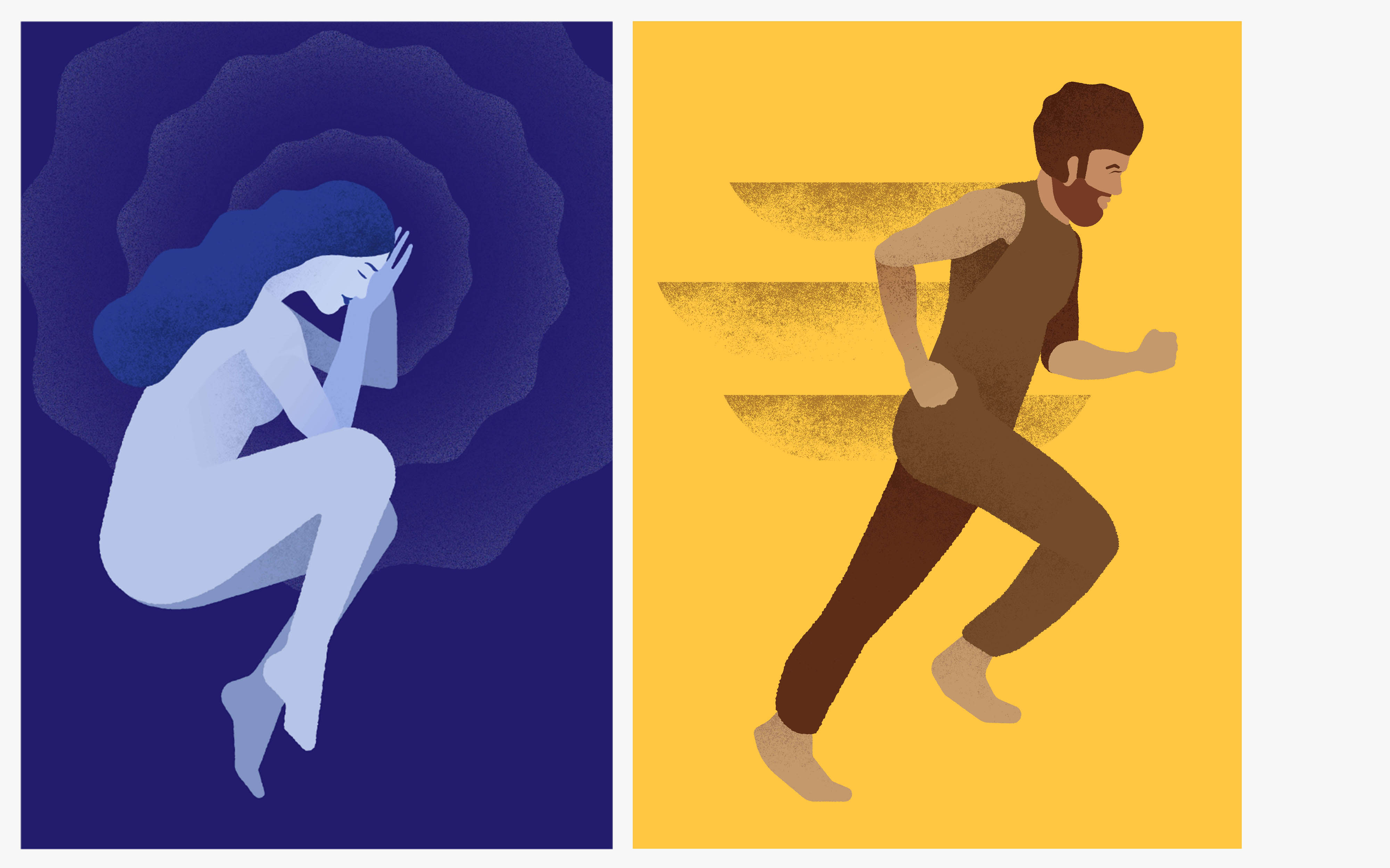
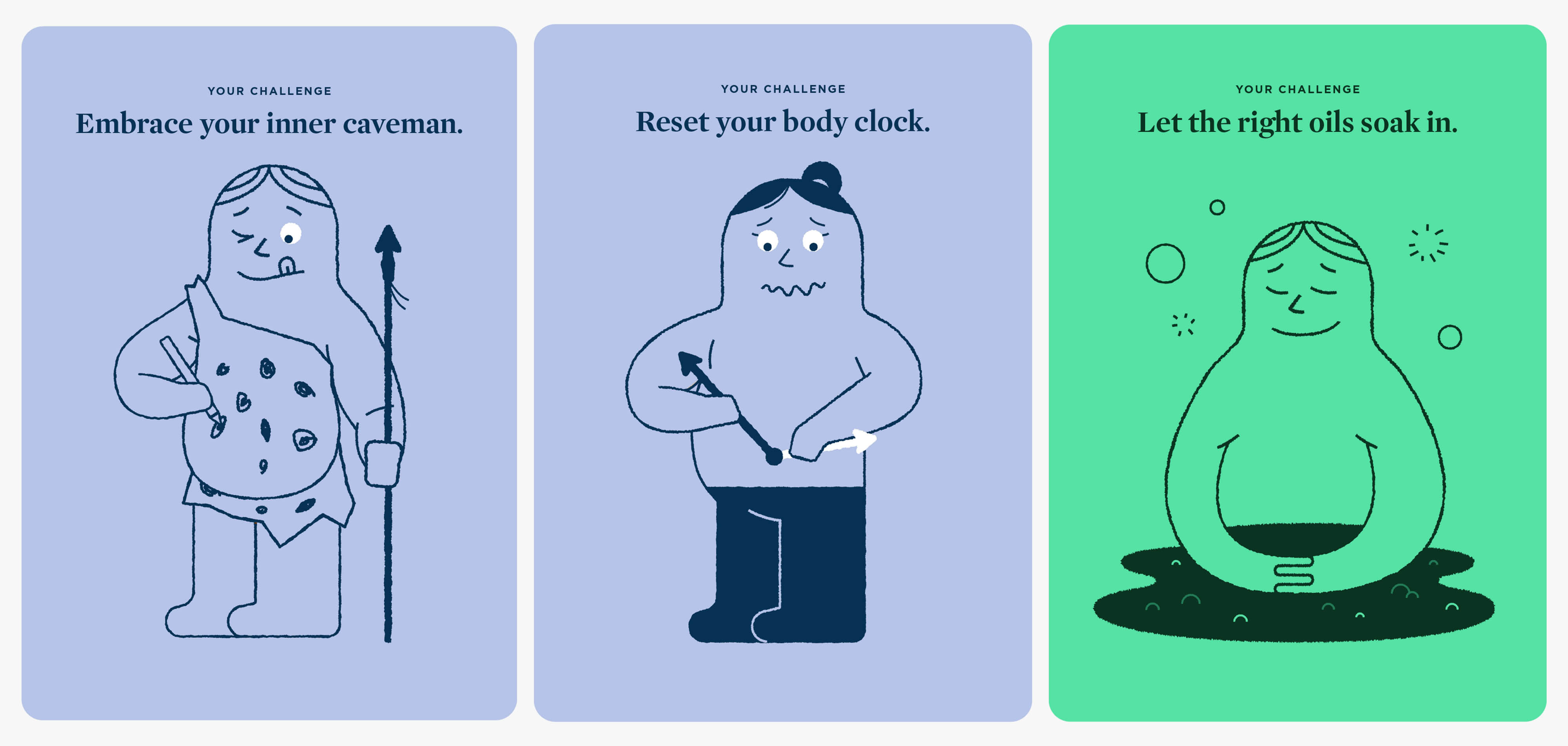
Older Directions
Older directions focused more on textured art approaches, drawing from minimal scandinavian styles. Or characters, which were seen as too cute and comedic to really make someone reflect.